Painterly yet practical: B&B Residence
Distinctive for its geometric clarity and minimalist material palette, this precisely curated extension to an existing Queenslander by Hogg and Lamb responds to the intensity of the sun and evokes a sense of calm.
Brisbane practice Hogg and Lamb is a partnership formed between architect Michael Hogg and designer Greg Lamb, whose formative years in practice were shared at Donovan Hill. While B&B Residence is the first house completed under the Hogg and Lamb banner, it follows decades of the pair working to refine the ways in which their domestic architecture responds to a subtropical, vernacular context.
Exploring a client-driven predilection for muted finishes and pure geometries, B&B Residence arrives at an architecture that is “humanist and minimalist at the same time.”
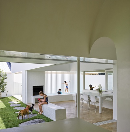
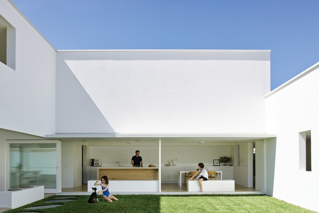
While alterations to the Paddington Queenslander appear relatively imperceptible, new additions emerge defiantly; they materialize as rising planes, fortifying an elevated garden onto which new rooms of varying enclosure open out. The separation between old and new is declared by a two-storey garden wall, bisecting the site, offset from the rear wall of the Queenslander.
The resulting slender interstitial space is absorbed by a cascading carpet of travertine that mediates movement between the natural ground and raised plateau. Arrival into the protected spaces of the vestibule precedes a moment of suspension between two worlds.
Encased in the vestibule, the white weatherboard wall of the Queenslander’s facade invites a return to the private spaces of the original house. Inside, the room layout follows the organizational logic of the historic plan, with the kitchen and dining spaces simply turned into bedrooms, resulting in its neat conversion to a children’s dormitory.
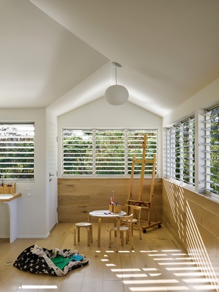
The central living room remains a social space, as does the louvred verandah, an L-shaped room of flexible semi-enclosure. The old front staircase is now largely ornamental, its use subverted by the more engaging and elaborately choreographed sequence that begins at the garden wall.
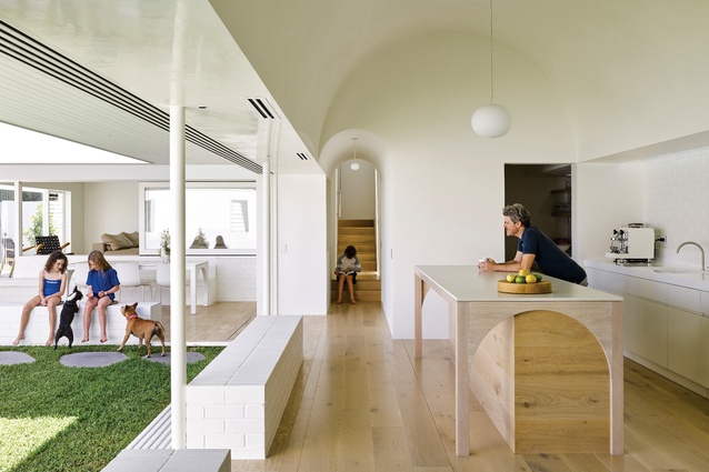
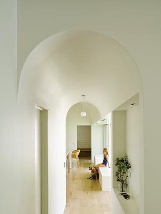
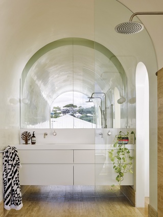
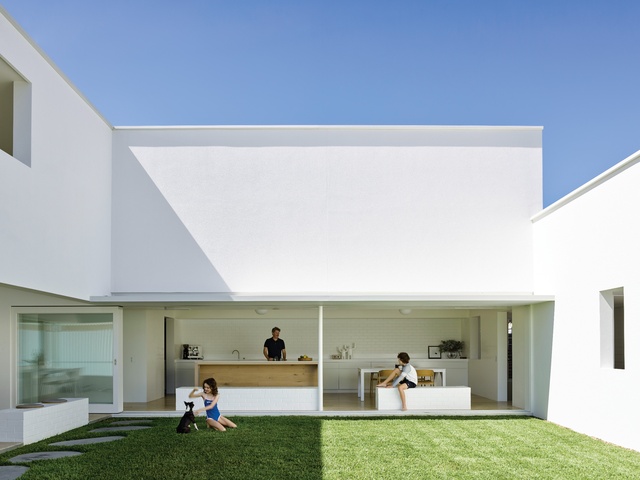
From back inside the vestibule, the journey in the opposite direction takes you through an unremarkable threshold in the immense two-storey garden wall, rewarding you with entry into the most celebrated room of the house – the kitchen. Expansion follows compression: a semicylindrical extrusion tunnel, overhead and off axis, transforms into a barrel-vaulted ceiling.
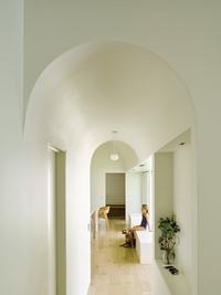
Concealed light sources, both natural and artificial, intensify the immersive quality of the room as shadows deepen and fade with the changing light. Airflow is tempered, drawn through the room and mysteriously expelled with a silent breath. The functional demands of a hardworking family kitchen are satisfied, seemingly without a trace.
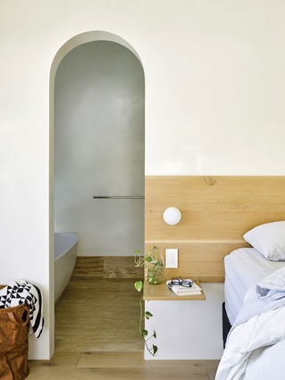
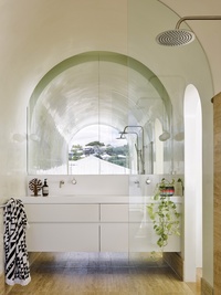
The ethereal surfaces of French oak, travertine, white stone and Venetian plaster wash the room with a sense of serenity that masks the complexity of the building’s section. Through the careful tuning of edges, a subtropical attitude merges with the ancient, elemental ceiling form.
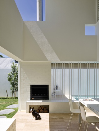
Glass louvres are concealed in the high recesses of the boundary wall, introducing daylight and drawing breezes while screening the visual intrusion of multiple neighbours. On the opposite wall, sliding glass panels retract, allowing a single column to advocate for the apparent weightlessness of everything above it.
Two brick plinths are embedded in the travertine floor, interrupting the otherwise fluid continuity of the ground plane, holding the edge of the courtyard, inviting pause.
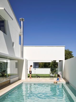
As the lawn extends to meet the fortified walls of the garden, the play of expansion and contraction intensifies. New volumes and rooms join the game, overlapping, crossing over and pushing through walls and apertures formed in white rendered masonry. From the outdoor room, smaller openings introduce a snapshot of sky or dazzling reflections on the pool’s surface.
Through the pairing of boundary walls and vertical landscape, the spectacle of suburbia is edited and hillside and mountain vistas are curated. As the sun moves across the sky the walls become canvases for the animation of light and shadow, and with sunrise and sunset the surfaces absorb and reflect a revolving colour wheel.
So painterly are the images of this building that it seems contradictory to suggest that this is a home expressly designed for casual occupation by a couple, their children and pets. Yet it is precisely the minimalist leanings that bestow the freedoms and enable the architecture to become so expressive, engaging and user-friendly.
“We didn’t have to spend a lot of time on working out what the construction system was and what the materials were going to be,” Michael says. “We spent time on the volumes, making the plan work well, making the light reflect really nicely and making sure the windows were in the right place.”
While curatorial discipline ensures that the building achieves the serenity and calm required by the brief, it is the rigour and discipline with which geometric purity and spatial complexity are resolved that delivers the sense of joy in the experience.
What elevates the architecture to something unforgettable is its radical proposition that the best way to respond to the intensity of the sun, the steepness of the earth and the thinness of the Queenslander is with visual spectacle, fortification and firmness.
This article was first published on architectureau.com

