Beachy graphics: Burleigh Street House
Embodying its local beachside context, this alteration and addition reconsiders the suburban status quo.
There’s a change happening on the Gold Coast, and this isn’t just in response to the expectations of tourists or holiday makers. Architect Matthew Eagle suggests it’s driven by locals – in particular, a generation that has a heightened awareness of the benefits that quality architecture and design, diverse cultural experiences, and innovative retail and hospitality venues can have for their hometown.
As a member of this generation, Matthew is making his own mark through his growing suite of sensitively contextual homes in the area. Burleigh Street House is a particularly impressive example of this.
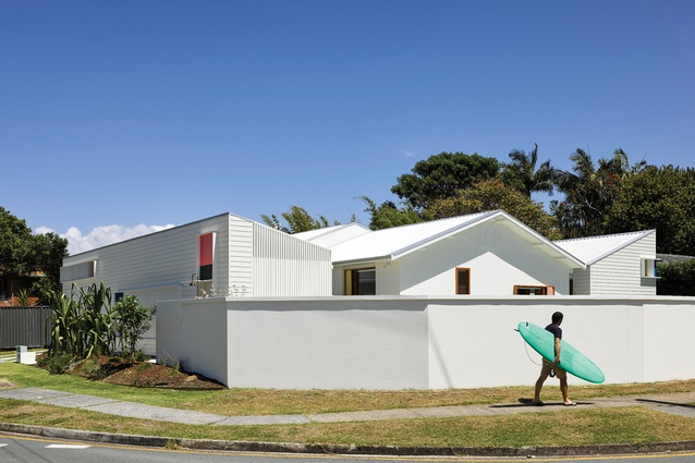
From the front elevation, this house could easily be mistaken for a completely new build. However, it is an alteration and addition to an existing 1970s three-bedroom bungalow. Using the original structure allowed Matthew to achieve much more within the budget, but also means the outcome is more sustainable.
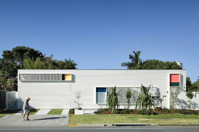
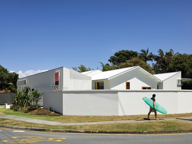
On a prominent corner site with issues regarding overlooking from surrounding apartment buildings, this home needed to be introverted. Although it is inward looking in its planning, it presents itself boldly to the street. The main facade is a composition of white-painted horizontal timber battens punctuated by three large rectangles containing blocks of pastel colours and vertical battened screens.
The breaking down of the solid wall into battened screens gives a hint of life to passers-by, while allowing fresh air and natural light into the transitional zone behind it. The beachy colours are taken from older fibro homes in the area; paired with the home’s simple form, it gives the impression that the house is a contemporary interpretation of the beach shack. An outdoor shower is located at the entry point on this elevation, a further nod to the beachside context.
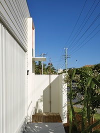
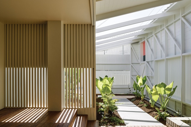
Behind this playful facade is a pathway that leads to the main house, lined with lush greenery and open to the sky. This “garden room” entry sets the scene for how the rest of the house unfolds – always with views into adjacent spaces, both internal and external. This peripheral zone allows for privacy and noise protection from the street – a water feature assists with the latter.
From the pathway you can see that the front facade was, in fact, neatly concealing the carport at the western end of the site. This arrangement challenges the typical suburban response of carport and fence and, as Matthew says, “reinforces the landscape as the predominant condition.” This placement of the carport also suggests that it might become a multifunctional zone.
In order to create this buffer zone from the harsh street corner, Matthew challenged the local council’s setback rules. Giving something back to the neighbourhood character (and ensuring there is an open-air space behind the front facade) contributed to the design being approved. During this process, Matthew also suggested other ways to improve the street, such as the planting of trees along the footpath.
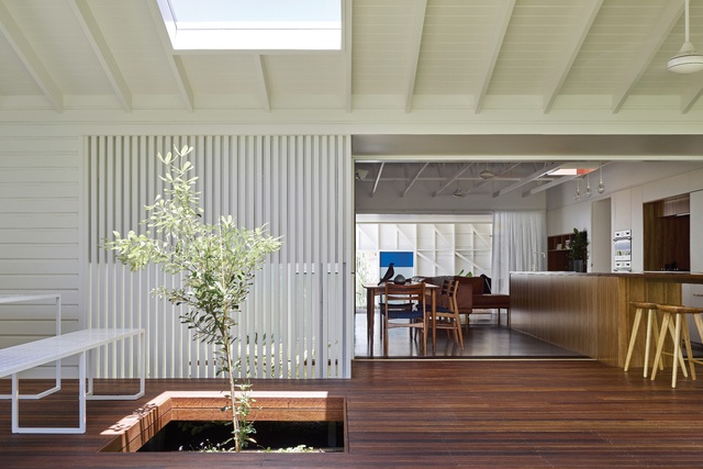
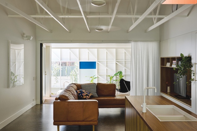
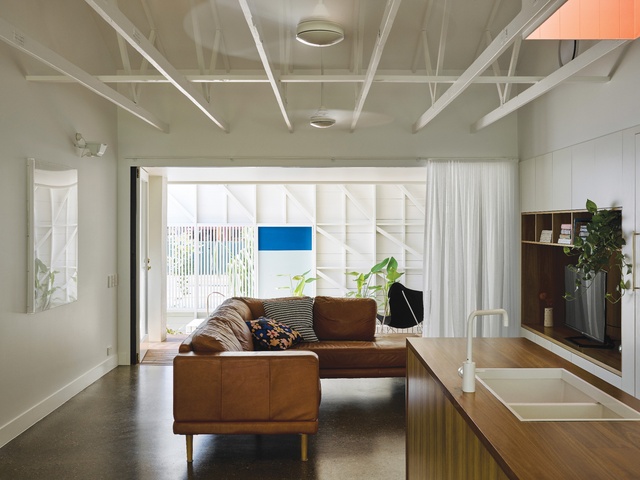
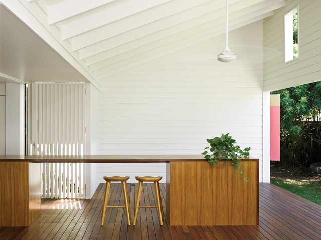
From the garden room, you enter the main living zone, which is contained within the original structure. To give the impression of more space, Matthew has removed the ceiling and exposed the timber trusses. A pink-painted channel reaches up to a skylight to allow natural light over the centrally positioned kitchen bench. Despite this source of light, the living zone has minimal direct sunlight, avoiding the harsh heat experienced in this part of Australia.
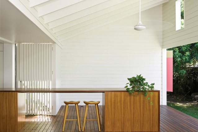
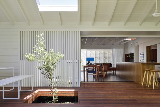
With the garden room along the southern edge of the living area, the northern edge extends into a protected outdoor room. This external area is used as an extension to the living area, with the kitchen bench crossing the boundary of inside to outside. The use of transitional zones such as this is imperative in subtropical climates, providing cross-ventilation and shade to the inner parts of the home.
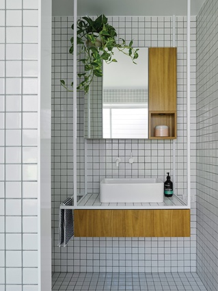
The two new pavilions, one each to the north and south of the site, mirror the existing home’s gabled roof form. Each pavilion is detached from the original house to allow for a series of garden pockets deep in the plan and to moderate breezes and light. Each of the bathrooms has a feeling of serenity and refuge, assisted by the adjacent greenery in the small courtyards. Finely detailed bathroom joinery adds to this sense of luxury, making these spaces as enjoyable to be in as the main living areas. The study borrows from the existing pool, with a low-level window capturing the reflections of the water.
The Burleigh Street House feels easy and relaxed, embodying the coastal way of life. It is a beach house and a permanent home, and although it presents a graphic form to the street, it is not a showy piece of architecture. This house reconsiders the suburban status quo and pushes boundaries, literally and figuratively, all within a reasonable budget. And, with its prominent siting, it will no doubt make a small contribution to the cultural shift occurring on the Gold Coast.
This article was first published on ArchitectureAU.com.

