Behind the scenes: Remuera renovation
Go beyond the everyday face of this Remuera home, originally built in the 1940s, to discover an unexpected touch of star power.
Humble on the outside, Hollywood on the inside. Those who wander past this property on a leafy avenue in Auckland’s eastern suburbs would have no idea that, beyond the crazy-paving-inspired pathway and a red-brick garage into which today’s mechanical beasts would be hard-pressed to squeeze, is a home that captures the glamour of yesteryear in a contemporary capsule.
Built in 1947, in the American-modern style, the original dwelling was a handsome little place with walls of poured concrete, concealed gutters and a low-profile roof that presented a friendly face to the street.
Fast-forward 70 years to when Paul Somerford and Alyssa Helleur of BDG Architects were called in by the current owners to alter and extend it. Time had twisted that fundamental thinking. “Afterthought upon afterthought upon afterthought,” is how Helleur describes the series of unfortunate events that took place. “It was a collection of uninspired, tight spaces with at least two non-compliant add-ons; it was a mess,” she says, somewhat bluntly.
The owners, though, knew they had a gem. Working in the film industry had given them a clear understanding of what is possible when ideas, talent and, yes, enough funding, collide. The location, on just the right part of the cliff top to guarantee a view, was superb and the house was solid with the modernist DNA they loved.
It was the architects’ job to overlay the owners’ cinematic vision across a regulatory framework. “Existing resource consent approval meant that some infringements on height-to-boundary and site coverage had already been signed off. So, it was important to stick within that envelope,” says Helleur.
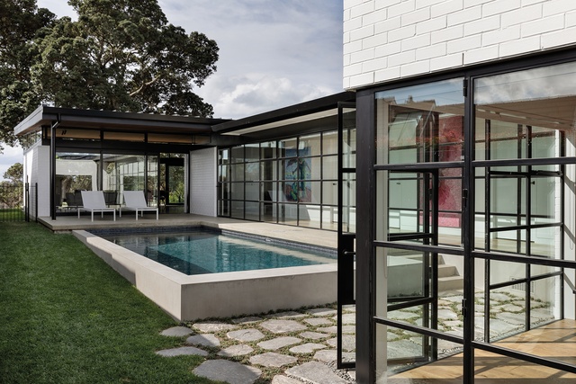
While she dealt with the grounded detail, the owners let their imaginations fly. “I liked the idea of mixing something old and something new like the Louvre, with its glass pyramids, or the Apple store in New York where a glass cube is juxtaposed against the older building,” says one of the owners. Two architectural icons as inspiration? No pressure then.
Push open the front door and it’s apparent the design team has triumphed. They have spliced the historical and contemporary together beautifully but with a few twists in the plot. “The owner likes to describe the house as a wolf in sheep’s clothing,” says Helleur. And what is revealed certainly makes you draw a sharp intake of breath.
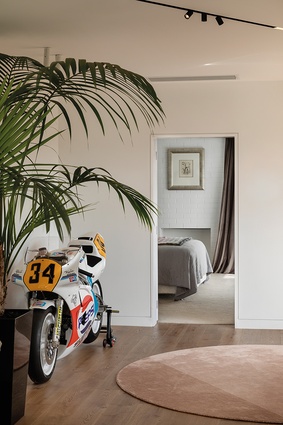
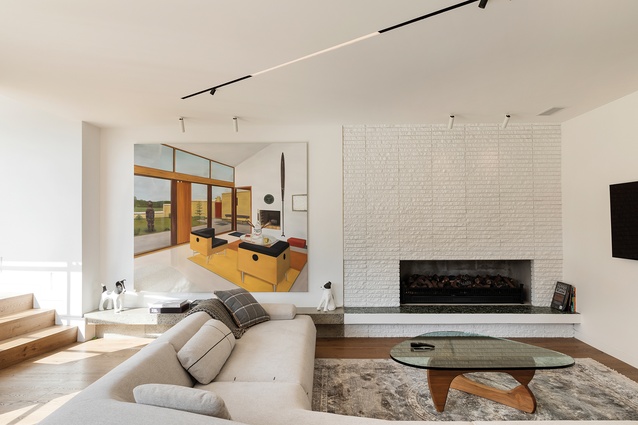
The entrance hall is a former dining room where a restored classic Grand Prix motorbike is displayed like industrial art. It’s an unexpected start. Next there’s a sitting area with a mid-century brick fireplace that turns back the clock and, a moment later, a glimpse of the courtyard pool wrapped in the embrace of the architecture.
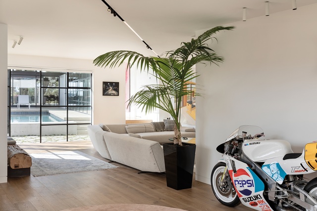
Like any good story though, there’s still more to discover. “We didn’t want everything to be revealed at once. It’s a progression,” says Helleur.
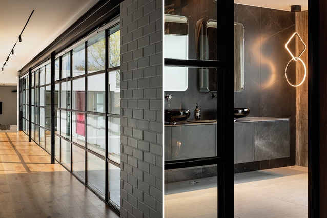
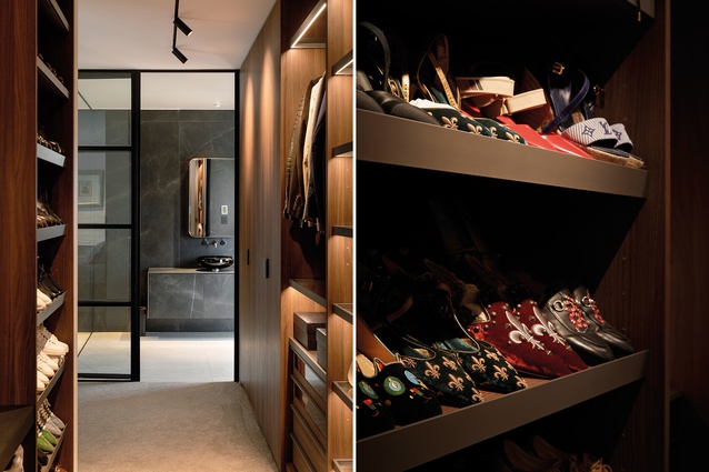
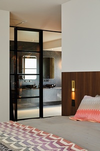
At the street end, the house has been structurally redefined to accommodate the master suite. Where once was a kitchen, there is now a walk-in wardrobe that spans seven metres. “The aim was for it to feel like a beautiful hotel,” says Helleur. By definition, that meant exquisite craftsmanship: a subtle negative detail around the doorway, recessed track lighting with trim-less casings, and a bathroom that is separated from the bedroom by bold, steel-framed glazing.
With Italian vessel basins, large-scale porcelain tiles that wrap the walls and floors in luxe, and custom-made mirrored cabinets, any leading lady or gent would feel completely spoiled here. “The owners have two young children and this is a wonderfully quiet room with a green outlook,” says Helleur.

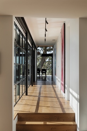
The U-shaped plan, however, does allow connection between all the spaces – a bonus when there are young children in residence. A bedroom corridor that leads alongside the pool is the umbilical cord that links the original to a new pavilion at the northern end of the site. It is decorated with bright, graphic artwork from the owners’ collection, which punches through the monotone palette of white walls, black joinery and oak floors.
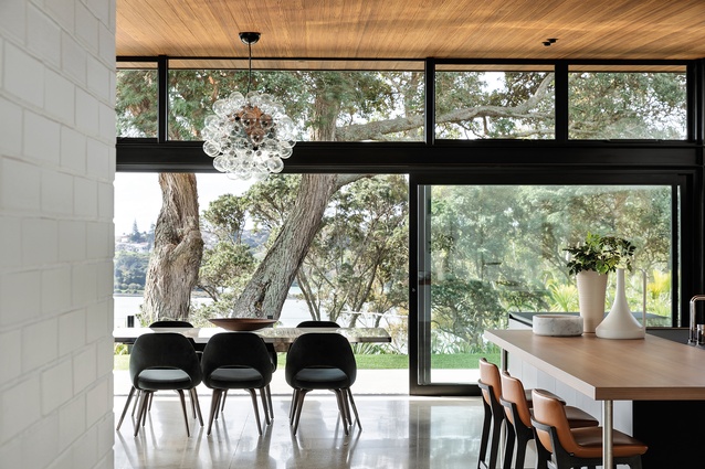
The pool is a teal-grey insertion: an aesthetic piece in its own right that rises out of the ground. Its subdued tone was not a happenchance and takes its cue from the waters of the harbour – the final scene of the journey where pohutukawa-framed views stretch out in an arc beyond the glazed walls of the pavilion.
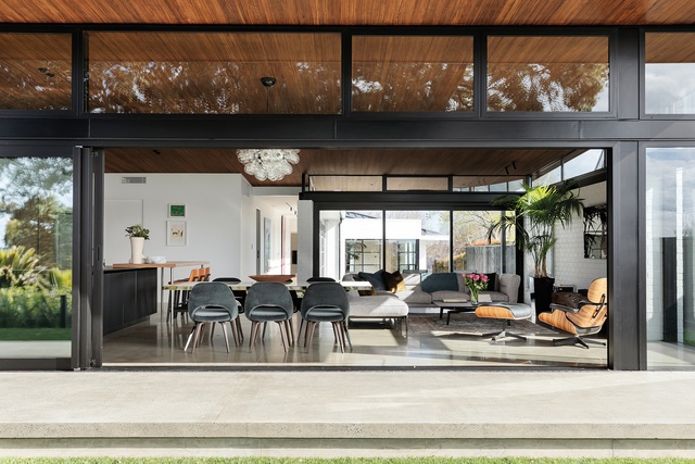
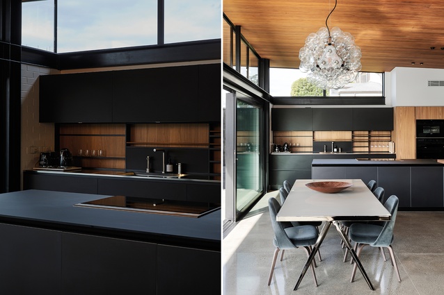
In the pavilion itself, an industrial flavour is evident; exposed structure, salt-and-pepper concrete floors and brick walls, which protrude into the space, ground the building and contrast with the fragility of extensive glazing. This material rawness is countered by dark-timber ceilings and elm cabinetry in the kitchen. In the evening, LED strips on the steel skeleton give the ceilings a soft ambience.
Each evening before bed, when the lights are turned off, the owners pause briefly to watch the red, green and blue flicker of distant dockside operations that continue long into the night. Inside this machine for living in, all is quiet.
Click here to see an extended interview with architectural designer Alyssa Helleur.
This article first appeared in Urbis magazine.


