Black beauty
Varying levels of interaction and connection with the surrounding landscape, both real and perceived, informed the design of this three-bedroomed family home in a coveted estate on Victoria’s Mornington Peninsula.
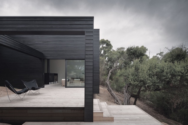
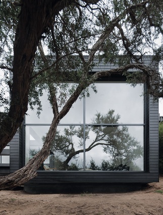
From the road above, the low-lying, two-storeyed home is barely visible amongst the native grasses and shadows of surrounding tree boughs. Black-timber cladding and dark reflective glass render the bold lines of the house, which juxtapose the organic contours of the site, almost indiscernible.
The front, streetside elevation is comprised solely of blackened walls and is interrupted only to signify the entry. From the street, the scale of the house is deceptively modest; the second, lower level, is completely non-apparent.
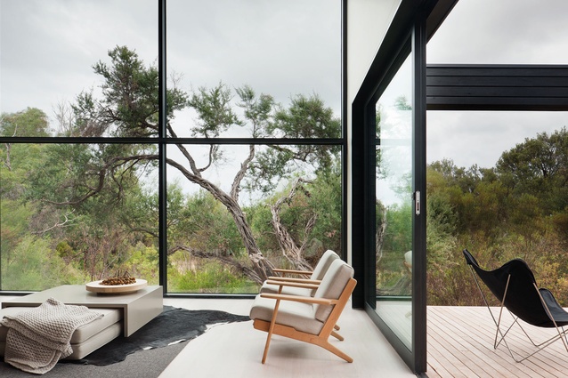
While the exterior was designed to reduce the structure’s visible footprint, the interior plays a different role. Inside, the volumetric spaces and clean lines accentuate the environs by drawing the landscape in through expansive windows and creating a connection with the dramatic and steep topography of the site.
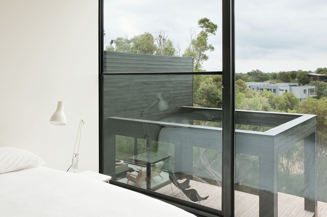
Architects Annabelle Berryman and Sarah Henry of Melbourne-based StudioFour architects say they sought to create a sense of space in the 274m² new build, which is located near the ocean and at the top of the Moonah Links golf course. The owners, a couple, wanted their home to be in stark contrast to surrounding properties, each of which generally attempts to nullify the sloping topography by creating a podium level at which the outdoor deck sits exposed, high above ground level. “The design for this house adopted a gentler strategy, with the building form spilling down the slope to terminate in a series of terraced decks,” says Henry. “These low-lying decks provide privacy from the golf course below, while the surrounding native landscape shelters the outdoor areas from harsh prevailing winds.”
Berryman says a simple brief – a home that had a relaxed feel and a strong connection to the environment – teamed with the dramatic site, enabled the design to become an exploration in enclosing the basic rituals of domestic life within restrained building forms and in creating different levels of interaction with the surrounding landscape, both immediate and beyond.
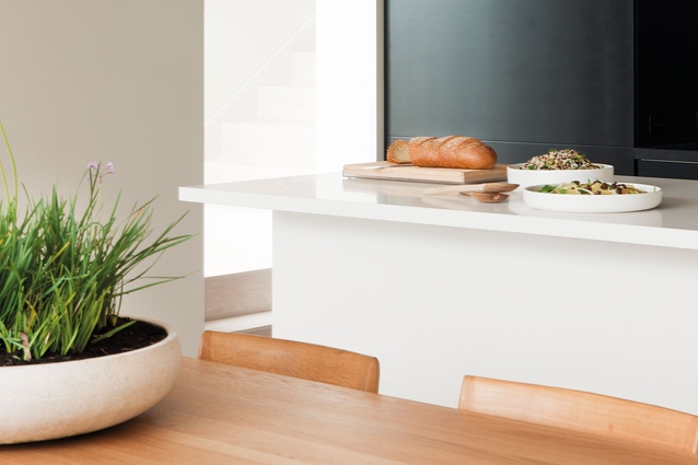
The challenges were immense. StudioFour won the contract because it agreed to match the price of a project home-builder, which made for a tight budget. Add to that the cost of excavation and it’s no wonder the architects chose to look to the natural beauty of the site for impact, rather than to create a high-spec space. The dramatic environs, rather than any architectural bells and whistles, make this home. The beauty is in the views, not the interior fit-out. This idea translated into modest choices for the interior, including an IKEA kitchen, which is cleverly disguised by a matte black feature wall at the rear of the room.
Berryman and Henry started the design process with drawings done by hand. “By using pared-back forms and detailing and a restrained palette of materials, the emphasis becomes not on the insular but on what nature has provided and drawing this inside for all to experience,” says Berryman. “The house is arranged to connect intimately with its surrounding landscape, from the channeled views of the horizon upon entry through to the double-height picture windows and the direct and intimate connection provided by the decks.”
Renewable timber was utilised as the primary building material, both internally and externally, to reduce the overall environmental impact of the building. A high level of insulation was used throughout to counter the potential heat loss from large expanses of glazing.
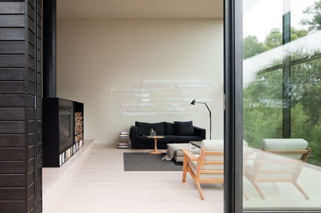
On the first floor, the kitchen, dining and living areas are combined to create a single, fluid space delineated only by a gentle level change. (The three bedrooms are located on the lower floor of the home; two of them have outside decks.) Elements of the exterior cladding are drawn inside with black highlights and accents; in the living room, a floor lamp and charcoal sofa were chosen, to tie in with matte-black panelling in the kitchen.
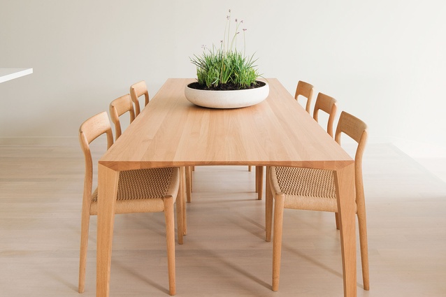
The materiality also reflects the client’s desire for the home to have a relaxed, coastal feel, says Berryman. “The bleached-timber flooring informed the furnishings and provided a strong basis to work from. Light oak was used for the dining table and any required timber accents or chairs. I think one of the most effective elements of this design was the double-height, black-panelled wall to the rear of the kitchen. Not only is it composed of two hidden pivot doors that give access to utility areas behind the kitchen but it serves to give depth and backdrop to the ground-floor volume.”
From the living area on this level, the aforementioned floor-to-ceiling picture window frames a view of an existing windswept tea tree: a reminder of the site’s proximity to the ocean and the strong winds that consistently blow across the peninsula. The house was designed to cantilever over the tree’s roots to ensure its survival and a dramatic panorama. It’s an apt metaphor for the house as a whole, which is, as Berryman says, “an exploration into the absence of what is not necessary, in both building form and detail”.
To read an interview with the architects of this home, click here.

