Black Building – Mackelvie Street Precinct
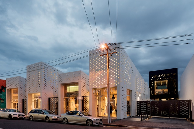
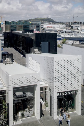
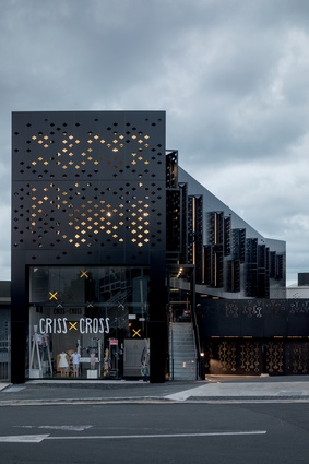
It’s hard not to miss the monochromatic mixed-use development, known as the Mackelvie Street Precinct, which sits just off Auckland’s Ponsonby Road in behind a string of well-known retail and hospitality outlets like Karen Walker, the Longroom and Santos Café. Rich Naish from RTA Studio describes them simply as "the white building" and “the black building”.
Architecture New Zealand featured the newly completed white retail building in January 2013, reviewed by Nicole Stock, who described its “white, staggered forms” as a “head-turner”. Now, on the southern edge of the site, its new cousin is a long, slender black form that shares its distinctive façade design. Here, Justine Harvey interviewed Naish about the project.
Justine Harvey: What was your brief for the Black Building?
Richard Naish: The history of the site is that we’ve been working on this particular block, owned by Samson Corporation, for a number of years. We’ve worked through the structural upgrading of some of the existing heritage buildings, we’ve done the Longroom canopy, the seismic upgrading of the Karen Walker building, as well as the white retail shops. Having done those buildings, part of the vision for the precinct was that we would be clearing up the interior of the site and turning the backs of the shops into double-ended stores.
Also, there was pressure on the market for carparking in the area as the quality of the tenancies increased. The way the resource consent works is that if you increase carparking, there’s a lot of extra potential for development on the site and that generates extra gross floor area; so RTA Studio cheekily suggested an additional building out the back.
We prepared options and designed a speculative office building for Samson, as part of the car park extension programme. There was always carparking on Pollen Street and we’ve now extended the amount of carparking that comes off Mackelvie Street, and that’s created the platform that this building sits on. In a strange way, we’ve turned a reasonably mundane car park into a real opportunity.
So, while we were respectful of needing to provide carparking at the lower level, the natural solution was to put the building up on stilts and that drove the dimensionally-long, hovering object on legs. It’s long and narrow to occupy the dead boundary of the site, because the other three boundaries open onto the streets. This was the fire-boundary/blank wall; so we pushed the building hard up against that boundary and kept it reasonably narrow at only 6m wide to get plenty of daylight into both the existing and new building.
JH: Where did the black and white come from?

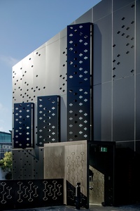
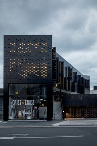
RN: We originally conceived it as being white, just like the shops, but then all of a sudden we thought, ‘what about making it black for a bit of diversity in the neighbourhood?’ Also, because it’s an office building, we wanted it to have its own separate identity from the retail function. So it was a reasonably easy decision to go black but the cladding system is similar; it has the historic decorative reference that we also incorporated into the façades of the white buildings.
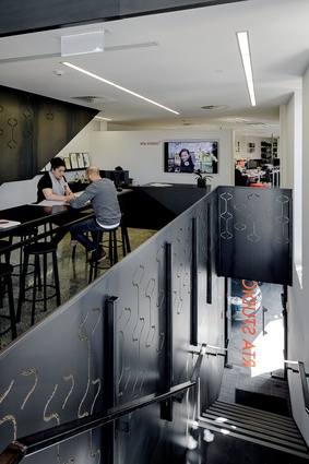
Essentially it’s two office tenancies and each tenancy has two levels. We divided the building down the middle with two levels facing north-west and two facing south-east. There’s a small retail tenancy on Pollen Street that was about activating the street and bringing retail further around the corner from Ponsonby Road. Pollen Street is starting to develop more as a retail street.
It’s the same old tricks that we’ve been playing on the site with everything – trying to activate the street and enhance the network of laneways. This building has enabled the pedestrian laneway connection, so you can now walk through from Brown Street, through Ponsonby Central, through Lot 3, through the Mackelvie Street Precinct into Pollen Street.
JH: Is the laneway open?
RN: It’s definitely open but closes late at night. Here, there is a reasonably constant stream of pedestrians using it as a shortcut, particularly during the daytime with people wandering through to Ponsonby Central for lunch, etc. There’s even talk of future-proofing this site, when we become less reliant on cars.
JH: Yes, it’s a shame there’s not better public transport into Ponsonby. The area is very reliant on car traffic.
RN: Yes. When the city gets some proper public transport! There are 1,500 new car parks in the new Countdown building over the road. There will come a day when we do become more reliant on public transport and electric bikes or you just use Hop cars from the street corner. We have a future masterplan that shows the underbelly of this building being filled with retail, so you have an activated edge along the laneway as well.

Cumulus, which Samson built in Parnell, has a particularly high stud on its ground floor for exactly that reason – for when the tenant demand on car- parking decreases in the future and there’s a train station going into Parnell – then they can infill that whole ground floor with offices. So, instead of a 2.3m-high stud for parking, it has a 3.6m-high stud.
These two buildings are good examples of intelligent development. We’d all love to infill it all now but you then couldn’t rent the tenancies because the tenants all need car parks; I’ve always been very realistic about that as an architect. You have to meet the demands of today, although you also have to be in tune with the context of the future as well.
JH: Can you talk about the form?
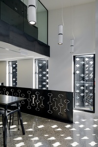
RN: What we’ve developed with the building is this almost sculptural quality where it has this fifth elevation that is the underbelly of it. It’s this building that’s floating above a shared space, pedestrian/car ground plane.
JH: The Black Building is surrounded by buildings – how did you approach the design?
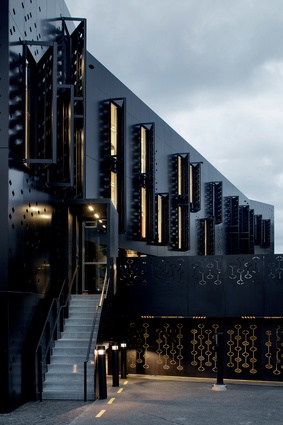
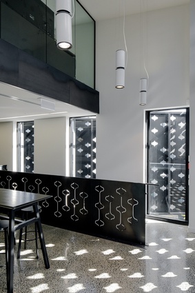
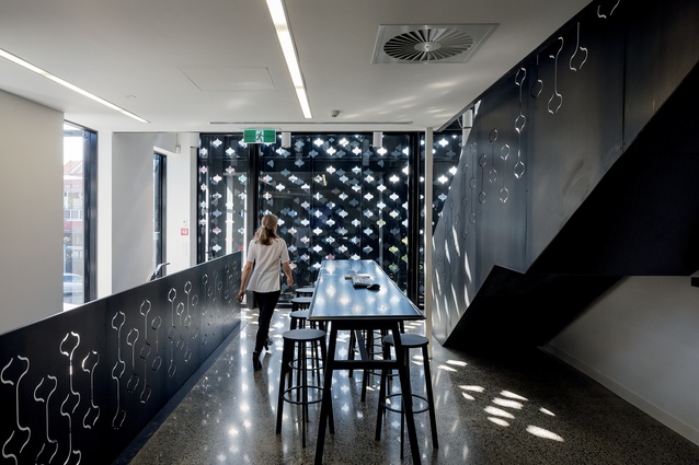
RN: One end has a very large picture window that looks north and the other end is south-facing; so we’ve screened the south side in the spirit of an artist’s studio with really controlled south and east-facing façades, which have a wonderful light quality, either for computer work or hand drawing. So, for a drawing studio, which is essentially what an architects’ studio is, it works very well. The shutters all open to allow clear views out and the screening creates a really nice dappled light coming through.
It’s a reasonable urban environment so there’s no nice views of the sea or Mount Eden or anything. The building doesn’t have much street frontage, – 80 per cent of the façade opens to a built-up environment – so we’ve taken the approach to screen it and control the light quality for a really nice internal environment.
JH: How did you tackle the façade treatment, which is similar to the White Building?
RN: It’s actually a different material than we used on the White Building but the general detail is very similar. It uses an aluminium sheet material, whereas the White Building uses fibre cement sheeting. We couldn’t get a jet black in the fibre cement material, however a really nice matte black product was available and we could laser-cut it in a similar way. It was perfect really.
JH: It’s fully tenanted, isn’t it? Who are the other tenants, besides RTA Studio?
RN: The front office tenancy is a property investment company and the retail tenancy is a children’s clothing retail shop, so there are only three tenants. Another piece to the puzzle is to do with rubbish management. In the base of the building, at the front end, there’s some rubbish rooms, where recycled bottles and things from the bars and restaurants are held until the rubbish trucks collect them.
It’s coming back to the final piece of the puzzle to resolve the refuse and waste management on the site, which couldn’t be released until we finished this stage. It’s really tidied up the site because when you have something like a dozen food and beverage retailers as well as retail, you end up with a great deal of waste. So there’s an area under the basement with another rubbish room, where rubbish trucks can come in from each end; that’s got rid of dozens of wheely bins that used to be here, which stink when you have food and drink. It was part of the brief from the client.
Also, there is one final building that we have planned for the site and we’re about to lodge resource consent on it. There is a small footprint of land [facing Pollen Street] where a small four-storey building will go. It will be retail at the bottom, office in the middle, and food and beverage on the roof – a rooftop café.
Read the previous article on the “white building” of the Mackelvie Street Precinct here.

