Black and white house in Sydney’s Surry Hills
Creative clients can go two ways: the ones that can’t give up creative control and the ones that appreciate trust in their own professions, so are willing and glad to allow the designer to work their magic. Happily for Ian Moore, his client in this Surry Hills warehouse in Sydney, a production designer with a background in graphic design and photography, was of the latter camp. Her brief, then, was exactly that: she wanted a black and white Ian Moore house, oh, and a big bathroom with a gigantic bath.
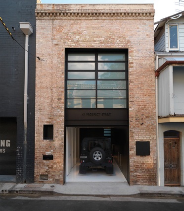
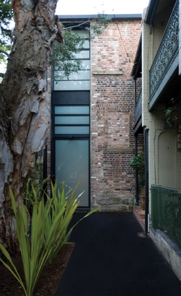
The shell of the building has been a grocery warehouse, a light industrial workshop and an artist’s studio / residence since it was built in 1895. The studio / residential conversion in the ’70s had bricked-up some of the original windows and added sliding timber doors to give an unnerving suburban feel to the urban site. The original loading docks remained, and Moore’s renovation aimed to emphasise this heritage quality by pulling the loading dock up as a slot for lighting and ventilation throughout the façade, while also trying to reinstate the original openings.
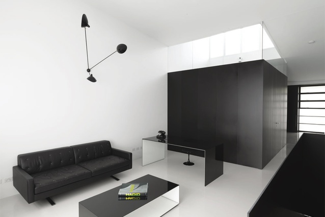
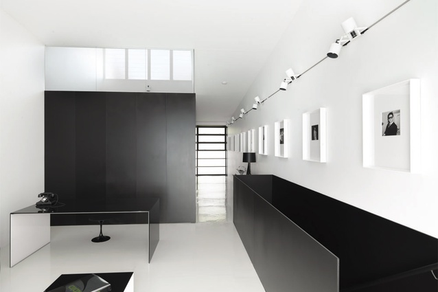
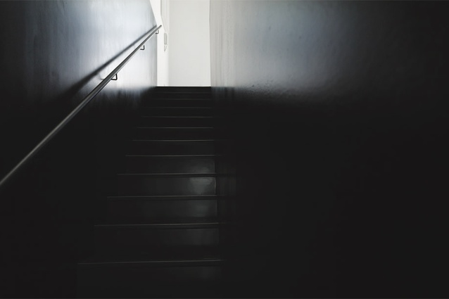
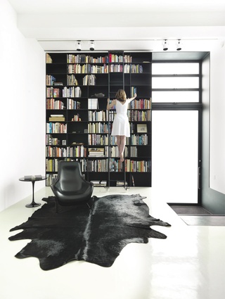
The building is tall and narrow and it was its width that influenced the planning as well as the materiality. Once Moore set aside space for the minimum dimensions for a garage, a stair and bathroom (left in exactly the same location for 120 years), he was left with 10 mm for a wall. With 10mm, steel plate became not only an attractive, industrial-edged choice, but also necessary. The steel plate continues throughout the house as a defining feature – creating elements like the bookcase, the portal frame and balustrade.
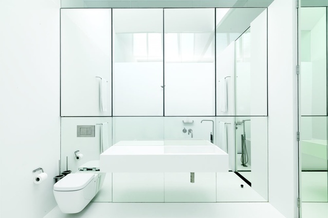
In this new-old house, the steel also helped to graphically illustrate the new and the old. What was already there (though perhaps lined) was white. Anything new was black. Though black on the outside, the interior of the bathroom is made from seemingly seamless white Corian, merging the walls, basin and floor into one surface, with a Flaminia ‘WASH’ bath in the centre. To avoid cutting up the open industrial space, this was conceived as a pod. Moore describes it as “an insertion, like a piece of furniture.” The ‘ceiling’ of the pod is glass, which sits under a punched skylight that bathes not only the bathroom in light, but also the entire bedroom. Moore was fascinated by how Corian could simultaneously take the focus away from the materiality of the space, and yet, draw attention to it because it is so neutral, so devoid of obvious materiality, you have to ask what it is.
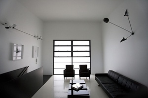
Continuing the play of old and new, the furniture for the apartment draws together contemporary pieces with vintage or re-purposed ones. The Saarinen tables were bought at auction, the client’s art deco chairs were re-upholstered and other pieces such as the Poliform bed were specially chosen for the new space.
The simplicity of a black and white palette belies the complexity of this project. Neither is this renovation an intellectual, cold abode, rather, in this playful and sophisticated space, Moore has made a comfortable home.

