Blue sky thinking
There has been a shift in the high-end retail zoning of Auckland. Established areas of retail struggle to keep up with younger upstarts, as both groups strive to capture the ever-shifting zeitgeist. Established shopping locations have reinvented themselves to retain their cultural currency, while once derelict areas have been redeveloped to provide fresh versions of their spatial connotations. Design is the weapon of choice in this commercial rivalry.
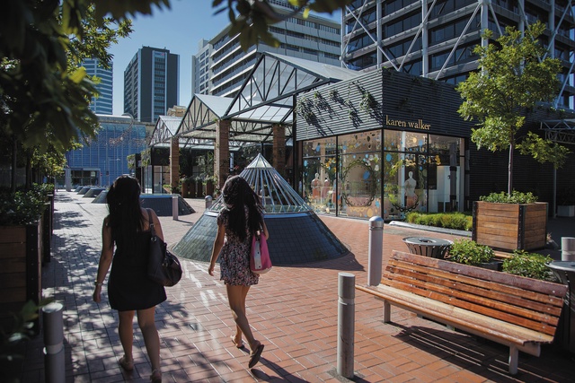
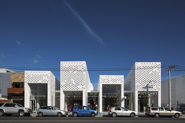
An example of this ongoing skirmish can be seen in two of Auckland’s most recent retail developments, Cooper and Company’s Britomart Pavilions, designed by Cheshire Architect’s, and Samson’s RTA Studio-designed Mackelvie Street development. On the surface, the two projects could be no further apart in their materiality or context; seemingly presenting different retail outcomes for different demographics. However, a little more examination reveals the same approach to retail renewal. It is here that the battle lines get blurred as both sides employ similar design strategies.
In the distant past, retail enterprises were much more concerned about the collective representation of a brand through both the design of the interior and exterior spaces. Take, for example, the golden age of the department store. However, in the age of the shopping mall, retail design became separated from the architectural whole in a way that marginalised the cohesion of the total experience. The design of retail spaces was thus more interiorised than ever before. As a reaction, global luxury brands embraced the “concept store”: often an iconic building whose ultimate purpose was to communicate the brand’s streamlined visual identity (to the exclusion of all else), through both the interior and exterior.

While shopping malls and concept stores continue to increase in size and distribution, some smaller retail developments such as the Britomart Pavilions and the Mackelvie Street development have hinted at something in between. These projects play with the idea of the whole and the part in a way which positions them between the concept store and the shopping mall, in the midscale. They each offer up interiors for individual tenants to stamp with their brand, while providing a common language of exterior patterning. This patterning ties together the disparate brand identities and is tempered by the massing of multiple volumes that break up the complexes into smaller, friendlier, volumes that recall a different era of high street shopping. Each retailer benefits from the sophistication of the cohesive whole while retaining their own identity and individually articulated storefront.

Without doubt, the Britomart Pavilions and the Mackelvie Street developments house examples of clever, contemporary interior design. If we focus on these clever applications of design, we find that the interplay of interior and exterior, part and whole, is carried through. These examples are the most spatially successful as they acknowledge the game being played in the design of the complete retail block and respond in kind. Two that deserve special mention are the Lineage store at Britomart and the Ricochet store at Mackelvie Street.
The Lineage store interior, designed inhouse by Patrick and Jennie Loo in association with Jasmax, draws the exterior of the development into the store. Within the store an axis is established that connects a planted interior courtyard to the landscaped pedestrian street frontage. The visual continuation of these similarly planted areas is reinforced, rather than masked. The interior also utilises full-length mirrors to reflect those passing by into the store and to place customers amongst the action of the street in their reflection. To temper the optical effects, a sophisticated palette of white and black surfaces is employed. While focusing its functionality, the design blurs the perception of the interior and exterior, the part and the whole, in a way that continually animates the store.
A similar level of sophistication is brought to the design of the Ricochet interior, designed by Ricochet’s inhouse design team. Here, the form of the tenancy is reinforced by the interior design. The long hall that connects the street frontage to the rear carpark is treated as a single volume and established as a catwalk. Lit from above, through an inflated ETFE roof, the space is both differentiated from the adjacent retail zone and still within the security of the store. The gesture of breaking down the retail block into smaller volumes is picked up in the interior design and has resulted in a pairing of spaces that highlight different aspects of the consumer experience.
Together, the Britomart Pavilions and the Mackelvie Street retail development, are exemplars of retail design in Auckland. While competitors on paper, they are in reality kindred spirits in their approach to retail development. They have avoided being a set of disparate and somewhat disembodied designs, and instead they work to create relationships between the stores, both interior and exterior. As such they represent a renewal of the midsize retail typology, between the singular concept store and the monolithic shopping mall.


