Book Review: Horror in Architecture: The Reanimated Edition
Joshua Comaroff + Ong Ker-Shing
264 pages, University of Minnesota Press, 2023.
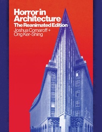
Horror is not simply “scary.” For Comaroff and Ker-Shing, in the new edition of their 2013 book Horror in Architecture, horror is a transgressive, sublime form of provocation. Architecture becomes the medium to analyse the “agonising presence of horror” underlying not only the built environment but our very society.
The latent presence of horror within modernity is the result of new technology, social practices, and economic models, manifesting in the scale, repetition, height, span, materiality of our buildings. Their goal is to “identify these disruptive influences and relate their architectural results to tropes of horror and monstrous analogues.”
They do this by drawing from theory, film, architecture, and art to create a patchwork collection of essays proposing examples of horror manifesting in modern architecture, of which a few chapters we will discuss.
‘Doubles and Clones’
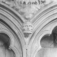
In architecture school one of our first lessons I remember was: avoid symmetry. Perfectly symmetrical forms often have an uncanny stillness, what Horror calls the “double.”
Contemporary examples of this off-kilter symmetricality are the Bahrain World Trade Centre or the Cullinane residential complex in Hong Kong. One half always feels like a doppelgänger of the other, “calling into question the legitimacy of the original.”
Instead they suggest doubled forms need to be broken, perspectives or scales or orientations slightly changed to avoid the uncanny. For the World Trade Centre towers it was as simple as shifting one along slightly (although they had their own type of terror) to mitigate the uncanny reflection of symmetry.
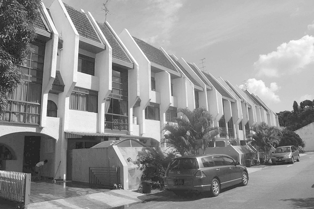
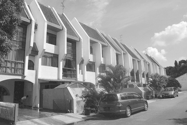
The double becomes even more monstrous when it is copy-pasted, “cloned,” without context or connection across the landscape.
“The built environment, more than other spheres, embodies the horror that arises when desires for individualization must compromise with the financial reality of repetition. Market pressures ensure that ‘homely’ humanism appears at risk, always, of backsliding into the unhappy condition of the clone.”
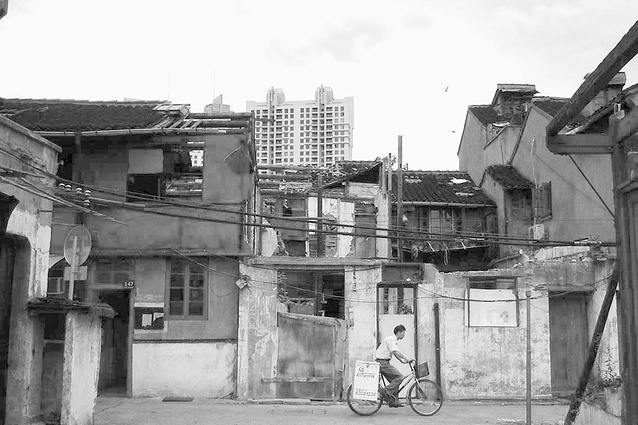
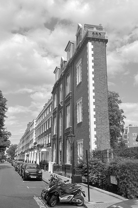
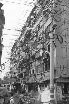
Confronted with such scaleless repetitions as Shanghai tower-blocks or London row-houses or Texas suburbs, it assaults us with the stark reality of our individuality within a suddenly massive world: are we just another clone?
‘Exquisite Corpse’
The common parlour game where participants draw sections of an artwork blind to what has been drawn beforehand, is the analogy Horror uses to describe the hyper-rationalist school of MVRDV and OMA.
The authors do not have any enthusiasm for the diagrammatic, expressed programming typical of these buildings. They describe MVRDV’s stacked Netherlands Pavilion as a Burger King “sandwich,” going on to compare it to the mullet hairstyle: “this Rabelaisian object combines two incompatible aesthetics, ‘business in the front’ and ‘party in the back,’” or perhaps more pointedly to The Human Centipede.
To them, these buildings appear as “ungrammatical bodies” because, like an exquisite corpse drawing, they do not cohere as a composition, their individual parts are inherently juxtaposed and disjointed. The horror here is a Frankenstinian one, a building unnaturally sutured together, kept alive through architectural surgery.
‘Incontinent Objects’
When normally hidden systems: internal plumbing, structural members, mechanical and electrical ducting are instead “herniated” and exposed to the world, we experience what the authors call “incontinent horror.”
“As the body opens where it should not, the incontinent object releases that which should stay inside.”
This can be taken in two different directions: the minimalist attitude is one of “disappearance,” Van der Rohe’s glass boxes appear to have lost their internal organs, hollowed out shells, with nothing to hide. Whereas Centre Pompidou is the classic example of the maximalist attitude, a scatological inversion, vivisected to be unnaturally open, with the building’s organs proudly on display.
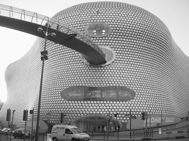
As Horror argues, “herniated objects are the accidental, ironic products of the modern world’s constructive mythologies: lightness, abstraction, efficiency, and the transparent.” It is a false honesty, a false openness presented by both the minimalist and the maximalist, in contrasting forms.
Incontinence is also terrifying through reminding us of poisonous odours and pollution. Think of factories’ visible chimneys and we are confronted with ideas of Chernobyl or Bhopal. These monstrous antagonists, creatures of pipes and tubes and smoke, cannot hide their own terrifying toxicity.
“The creature that radiates, vomits, or spreads its lamina in public space operates like our other types….It undermines, in particular, the sovereignty of the individual…Rather, it reminds us that we all exist within a broader field.”
Conclusion

Despite the title, Comaroff and Ker-Shing’s book is social theory, not film or architecture. Its concern is less with looking for connections between horror movies and architecture, than diagnosing something about modernity and the state-of-the-world right now by looking “through” architectural form.
Whether it be the “negative avant-garde” of Eisenman and Libeskind, the polemical provocations of OMA and Gehry, or the slippery modernism of Scott Cohen and Atelier Bow-Wow, these practitioners all fall short for Horror, because none of the works go far enough in overcoming their commercial constraints or productive conditions to achieve confronting architectural manifestos for change.
Instead, the authors ask for greater provocation: “the challenge, ultimately, is not to mitigate the horrid but instead to follow its example and produce an architecture that is authentically transgressive.”
Whilst there is definite academic rigour behind this argumentation, particularly the compelling chapters analysing horror tropes, the conclusion we come to seems rather unsatisfying, and one I imagine few will support.
Do we really want more horrific architecture simply as a form of social commentary and provocation? Is this really a sacrifice we want in order to create more “interesting” architecture?
We probably agree that action on climate change, for example, is needed. But does designing horrific “incontinent” buildings help achieve that goal?
Moreover, this seems counter to their earlier thesis that horrific architecture is a symbol, a symptom of social sicknesses. If architecture is downstream of social forces, what good is more overt signs of structural problems?
How is that going to inform real change, particularly when capital, as the main source of power in the world, generally controls what is built and what work architects get?
To me, their solution simply seems like a covert form of accelerationism.
That being said, Comaroff and Ker-Shing’s analysis is a novel framework, providing dense, sometimes hilarious, always interesting, connections between art, architecture, film, and theory which in the end unfortunately never quite coheres into a viable way out of the capitalist realist horror they describe.
