Brick by brick: Grey Street House
A celebration of the process and legacy of making, this house by Local Architecture transcends its modest site and budget through strategic manipulations of light and form.
Arising from the constraints of a modest site and budget, Grey Street House by Local Architecture celebrates the beauty of humble materials and the legacy and process of making. Sitting respectfully behind an established heritage house just two hundred metres from Success Boat Harbour in Western Australia, the 170-square-metre dwelling addresses issues of privacy, access and planning to deliver a comfortable family home that nurtures the daily rituals of living.
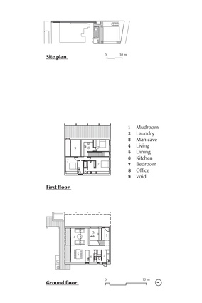
The footprint of the home was informed by the prevailing conditions of the 250-square-metre site, including narrow right-of-way access, a tight vehicle turning radius, boundary and shading setbacks and an existing sewer easement.

Architect Natalie Miller considered the available volume and how it could be manipulated to adhere to height restrictions and maximise solar performance while maintaining privacy and sunlight for neighbours. This spatial problem-solving resulted in a striking rectilinear form with a pitched roof, interspersed with openings that carefully balance proportion, orientation and location to draw in light.
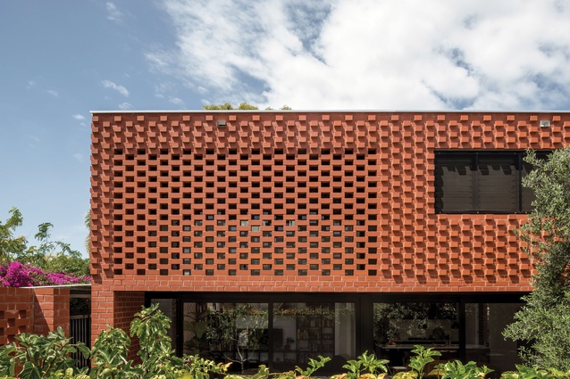
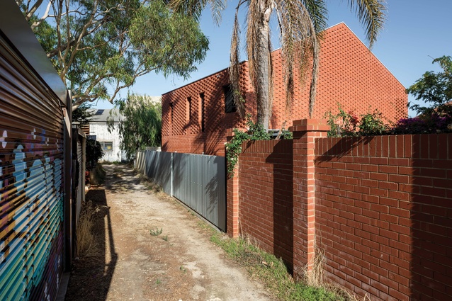
A low-maintenance material with resilience against salt-laden coastal winds was sought, and red brick was nominated as the principal building material early on. A substantial insulated cavity in the building envelope conceals all structure and services and delivers excellent acoustic performance and thermal comfort.
Following an extensive survey of Fremantle’s brick palette and textures, Natalie played on traditional Flemish bond brick patterning to make a contemporary contribution to the legacy of brick construction in the area. “The header course is either flush within the bond pattern, removed to make the brick screen or in relief to make the highly textured facade that changes throughout each day,” Natalie explains.

A brick planter and letterbox provide an offering to the street and act as a beacon for locating the house behind. Visitors are led to a recycled steel gate, where a large brick planter and perforated brick screen mediate the transition to the north-facing jarrah deck and garden – the entry to the house. An excavated alcove provides shading along the northern edge and is treated as a blackened threshold to the living and dining areas. The absence of a traditional front door allows visitors to step directly into the heart of the house, imparting a sense of informality and familiarity that sets the tone for the project.
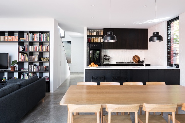
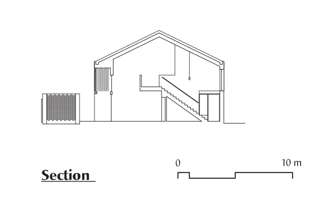
Internally, program spaces are strategically arranged around a central stair. The kitchen, living and dining spaces face north and are directly connected to the entry deck and garden. A sixty-five-year-old olive tree that was relocated to the north-west corner provides an abundance of shade from the hot afternoon sun and a brick barbecue area offers a robust plinth for cooking and entertaining.

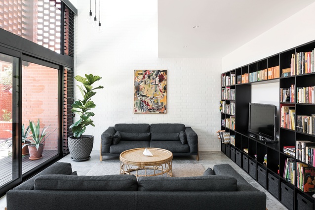
The house’s burnished concrete floors and white-painted brick walls provide a neutral and tactile base palette for the interior. The kitchen is articulated with restraint; American oak cabinetry is darkened with black japan stain, offering a subtle tactility, while a fine, white engineered stone benchtop and vertical subway tiling provide a refined and contemporary feel. The living area offers a generous vertical volume to the roof ridge, while the perforated brick screen casts ephemeral patterns across the double-height wall throughout the day.
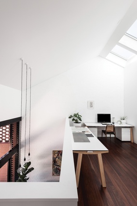
Vehicle access is via a rear right-of-way and a double carpark is provided in a carport to the east. A roller door conceals a plywood-lined “man cave” with a robust workbench and ample storage for tools, fishing gear and five bikes. A playful, china blue entry door leads occupants to the southern “mudroom,” a place of coming and going, for hats, coats, shoes, helmets, bags and umbrellas. Local remilled jarrah treads and risers gently sheath the central stair, ascending to the centre of the house: a bright and welcoming office space.
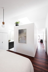
Despite the small footprint of the house, privacy is maintained through the upper level by locating the three bedrooms in the corners of the floor plate with no shared walls. The raked roofline creates a sense of spatial compression in the bedrooms, crafting intimate, attic-like rooms.
Although the home has no “special” view, windows are strategically sized and positioned to edit glimpses of native trees and nearby rooftops and to draw in natural light. Three operable sky-lights to the south provide diffused light and effective cooling, while all operable windows are louvred to invite cooling sea breezes to enter the interior. Pivot doors allow generous openings to the bedrooms, enabling breezes to flow through the house.
The bathroom and ensuite are at the western edge, where a continuation of black-stained cabinetry is complemented by a natural-toned tile that lines the floor and walls. Conceived as a Japanese-style wet room, the ensuite’s tiled alcove offers a tranquil retreat flooded with soft natural light.
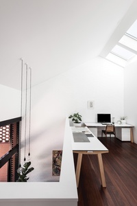
A void to the lower level occupies the fourth corner of the upper floor plate and connects the house vertically. From each space, occupants can cast their gaze through adjacent spaces. “In this way,” Natalie explains, “the spaces borrow from each other and have allowed for the inclusion of program elements not often seen in a house of this size.”
Indeed, a feeling of spaciousness is maintained in Grey Street House that provides a high level of amenity through access to natural light and ventilation. At its core, “the project is about making – making with brick, making with light and making the most of things,” says Natalie. Through strategic design thinking, Local Architecture has demonstrated the possibilities of subdivision, resulting in a house that has longevity and purpose and hums with the activities of family life.
This article was first published on ArchitectureAU.com.

