Buon appetito
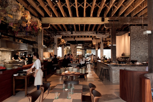
It’s Wednesday night in Auckland’s Britomart, and Amano, the newest restaurant on Tyler Street’s hot row, is buzzing. This is just as well, because the restaurant and its adjoining bakery of the same name make up an ambitiously large and opulent space. They are housed in two of what are thought to be original port warehouses, and the restaurant also opens onto Quay Street.
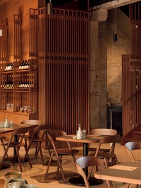
The latest addition to Hip Group’s impressive family of establishments (which includes the likes of Milse, Ortolano, Takapuna Beach Store and Rosie), Amano is designed around the theme of an Italian marketplace.
The design was a collaborative effort between Jack McKinney and his team at McKinney + Windeatt Architects and Hip Group, led by Jackie Grant.
The initial idea was to create a city market, with food and produce to go, and there is still an element of this idea alive in the final product, with a potential food store area planned near the Tyler Street entrance. A gelato store is also in the works for the Quay Street entrance.
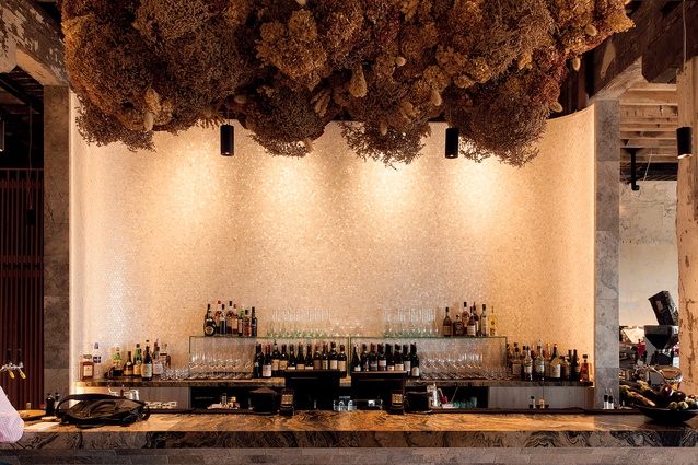
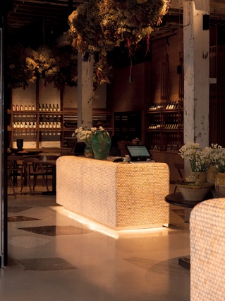
For McKinney, the essence of an Italian-style restaurant is welcoming and open. This is translated in the design through a palette of pale colours, reflective and luminous surfaces, and soft edges.
“My impression of Tyler Street – you think of Ostro and Tyler Street Garage – is dark and hard and quite urban. We wanted to do the reverse, so we put a really light floor in and made the mother-of-pearl cabinets glow. It’s that idea that if you light a fire, people will be attracted to it.”

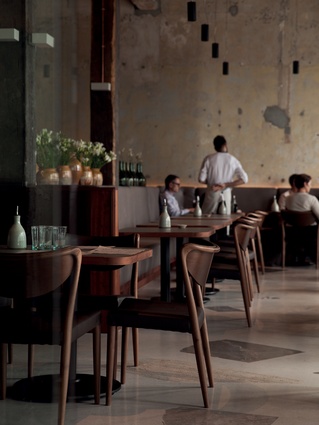
The floor is the hero of the space. A white terrazzo base is inlaid with seemingly randomly-placed offcuts from stonemasons’ yards. Making use of these pieces – which might have been cut to the wrong size or cracked in transit – is reflective of Hip Group’s nose-to-tail philosophy. The menu at Amano uses unusual cuts of meat and the seafood section often features by-catches, which would otherwise have been thrown back into the sea as waste. The company has its own farm to supply its kitchens, says Grant.
“We kept encountering suppliers that frustrated us, so it has developed where if we think there is a better way of doing things, we do it ourselves. That’s where the farm started. It’s the same with fish. It is impossible for restaurants in New Zealand to order good fish; it all gets exported. Our executive chef goes to the market herself to buy the fish every morning.”

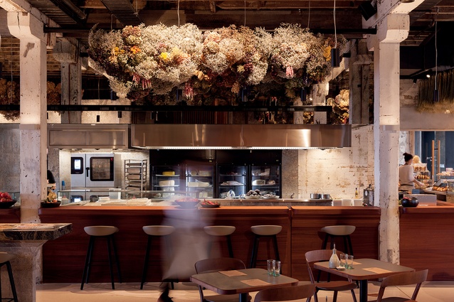
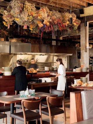
The open kitchen is huge, running only marginally short of the length of the restaurant. Executive chef Jo Pearson was involved in its design, which features a flour mill for the creation of fresh bread and pasta.
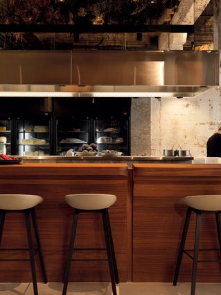
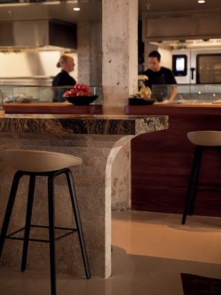
“The kitchen is a big piece of theatre; it’s a pretty heroic kitchen,” says McKinney. “People can sit up here and be involved in all the activity, which also means they can dine alone comfortably.”
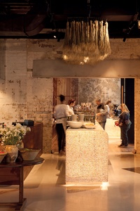
McKinney was inspired by the beauty of the original arched windows on the Quay Street side of the building, and these gave shape to the bar and banquettes. The leaners curve in towards the floor and create an arch in the negative space between them and the mother-of-pearl counter. The shape also reflects the curve of a wave – a reference to the restaurant’s vicinity to the ocean. This is likewise the reason for the use of mother-of-pearl, which is incidentally also a by-product of a food source, tying in again with Hip Group’s waste-free philosophy.
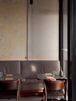
The original plaster walls were stripped back to reveal layers of paint, giving an authentic aged look. “It was an old building and it was beautiful in its age,” says Grant. “The architects took that and tweaked it so the very beautiful things about it are exposed and all the things that make a building ugly and too raw are tidied up. There is a trend to show too much rawness, in my opinion.”
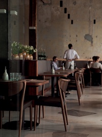
The soft colours on these walls are echoed in the kitchen by a cleverly-chosen wall tile, and also by the beautiful dried flower displays, which hang overhead and further the Italian marketplace theme. Look up to the ceilings, with their original herringbone bracing, for another level of texture. These have been carefully lined with acoustic treatment to allow for a good ambient level of noise in the restaurant.
The leather seating was carefully selected to allow for a high level of comfort, what McKinney calls a “relaxed luxury”. This is greatly appreciated by Grant, who loves a good chair. “I want people to be very comfortable and able to sit for hours, even at the bar, enjoying high-quality seating, something they may not choose for their home,” she says.
Back to our Wednesday night dinner and it’s not just the after-work crowd who are at Amano; along with the suits and groups out for a meal, there is a couple with a baby, and, just as we are leaving, a tourist family with two young children. It would seem McKinney’s fire is working its magic.

