Camperdown apartment: Ode to brutalism
The brief for this Sydney apartment called for a concrete box… the result, surprisingly, is a warm and inviting gem.
Ask anyone who lived in Sydney’s Camperdown more than 15 years ago to describe what it was like back then and, chances are, they’ll recall how good it smelt. The densely populated inner-city suburb was home to the Biscuit Factory, where all manner of cookies and sweet treats were baked prior to its closure in 2004.
Today, the building is an exemplar of the city’s many long-standing adaptive reuse projects, successfully developed as residential apartments for a booming real estate market.
For designer Matt Woods’ recent clients, purchasing one of these small units was a wise investment. And, after living in it for 10 years, the time was right for a renovation. As the Sydney-based designer and founder of Killing Matt Woods explains, “They both work in design-related disciplines and so they came to me wanting something a little different: something out of the ordinary. But they also wanted to be able to reduce and minimise the amount of stuff they’d built up while living there.” By way of a brief, the couple asked Woods to give them a concrete box and he jumped at the opportunity.
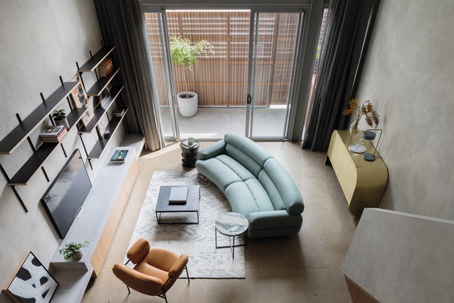
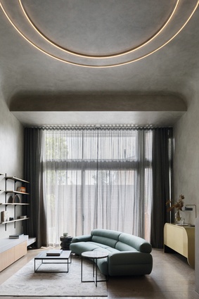
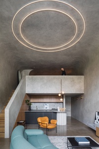
An obvious reference point was brutalism and Woods drew inspiration from the style’s iconic architecture of the 1960s. The resulting scheme makes logical sense of a compact floor plan, positioning the kitchen, lounge and bathroom on the first level and bedroom on the mezzanine, with all areas (except the bathroom) receiving plenty of natural light from the west-facing, full-height glass window.
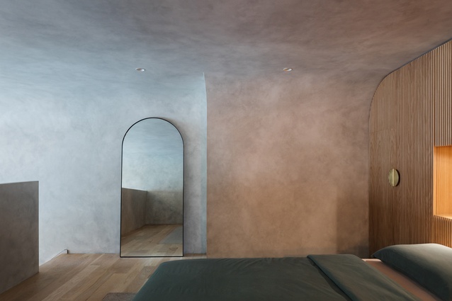
Woods stripped away any superfluous detail to maximise the apartment’s spatiality and convey the pared-back aesthetic the clients so desired. Strong geometries and confident utilitarian styling prevail, along with the moody grey hue of the walls, ceiling and balustrade finish.
Surprisingly, Woods used virtually no concrete in the refurbishment. “One of the driving principles behind my practice is to be as sustainable as possible and, for this reason, I didn’t want to incorporate lots of concrete, although we did retain the existing polished concrete floor,” he says.
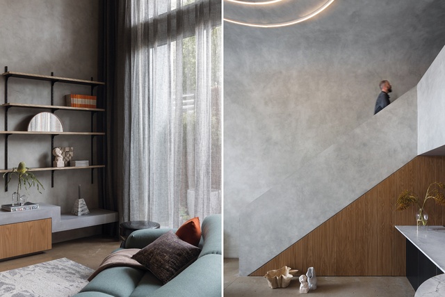
“So, I had to figure out how to create a concrete box without using a load of cement.” The solution was to apply a paint finish over the main surfaces, which are fabricated from plasterboard or glass-reinforced cement.
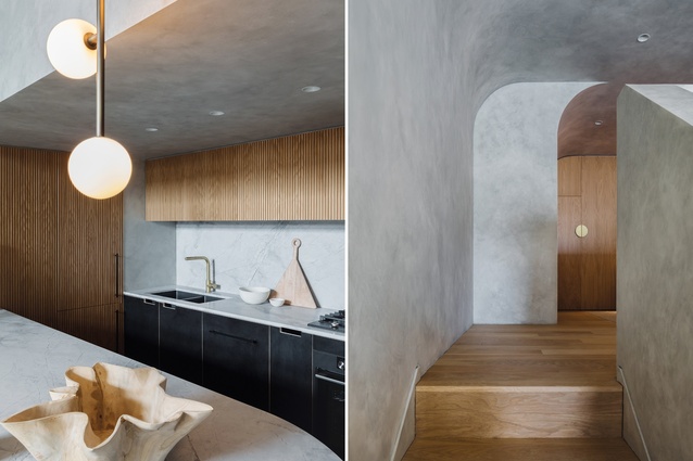
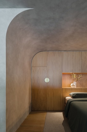
Woods’ environmentally responsible approach gives the appearance of concrete and lends the overall apartment a cocoon-like atmosphere. Meanwhile, ambient lighting – an oversized circular ceiling light above the lounge and a pendant light cluster in the kitchen – punctuates the scheme. Timber joinery in the kitchen and bedroom, along with the timber stair, adds further warmth to the design, breaking up the singular colour palette by providing an amber accent as elegant as it is striking.
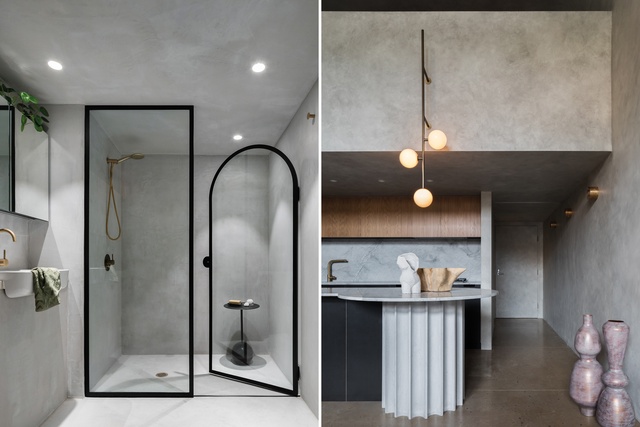
It’s nuanced vignettes such as these that make it easy to remember why Woods’ restaurant fit-outs are so highly regarded. Indeed, he’s brought those same experiential qualities that characterise his hospitality design to this apartment’s renovation. So, while the repeated use of a curve motif tempers the interior’s brutalist sensibilities, it also makes it undeniably immersive: from the way in which the walls and ceiling seamlessly wrap the mezzanine level to the kitchen island bench’s rounded edge. Even the arched shower door in the bathroom makes the space that bit more inviting.
The wet area’s micro-topping cement provides a robust surface finish, which also contrasts nicely with the rest of the apartment. Woods was mindful to use materials that have longevity and, along with the clean lines and visual simplicity of the overall design, won’t date any time soon. This is a home that pays homage to its industrial past via an outcome that’s unexpected, with a clarity of vision that makes it both cosy and dynamic.
This article first appeared in Urbis magazine.


