Carefully crafted: Cathedral Grammar Junior School
Designer and professor at the University of Auckland, Andrew Barrie, joined forces with his Japanese friends, husband-and-wife architect duo Takaharu and Yui Tezuka, to design an innovative timber building for the junior pupils at Cathedral Grammar School in central Christchurch.
Justine Harvey: How did you arrive at designing a school in Christchurch with Tezuka Architects from Tokyo?
Andrew Barrie: They are old friends from when I was a student at the University of Tokyo. Here, in my role at the university, I invited them over to New Zealand to teach in our International Architect-in-Residence programme. As part of that, we organised a lecture in Christchurch and the principal of Cathedral Grammar School, who knew about Tezuka Architects’ Fuji Kindergarten, attended the lecture.
A week or so later, Takaharu received an email from the principal saying that they were having a design competition and asking would Tezuka Architects take part in it; so Takaharu got hold of me and said ‘we’ll do it if you do it’ and, so, we agreed to do it together.
I looked at the site and threw down some master-planning ideas and we did the competition entry back and forth between Auckland and Tokyo; we managed to win the competition. Once we were under way, we jointly produced a masterplan for the project; I went over to Tokyo and we spent a week workshopping the design and configured all the basic principles. From that point on, we worked back and forth as a collaborative process.
JH: What was the brief?
AB: Education architecture is pretty fluid – that’s probably the best way to describe it – in that there are a lot of new ideas relating to modern learning environments (MLEs) [or innovative learning environments (ILEs)]. The driving idea is of collaborative teaching, basically, but there’s a real question, if you look at all of the research literature, about how well that corresponds to the idea of open-plan classrooms because you can have one without the other. The interesting thing with a lot of the big, open-planned educational environments that were tried in the ’70s is that, in many cases, they cut them back up again later on.
Cathedral Grammar’s junior school had previously been operating in a historic building with the traditional one-class/one-teacher model. However, the School Board wanted to set up an environment that would encourage the teachers to be more collaborative but they didn’t want an MLE. In fact, an amount of the parents didn’t like MLEs – they wanted a more traditional education for their kids. The Board wanted a building that would allow flexibility; they had teachers that had come out of the one-class/one-teacher model who didn’t want an MLE but did want an environment that encouraged collaborative teaching.
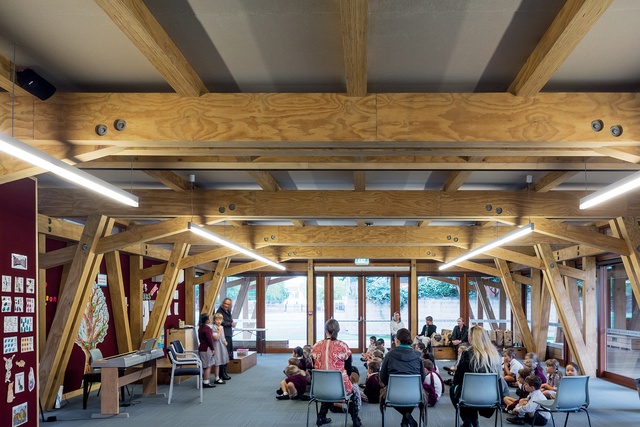
So, basically, we made a big structure with spaces for classrooms laid out in a line. There is a solid wall along half of the boundaries between rooms, while the other half has is a big concertina door, which means you can link two classrooms together or you can close them off in a moment. Because the classrooms are a proportion of roughly two squares, the wall ensures that even when the doors are open there’s a bit of spatial modulation.
One of the other key decisions is that all of the walls are actually non-structural, so in a hundred years you can take them out and lay it out differently. In the future, the school might want to take the solid bits of wall out and replace them with folding doors, or vice versa. Another key idea was to create a garden school.
JH: Because it’s in the Garden City (Christchurch)?
AB: Yes. Garden city, garden school. The children move around a lot between the buildings. They have a library and what they call a specialist block, which has music rooms because music is a big part of the school’s history: it was originally the school that supplied the choir to the Christchurch Cathedral.
JH: Do they still supply the cathedral?
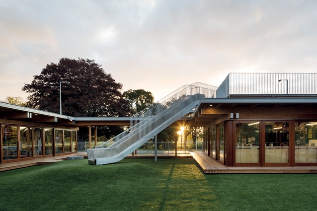
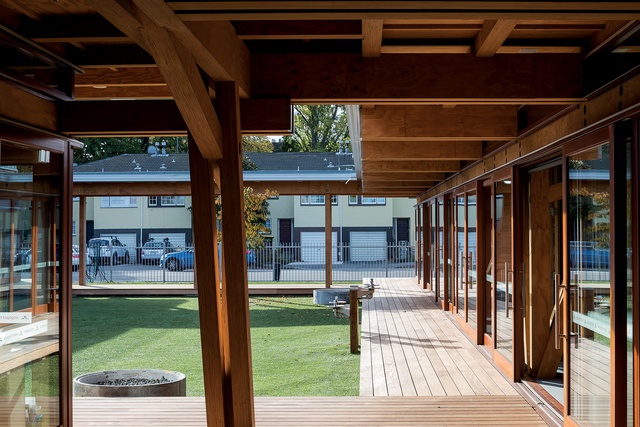
AB: Yes, they do. The students move around the campus a lot, which is why we conceived the campus as a collection of buildings where the garden or outdoor spaces were really intrinsic to the design. The landscaping itself is quite simple; it was more to do with its position. This building is wrapped around a courtyard and located on a corner site that looks out across to Hagley Park – the Avon River is there too.
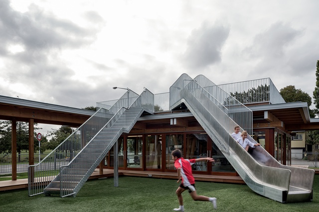
We designed an L-shaped block with all of the spaces looking out across the street to the greenery; Japanophiles will say it’s kind of a borrowed scenery thing. There’s an open pavilion on the corner with the roof deck on top. In many ways, it’s like a traditional country school with an outside walkway that looks out onto greenery. The primary circulation and the main entrance are outside; in fact, a lot of the key spaces are outdoors – hence, the garden school idea.
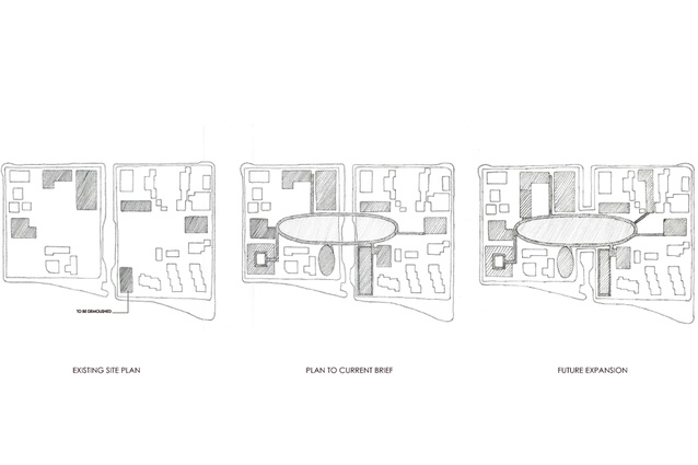
The overall masterplan is a strange arrangement because the school sits on a piece of land that’s through the middle of two different city blocks and across a street. The school has a long-term ambition to close the street and link the buildings to it. Our masterplan idea was almost a Metabolist thing where we said, ‘we’ll make a link in the middle’. Then the masterplan will still make sense, even if you add or subtract buildings.
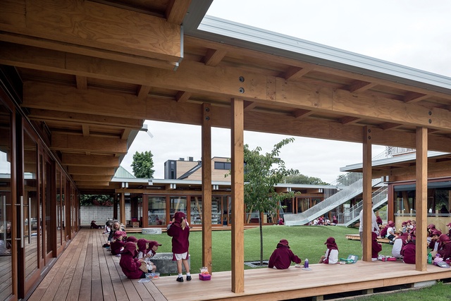
Also, we worked with the idea of designing a school like a home. The school said that they wanted the building to be ‘better than home’ – or at least as much fun. MLEs can feel institutional, so we used residential design considerations: sun, ventilation, outlook onto a garden – as opposed to adopting ‘activity nodes’ and ‘watering holes’ and all that office design language; just make it a lovely place to be in.
The design references key aspects of Christchurch but it’s linked closely to Japanese architecture. It’s a prominent site; so we had to explain to the Urban Design Panel how it ‘fitted’. So we talked about Gothic churches, and about Peter Beavan, who was very influenced by Japanese postwar concrete architecture, which in turn was very influenced by traditional timber architecture.
So you go from Miles Warren and Peter Beavan back to Kenzo Tange, and then back to Japanese pagodas – Christchurch Town Hall was part of the story, and St Michael’s Church, too. We tried to show that ‘there’s nothing to be afraid of here!’ It’s all a bit of a history lesson but, anyway, we got it through.
JH: Tell us about the timber structure.
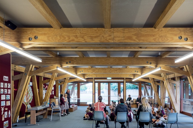
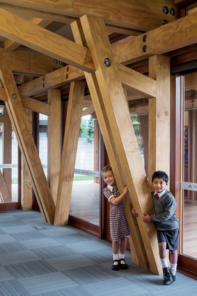
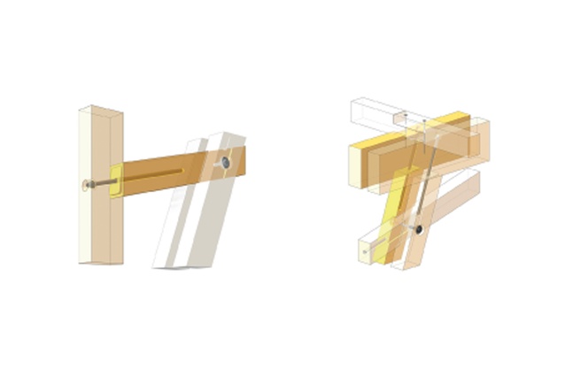
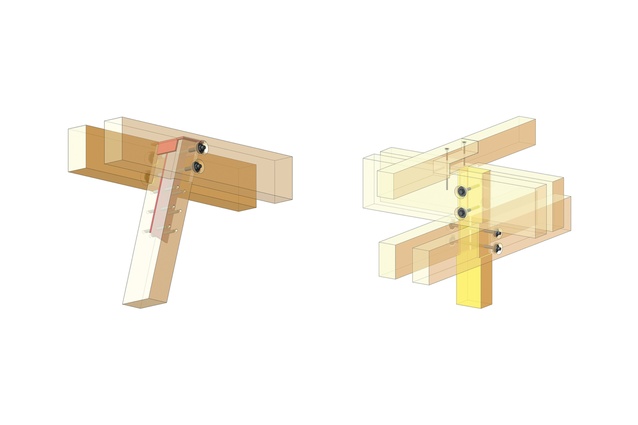
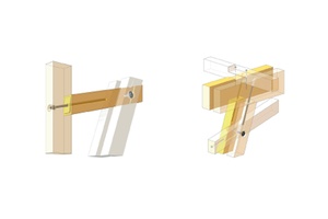
AB: We used timber elements that were notched into each other and bolted together, which creates rigidity. It’s actually a very traditional method but not one used much now because of the level of accuracy required. This very high level of craft means it’s usually very expensive, but we were able to take advantage of the new CNC technology – so all of these elaborate joints could be cut with robots. There are a couple of places in New Zealand that have the right technology for this and it’s very, very precise.
JH: Who did you work with?
AB: We made the building here in Auckland with TimberLab and shipped the whole stack of carefully-crafted sticks down to Christchurch to assemble. It was demanding because everything had to carefully be made in advance. Once the contractor was on board, there was a very detailed process of thinking through the buildability of all the joints and, then, modelling up the timber.
Luckily, we had an amazing guy, Thomas Kaestner from Contract Construction, who is experienced in working with LVL timber. All of the beams had rebates in them to allow the plywood sarking to be slotted in, so we came up with a cunning system to allow the linings to fit in after the roof was on and, also, to make the ceiling fireproof. It’s a complicated combination of GIB fireproofing, which is the standard solution, and timber, the unusual solution, and making them join up. It took a week in my life figuring that out, going through all of the options.
JH: People probably won’t realise what’s gone into it.
AB: In a certain sense it’s a very simple building but it became tricky because we wanted everything to be seamless – exposing the structure and slotting the envelope in between. There’s nowhere to hide anything!

JH: But, you could have put it up and realised, ‘Oh no, we didn’t put that wiring in there’.
AB: Yes, we could have run conduit around but that would have been more money, and you would have seen it. So, as part of the design, we figured out all kinds of tricks to try and keep costs down. We had about 19 different profiles for the rafters but we worked with Thomas to get it down to three by systematising things even more.
JH: Can you use these processes again somewhere?
AB: Yes, if we make another one – no sweat! But, I mean, we were just inventing a whole new way of making a building. And, of course, the challenges we faced were because of the prefabrication and needing to have it all worked out ahead of time.
JH: Did you become quite involved with the CNC cutting process?
AB: Our drawings were sent off to TimberLab, who put together a model, including every single piece of timber, so that they could check it – then we double-checked. There were about 500 pages of shop drawings for the project, including these incredible schedules that were like a computer language. If the model was slightly wrong, it would have created havoc on site, but we managed to avoid that completely. The tolerance was plus or minus half a millimetre, which is kind of loony – half a millimetre on timber that’s 12m long. The building was actually sized to the biggest bits of LVL that you can buy. In order to be rigid, all of the joints had to slot together perfectly and TimberLab – bless them – managed to do it. The team on site were real craftsmen, too.
JH: It’s lucky that you’re someone who’s very precise and into detail.
AB: I’m the child of two accountants.
JH: I can’t imagine everyone being able to handle that process.
AB: It was incredibly time consuming.
JH: So, do you want to make it again – get your money’s worth out of all of that effort!
AB: Yes, what we proposed to Cathedral Grammar was quite a systematic thing: to make this building and then the next building would be a two-storeyed version; but it’s not the cheapest or easiest way to make a building. What’s normal is almost always the cheapest – that’s why it’s normal.
JH: This building has uniqueness. It has beauty. It has so many qualities that you wouldn’t achieve in a ‘normal’ building.
AB: I always ask myself, ‘what kind of architecture do you want to make?’ We wanted to make a building that was wooden and simple, with an exposed structure and without the normal mess. So, suddenly you find yourself in this position where it’s 11.00pm and you’ve a pile of 500 shop drawings in front of you.

