Casa Cavia
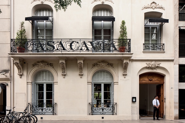
Buenos Aires is a cosmopolitan haven in South America. Open-door immigration policies and an outward-looking middle and upper class have meant a significant, two-way flow of ideas and information from countries as diverse as Italy and China. Although the city’s architecture reflects this eclecticism there is an undeniable slant toward the European. Brutalism and beaux arts buildings rub cornices with the neo-gothic and the art deco. Italianate and neoclassics are everywhere.
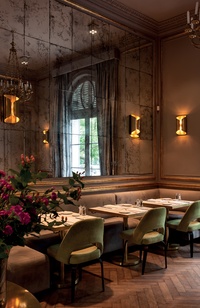
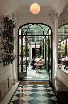
Casa Cavia, in a leafy, central neighbourhood in the Argentine capital, is not just an example of the city’s fascination with Europe’s old constructions but also a success story of what can be done to modernise their interiors via clever design and edgy retail/hospitality match-ups. The 1923 house was commissioned from Norwegian/Argentine architect Alejandro Christophersen and remained in the hands of its owner for close to a century.
Four years ago it was purchased to serve as the headquarters for a book publishing business. “We thought it was an interesting idea to have the publishing house emulate what was happening in the beginning of the century when [publishing houses] were places where people would hang out and have interesting conversations,” says creative director for Casa Cavia, Guadalupe Garcia Mosqueda.
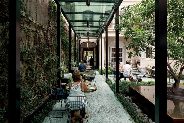
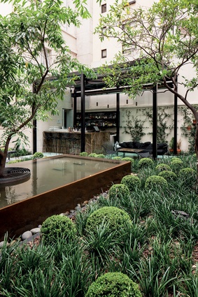
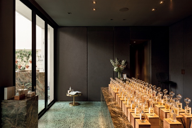
Mosqueda (whose mother owns the building) engaged the services of Stephania Kallos (from Kallos Turin) to reimagine and modernise the interiors while respecting the heritage of the place. Unexpected import restrictions meant the designers had to rethink their materiality. Local textiles and parquet floors were either dyed or aged; green terrazzo was manufactured for outdoor areas; mirrors and surfaces were meticulously treated to maintain continuity and reference the age of the grand home. The residential feel was retained throughout, making the interior elegant yet cosy and relaxed.

Kallos also brought with her a vocabulary of green and white marble for tabletops and bar counters (with delicate copper finishes). She inserted plush, rounded seating. There are accents of art deco and the usage of steel structures to create a sort of tunnel, connecting the restaurant to the retail area, lends a fairly contemporary industrial nod to the place. Those structures are also blatant reference to Kallos’ past employer, British architect David Chipperfield.
“Stephania focuses on the types of cafés and restaurants that were common in both Paris and Buenos Aires back in the 1920s,” says Mosqueda, “so, although she is using contemporary shapes, she uses the materials referencing that era.”
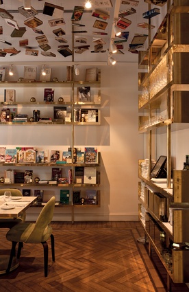
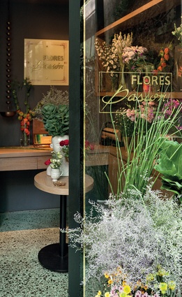
The elegant interior is complemented by carefully curated retail and hospitality match-ups, all keeping in thematic tune with the original literary purpose of the abode. There is a private office space for the publishing house on the upper floor while downstairs a perfumery, a florist, a restaurant/bakery, a library/bookshop and a cocktail bar cohabitate.

