Catching the wave
Arches, circles, curves – these two interiors seek a softer, more rotund way of welcoming customers.
Research into the ways in which architecture influences aesthetic judgement and the decision to approach or avoid has found that we have a natural preference for curvilinear rather than rectilinear forms. Indeed, not only do we consider curves to be more beautiful, but, also, they trigger pleasant emotions and encourage us to approach or enter (source). The curve – sinuous, wavy and inviting – seems to be making a comeback of sorts in interior spaces, with furniture, architecture, accents, artworks and beyond favouring the friendly shape over its harsher cousins. Here are two recent projects that encapsulate some of this softer, more tender side to commercial interiors.
Spiritea, New York by New Practice Studio
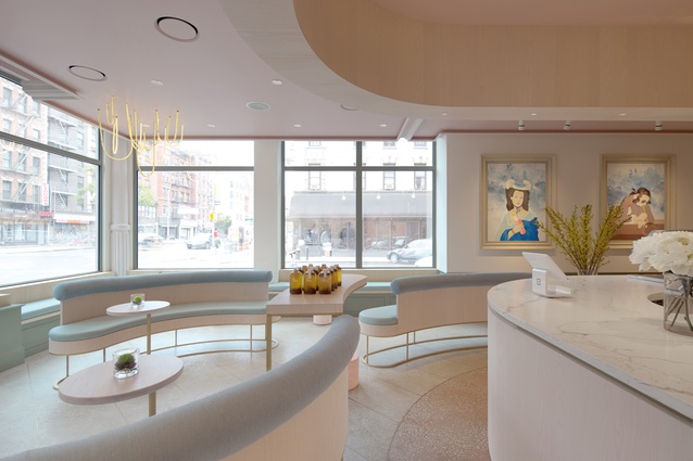
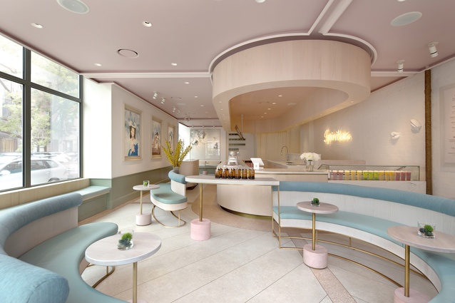
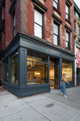
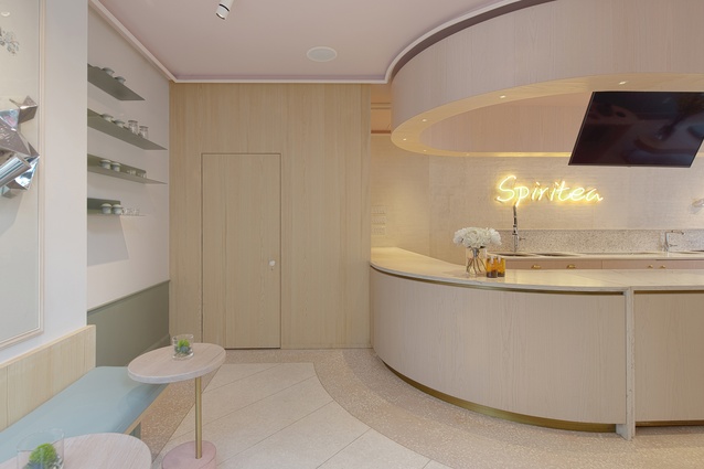
With sweeping curves and a pastel palette, Spiritea in East Village, New York, entices customers inside – an inviting contrast to the rectilinear grid of streets and avenues that defines much of Manhattan. New Practice Studio designed the curvilinear environment to guide circulation through the tea shop, and selected gentle colours inspired by the exotic fruits used in the teas. “Spiritea is conceived as a fresh and playful environment that showcases the elegant process of tea-making to the guests,” says Nianlai Zhong, founding partner and principal at New Practice Studio.

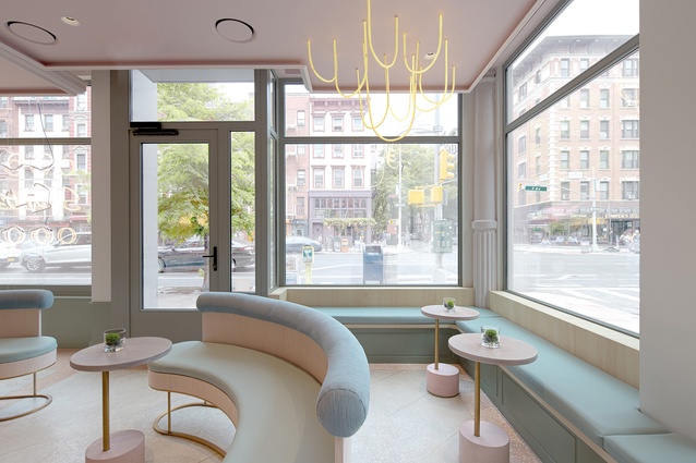
Spiritea is located in a brick tenement building that dates back to 1874. New Practice Studio preserved the original structure and incorporated existing and new decorative mouldings to retain its historic character sensitively.
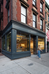
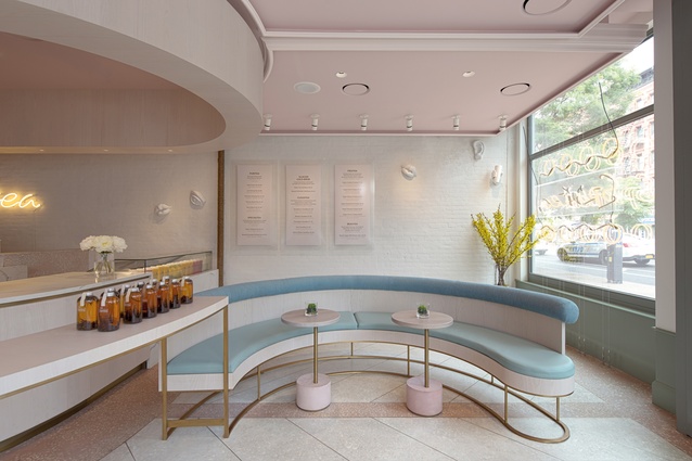
Curving custom-made banquettes create a lounge-like seating environment within the entry of Spiritea and subtly guide movement towards the counter. Guests pass behind the banquettes and alongside the counter where they place their orders and views the tea-making process. Once they pick up their drink, guests circulate back through the café to sit on the banquettes or bench seats around the perimeter. An elongated cylindrical ceiling also entices movement towards the counter, and the terrazzo flooring discreetly directs flow as well, with darker colours wrapping around the bar and walls.
New Practice Studio looked to the fresh fruits used in the teas for the colour palette. Upholstery is baby blue and pale green, while tables have pink marshmallow-like bases and the ceiling is dusty rose. The bronze framework of the banquettes is light and elegant, reminiscent of the more feminine forms of art deco furniture that could be seen in 1930s’ New York. The curves continue in the restrooms, which have double-dome ceilings and are dimly lit, creating a cavernous atmosphere.
Est Lighting showroom, Melbourne by Christopher Elliott Design
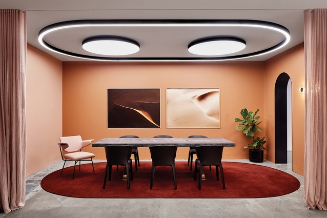
Lighting plays an essential role in the way we experience architecture. The reverse applies in Est Lighting’s new showroom in Richmond, Melbourne, where architecture plays a crucial role in how we experience the lighting. With curved walls, arched openings and varying ceiling heights, the showroom, designed by Christopher Elliott Design, is an immersive space with a highly curated display of lights.
The showroom is located in a former warehouse building with a sawtooth roof with exposed beams and service ducts, and no windows or openings along the street frontage. “This presented many design challenges but meant we could encapsulate the showroom as we weren’t influenced by the architecture’s relationship with the outside,” says Elliot.
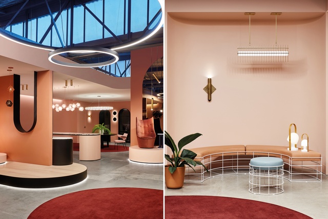
A new suspended ceiling wraps around the showroom, with an elongated oval cut out in the centre to reveal the sawtooth roof and bring in natural light. The ceiling provides a surface for light fixtures and the varying ceiling heights create a sense of volume or compression, enhanced by walls, plinths, partitions and joinery that define spaces and provide platforms and backdrops for the product. Lighting is placed to show off the fixture and diffused light in the best way, with negative space being equally important to showcasing the product and helping create a free-flowing layout that leads from one installation to the next. “We didn’t want a Christmas-tree effect of a million lights all together,” says Elliot.

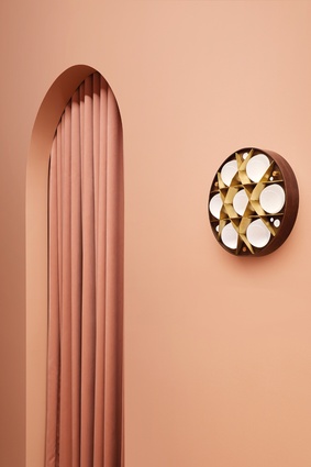
The insertions are inspired by the way light interacts with curved surfaces and materials. Curved walls create nooks and arches frame views through the showroom. Rounded area rugs define space and soften the industrial nature of the warehouse, as do the warm tonal colour palette and the tactile materials, such as slatted timber, glazed tiles and the s-fold curtains flanking the entrance. “These elements highlight the way light and shadows react beautifully with uneven surfaces,” says Elliot.
The seating also has sculptural, voluptuous curves and is placed to create vignettes or suggest commercial or residential settings. “It is more of an emotionally comforting experience than a typical showroom,” Elliot describes. “You feel as though you have stepped into another world that is inviting and comfortable to spend time in.”
This article first appeared in Interior magazine.


