Moore’s minimalist but functional Cubby House
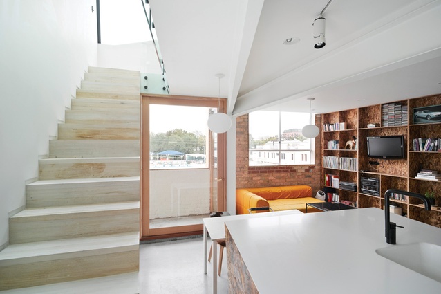
The Cubby House by Edwards Moore makes the most of an existing apartment that is tight on space but has a distinct view – the popular public swimming pool in Fitzroy, inner city Melbourne. The pool’s iconic ‘Aqua Profonda’ sign runs directly below the apartment’s façade.
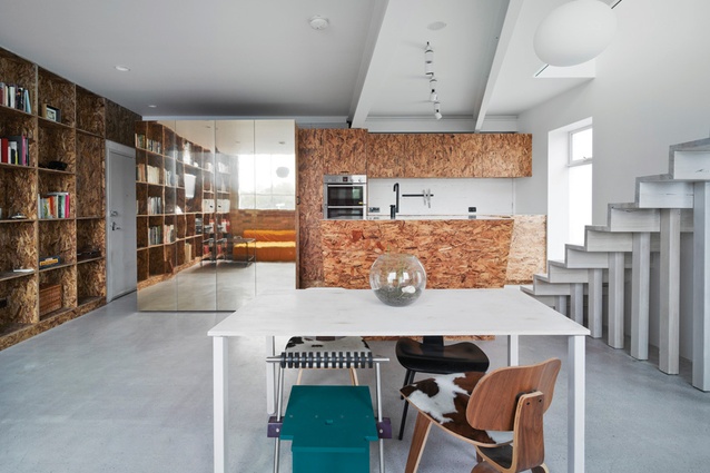
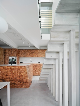
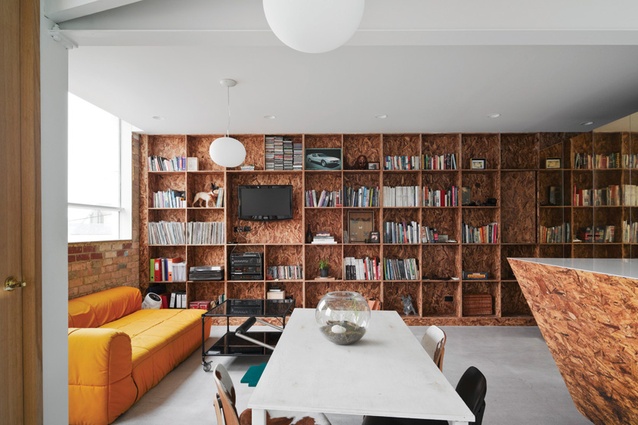
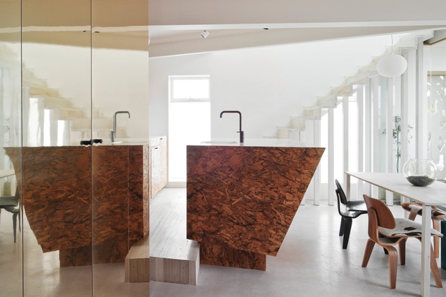
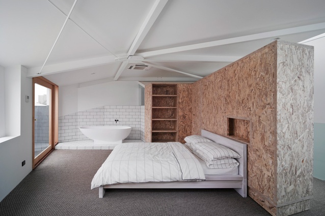
The first thing that strikes you about the interior of this project is the extensive use of strandboard – not the easiest of materials to pull off, but it’s used to great effect here as a counterbalance to the background palette of neutral surfaces and clean lines.
The whole of the interior has been renovated to become largely open plan. Minimal use of walls and doors is inspired by Adolf Loos’ theory of Raumplan – continuous living spaces on different levels, rather than fixed dividing walls. The open-plan kitchen area is defined only by a raised floor, which gives views out to the pool while cooking, but also forms the first step of the staircase. A semi-enclosed balcony further extends the kitchen space and connects it to outside.
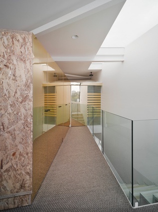
The architects have aimed to blur the interior and exterior, public and private. Outdoor space is treated as part of the living area, and views to the swimming pool are key. The double height void, running the length of the house, brings light down from the new rooflight to the ground floor living room, and reflective surfaces bring light and outdoor views into the rear of the house.
What the washing arrangements lack in privacy, they make up for with more light and views. The bath is set in the corner of the bedroom, adjacent to the small terrace overlooking the pool and even the shower has an outlook through a glass wall with fairly minimal privacy panels.
The extensive use of built-in cabinetry maximises the living area and gives flexibility. Downstairs, a sliding gold box frames the entrance lobby, and is also wine storage and privacy screen to the bathroom. The bookshelves extending along an entire wall even include a built-in kennel for a lucky dog called Jimmi. Upstairs, a large wardrobe element is constructed from strandboard with one reflective gold face, doubling as a divider separating bedroom and hall, and when rotated creates space for a guest bed or study.
Another of Loos’ principles is that unnecessary ornament should be avoided – the Cubby House is minimalist but always functional, creating richness through the thoughtful use of materials. The strandboard provides a rough texture, and elements in reclaimed limed timber, exposed structural steel, reflective gold laminate and sisal add subtle texture and interest, without adding decoration. In fact, the only apparent piece of whimsy is the shower rose mounted over a circular cut-out in the sloped ceiling, but even this is a device to bring light into the bathroom.
This is a clever project full of clean detailing and rich materials, which made this house a finalist in the Australian Interior Design Awards, 2011. Considering how protective Fitzroy residents are of their local pool, it’s lucky the Cubby House is such a great addition to the neighbourhood.

