Christchurch Bus Interchange
If schadenfreude is gaining pleasure from someone else’s suffering, then what is the opposite? I’ve been a vocal critic of the government’s leadership of the rebuild and recovery in Christchurch. The Christchurch Bus Interchange or Central Station (it seems to have two names at the moment) is the first major project produced and finished by the soon-to-be-dissolved Christchurch Central Development Unit. I’m happy that one of the main government projects in the rebuild has come into being (almost) on time and on budget, and, most importantly, it’s actually a pretty good result in terms of architecture and urban design.
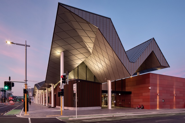
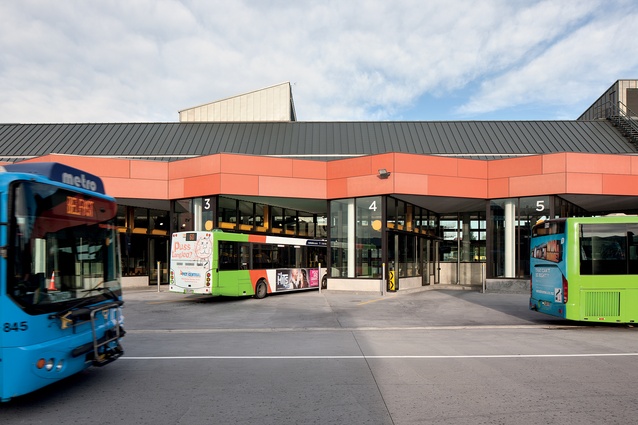
Firstly, it is important that a visually strong bus station has been prioritised in the reconfigured city. In a place that, historically, has treated public transport as an inferior mode of travelling, this signals a significant shift. The architecture of the building echoes this gesture and has the scale of a train station, rather than the bus stations we normally see in this part of the world.

The configuration of the bus routes – it requires that buses drive in around a loop and then reverse out of bays – has been criticised as inefficient and poorly designed. I think this criticism is misguided as this new configuration represents a victory in prioritising pedestrian safety and amenity over the efficiency of the buses themselves. There have been some incidents with buses backing out at the wrong times but, because of the design, there is no interaction between pedestrians and moving buses so this isn’t a safety issue. This is a teething issue, not necessarily bad design.
This building is a hopeful example of design that focuses on the needs of people not the efficiencies of technological systems. The architectural consequences of this shift are significant and a space has been created that is both coherent and singular.
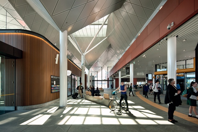
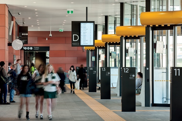
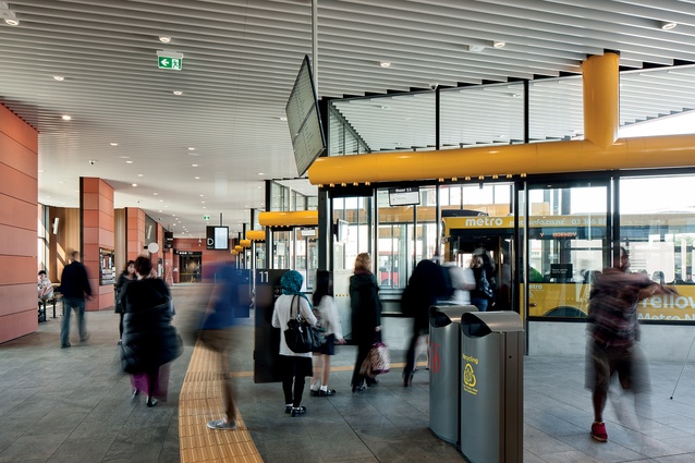
Rather than a series of linked bus stops, the building is one large hall in an ‘L’ shape. This has given the architects the ability to create a building of real civic scale that’s read like this from both the interior and the exterior. It also makes the building accessible with flat public entry from three different street frontages. Users gather in a central space with a number of bus bays arrayed in front of them with clear signage.

A large hall dominates the interior but smaller, functional spaces are tidily detailed and well scaled. Bike rooms, food shops, locker rooms and ticket booths are welcoming and warm. The public toilets are cleverly designed as individual rooms with a well-monitored lobby so the toilets are private but entry is safe.
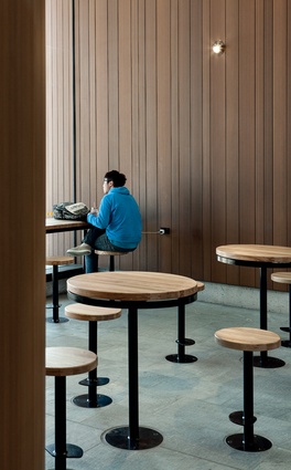
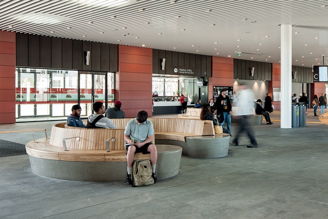
The material palette of the building is restrained but feels warm and consistent. A large stone floor extends throughout the interior and almost matches the exterior public surface. Vertical timber is used inside to create the smaller shops and storage spaces. Lighter-coloured timber seating is distributed throughout the space. It will be interesting to see whether or not the placement and configuration of this seating works. Strong yellow is used to create some contrast highlight on the air ducts over the doors in the bus bays.
The building does not, wisely, attempt a full, expensive air-conditioned space but instead uses underfloor heating to keep the temperature comfortable. This works well to keep out the cold mornings while avoiding the overheating that would require sudden removal of jackets and scarves.
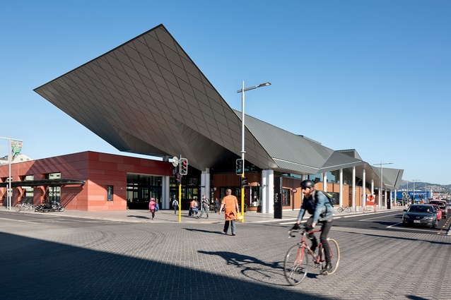
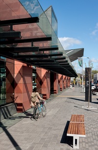
The northern façade along Lichfield Street is finished with a well-articulated pattern of terracotta-coloured panels, which match the few remaining brick buildings in the city. The western façade along Colombo Street features a large, folding roof shape. The scale of this form is impressive and cleverly signals its civic function along the major streets in the city. Formally, I find the shape of the form doesn’t always work; it seems stuck between a strong, formal gesture and a playful reference. On the south-western edge, the shapes become more acute and irregular, achieving a more satisfying amount of complexity and attitude as a result. Still, it’s certainly not a disaster and I’m glad it’s a building that prioritises urban quality over architectural form.
Some of the aesthetic cleanness of the project is tempered by the inclusion of a number of well-crafted artworks by Ngāi Tahu artists. The various works are based on a narrative provided by the Matapopore Trust on behalf of Ngāi Tūāhuriri Rūnanga and centred around Ngāi Tahu migrations from the North Island and within Canterbury. A large compass is placed at the main entrance that locates the places mentioned in the other works located throughout the building.
It remains to be seen whether or not large buses offer a long-term solution to public transport; the threat of driverless cars, Uber and smaller, more-agile PT systems might yet question the wisdom of a project like this. However, this project is an important one for Christchurch at the moment and waiting for technological resolution would have been foolish.
Impressively, the building illustrates some significant future-proofing. Its foundations have capacity for further vertical development over the area where the buses turn, and a large heating system is installed that can support a much larger building. Additionally, the planning of the block has created two empty sites east and south of the main building that can be developed as needed in the future.
These moves represent the kind of considered long-term approach that is often overlooked by private interests and is missing from other government projects in the city. This building feels large and it is interesting note that the footprint is twice that of the new library being built on the northern side of Cathedral Square but only a tiny 20 per cent of that of the Convention Centre.
After the destruction, demolition and political confusion of the past five years, here in Christchurch, it is a deeply pleasurable experience to see a variety of communities using a well-designed, safe and comfortable space. At last, snotty teenagers, joyful toddlers, well-heeled pensioners and busy workers have a place to collide, interact or ignore each other: all the wonderful urban things you notice only when they have been absent in a city for too long.
The new Bus Interchange is generous and public, and, even after only a few months, I’m happy to say that it feels like an important part of the city.

