Christchurch Civic Building
I remember once seeing prominent architect Graham Stirk talk about his designs for a large London skyscraper. He said it was like landing an oil tanker in the middle of town, but giving it manners. With the new civic office building in Christchurch, the oil tanker landed in town decades ago and it fell to Athfield Architects to teach it some manners very late in life.
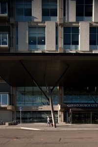
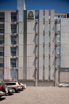
The New Zealand Post building in central Christchurch was designed in 1965 and completed in 1981. It was a huge slab of Brutalism, looming over the city centre and clad in grey, concrete panels. New Zealand Post moved out in 2007 and, later that year, the Christchurch City Council announced a joint partnership with Ngai Tahu Property to redevelop the building and transform it into new civic offices. Athfield Architects was appointed and tasked with transforming the monolithic bunker, clad in what look like nuclear-blast shields, into a shining symbol of democratic transparency. No mean feat.
The building was completed before the September 2010 earthquakes. Staff had to move out for repairs after September and, again, after February 2011. All staff had moved back in by June 2011. I approached the new civic offices with Athfield Architects’ director Trevor Watt; the building is visible from quite a few blocks away. Then you turn the corner onto Hereford Street and the dramatic scale of the building is immediately obvious. “There’s the beast,” says Watt. “It is such a massive building.” And it is a beast. The 5.8m-ceiling heights mean the seven-storeyed building is taller than many buildings with more floors.
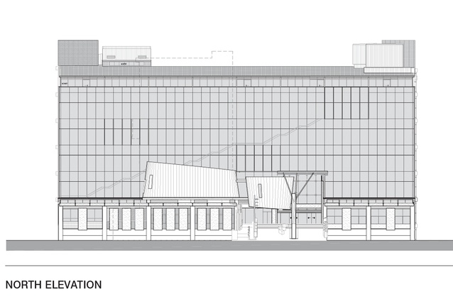
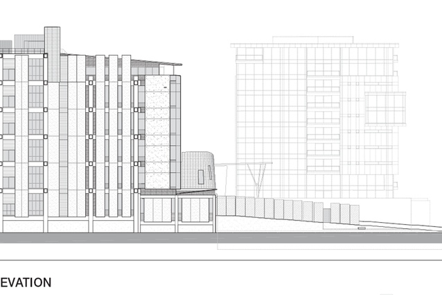
The redesign of the building has made it more approachable and accessible by removing all the concrete slabs from the northern façade and replacing them with an untinted, glass curtain wall. On the southern façade, half the panels have been removed and replaced with windows.

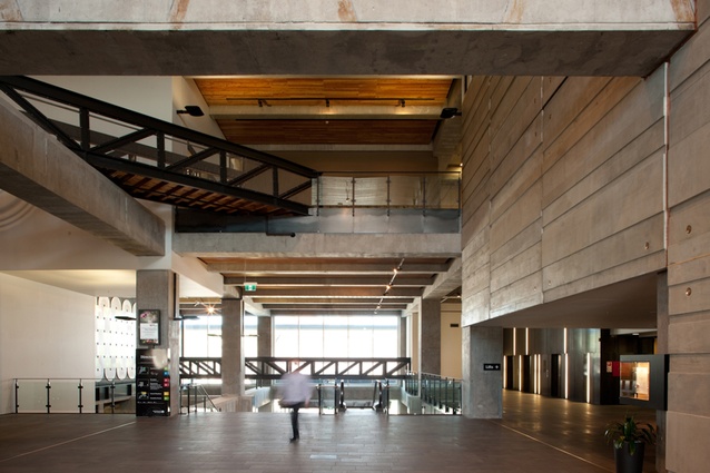
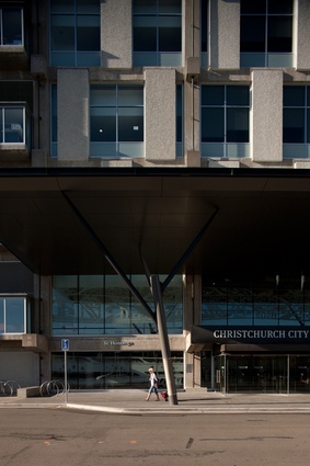
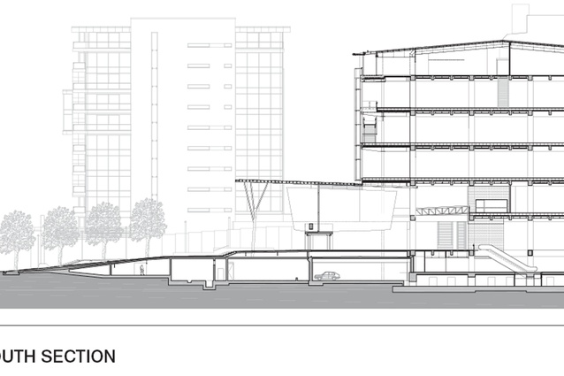
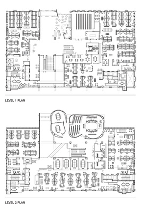
But the most dramatic public intervention is inside. On the ground floor, Athfield Architects has carved a huge, two-storeyed public space through the building from Hereford Street to Gloucester Street. It is a generously proportioned space that holds the curving civic chamber, committee rooms, public service counters and a café. It is the large, public heart of the building that creates a handy new pedestrian link through the block; Watt refers to the large space as “a public street”. At either end of this street are two new public entrances. The Hereford Street entrance is all business, with street-level glass doors beneath a large canopy leading to the reception, public service counters and lifts. The Gloucester Street entrance could not be more different. A former truck ramp has been transformed into a long, sloping public entrance that leads to the front doors. A water feature cascades down the middle of the ramp. It’s very grand and stretches over nearly a city block.
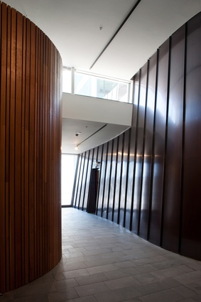
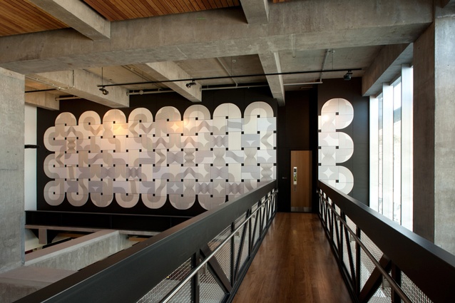
The curving civic chamber can be seen from the Gloucester Street entrance, protruding through the glass curtain wall like a rock through a waterfall. The Richard Serra-inspired chambers are clad in a dark copper that will gently green with age. The colours are muted with reminders of the building’s industrial past left raw and undisturbed. Pencil marks and drill holes remain on the raw concrete: a theme repeated throughout the building.
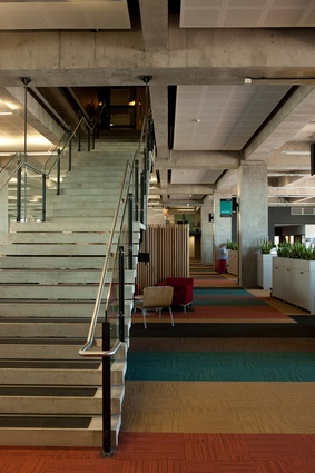
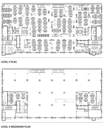
Offices are clustered around the remaining spaces on the lower floors and spread across the three floors above. The office floors are long and narrow with lift cores and services clustered at either end. A typical office floor is laid out simply with rows of desks and planters breaking up the different sections. The space is very tall with an exposed concrete ceiling as all the services, including air conditioning, are hidden in the floor.

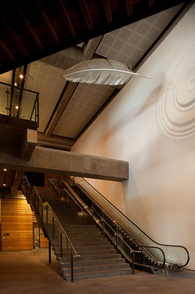
Each floor is slightly different thanks to the colour scheme and a large staircase that descends four floors in a single diagonal run along the southern façade. The staircase meets each floor at a different point, creating a unique layout, on each level. The staircase is snug against the glass façade, animating the building during the day and at night when it is illuminated.
The office floors would have remained that simple but the brief changed as the project progressed. The number of people that needed to fit in the building grew from 900 staff in 2006 to 1,000 staff in 2007 and 1,200 staff in 2008. The developing brief forced a few design changes. The planned extension on the northern façade was pushed out as far as possible, adding 8m to the floor plate and columns extending down the height of the building. But, even then, all the extra people couldn’t fit in so mezzanine offices had to be installed. The wood-clad mezzanine floors are clustered around the lifts and toilets at the eastern and western ends of the long floor plates. The wood cladding and steel-mesh screens make the spaces feel like tree-house forts. They are cosy spaces with lower ceiling heights than normal, which you can reach up and touch. The mezzanine floors are not ideal but are a pragmatic response to a challenging brief. They also help break up the large open-plan office plates with a contrasting vertical rhythm.
The top floor is a very different space: home to the mayor’s office, the mayoralty lounge, the councillors’ lounge, the chief executive’s office and more general office space. It is a complex space with many different demands placed upon it, including the need to create more general office space for all the new people. As a result, it is the least successful floor in the building. It is awkward and warren-like. This is where the growing brief, thoughtful design and pragmatism finally fail each other.
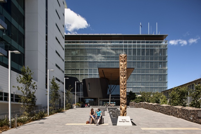
But there is another area where the brief helped create a very unique building. The civic offices are in the first renovated building in New Zealand to win a six Green Star rating for its sustainable features. These include a mini power station on the roof, creating heat and power from methane gas harvested at Burwood landfill, the largest double-skin façade in the country, escalators activated by sensors, rainwater harvesting for flushing toilets, power generated from the lift brakes and solar-heated hot water. Watt estimates the extra expense will be reclaimed in power savings over just three years.
So, given the unenviable task of teaching a brutal slab of concrete some manners, Athfield Architects has done a remarkable job. The new civic building is a handsome public addition to Christchurch. And, as the copper cladding on the civic chambers ages to a mellow green, the city will grow. One day, the chambers will be a rich copper green and a reborn city will surround this rejuvenated monolith. Athfield Architects has succeeded in giving the civic offices more than manners; it has given the building an open-hearted civility and a conscience.

