Colour Collab: Alan McCorkindale
A senior interior designer at Jasmax in Wellington, Alan McCorkindale is passionate about human-centred workplaces that create a positive impact on people’s daily lives.


How did you land in the world of interior design?
Alan Alan McCorkindale (AM): From a very young age, I was always interested in buildings but, on reflection, I think what I found most fascinating was the human experience of a building — how you feel when you enter and the connections we all have to the spaces we inhabit. I started out by working towards a career in architecture but soon realised that what I really wanted to do was to shape the experiences that people have inside buildings.
Does any particular designer provide you with inspiration?
AM: I’ve always liked the author Alain de Botton’s idea that buildings help us to visualise who we are and signal our aspirations of who we’d like to be, both on an individual level with our homes and on a societal scale in our public spaces.
We all do this in small ways — we hang art on our walls or choose objects and furniture for our homes that we feel reflect our identity. I apply this thinking to my projects; I want to understand my client really well and design something special and unique that reflects their organisation and how they want to be perceived.
Earlier in my career, I was lucky to work with two talented hospitality designers, Matthew Shang and Paul Semple, based in Singapore. I learned how great hospitality design can create exciting worlds, which cast a spell when you enter into them. When I design workplaces for clients, I try to bring some of the magic of hospitality, reflecting how organisations want people to feel when they enter their space.
How does colour factor into your designs?
AM: At the concept stage, I start with gathering imagery, ideally something other than architecture, like art works or objects. This sets the tone for the project in terms of its style and colour palette. It also helps bring the client along on the journey so, when we show them the colours we’ve selected, they understand where they’ve come from, and how they come together as a whole, stylistically.
I’ve recently worked with Buddle Findlay on their new Christchurch office overlooking Cathedral Square. We used Resene colours, evoking the silvers and golds of the landscape encircling the city as the starting point of the material palette. We then selected fabrics, tiles and timber veneers to create a relaxed, calm and natural aesthetic.
What was the thinking behind your collab?

AM: An exhibition at the Govett-Brewster Art Gallery in New Plymouth inspired me. It was a series of seven very large works by artist W.A. (Bill) Sutton, in his series Te Tihi o Kahakura and Sky, which capture big, dramatic skies over the Port Hills. Essentially, each piece is the same painting of the same landscape but with pronounced variation in the way the light falls over the land to create shifting colours and shadows. The paintings belong to different collections so it was very special to see them together in the one place.
How did you select your colours?
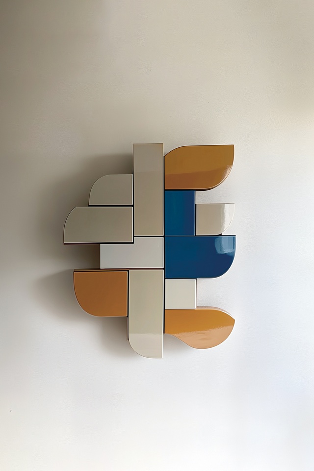
AM: My selection is drawn from Sutton’s paintings — Resene Bellbottom Blue captures the Canterbury sky, with Resene Eighth Akaroa depicting the dramatic clouds. The golden and changing hues of the Port Hills is depicted in Resene Alamo and Resene Half Sisal. Like Sutton, I also grew up in Canterbury and these colours connect me strongly to that place.
See more from the Resene Colour Collab series here.
ArchitectureNow works with a range of partners in the A&D supply sector to source appropriate content for the site. This article has been supported by Resene.


