Colour Collab: Amelia Holmes
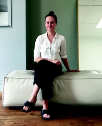
Interior designer Amelia Holmes is known for her deceptively simple design moves, which exude understated sophistication, comfort and a love of natural fibres. Her current work is focused mainly on residential projects.


Your background is in both fashion and interior design.
Tell us how the two worlds collided.
Amelia Holmes (AH): I studied textile design so, during my study, the two fields naturally crossed over. I always had a strong interest in textures, tones and how materials worked together. When I completed my studies, I initially worked on interiors in New Zealand for Penny Hay and then travelled to New York to work as a fashion stylist assistant. It was a perfect job for me in my mid-20s. At the time, we were working mostly on print editorials for Teen Vogue, American Vogue, i-D and Muse. I returned home one summer and really felt like I wanted to be home for a bit. That’s when I started working on interior editorials here and my focus naturally shifted from fashion to interiors. It was a very fluid transition. In the past four years, since having children, I have worked solely on residential and interior projects. That said, I have very fond memories of editorial work, be it in interiors or fashion.
When you were in the States, did you travel widely?
AH: Before living in New York, I had been to New Mexico a few times as I have family there. My first visit was by myself at 16. I really had no expectations and it was very different to the urban America I had been exposed to through movies. I was lucky enough to travel to neighbouring states Colorado and Texas but, aside from that, I’ve really been only to California and New York. I’d definitely like to explore more.

Do you think the New Mexico landscape influenced your interior design thinking?
AH: New Mexico is a special place. Geographically, it is so different to the New Zealand landscape. The desert set in the mountains, the ski fields and the endless sky in that part of the world are so different from the natural environments here. All the buildings in Taos, be they residential or commercial, have to be built in the adobe style. The application of these natural materials used in that part of the world had a big effect on me.
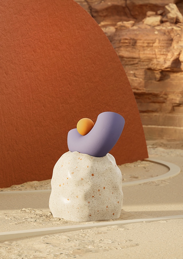
Your collab here has been inspired by the artist Ken Price, whose vibrant fluoros and surreal comic reliefs are not necessarily something we would associate with your work.
AH: Initially, when I was approached to create this collab with Resene, Taos, New Mexico, was the first place that came to mind when I thought of colour. It doesn’t necessarily relate directly to my work; however, the raw natural interior and architectural finishes really have informed my work.
Taos is not an overly colourful place but there are so many subtleties in the landscape and architecture. The houses strictly have to be adobe so they are all varying hues of brown but, while they all appear the same colour as a result of the natural materials used, there are subtle differences in the tone of every building. I felt Resene Blank Canvas and Resene Chilean Fire reflected the earthy tones of the architecture.
The interiors are mostly very traditional adobe finishes: exposed timber beams, plaster walls and concrete floors. However, I was lucky to visit a few homes that pushed the traditional boundaries, mixing in modern and industrial elements. I ended up house-sitting for the artist Ken Price one winter. The house was full of modernist sculpture, which was quite a contrast from the surrounding monochromatic landscape. It made the artwork feel more surreal than it does when you typically see it in a gallery. The colours Resene Siesta and Resene Touche feel bold and dusty in contrast to the natural hues of the landscape. It’s these different facets of Taos that make it such a special place.
See more from the Resene Colour Collab series here.
ArchitectureNow works with a range of partners in the A&D supply sector to source appropriate content for the site. This article has been supported by Resene.


