Colour Collab: Natasha Markham
In this Colour Collab with Resene, we hear from Natasha Markham about how a recent trip to Otago has inspired her thinking about colour. Founder of MAUD (Markham Architecture + Urban Design) and co-host of architectural podcast 76 Small Rooms, Natasha is currently working on bespoke projects for residential and commercial clients while analysing and reviewing urban areas undergoing change.


You co-host 76 Small Rooms with Jeremy Hansen, Mat Brown and Richard Archbold. How did that come about and what does it entail?

Natasha Markham (NM): It started with a casual question from a mutual friend on Twitter: “Know any good local architecture podcasts?” “Hmmm…” “Maybe you should do one.”
Within a week, we were standing on architect Richard Naish’s front steps with a borrowed recorder and the overarching idea that we wanted to talk to him about his award-winning house in a non-architect-y way. It’s still the driving idea behind our conversations: to talk about architecture-related issues, mostly local, in a way that’s accessible to anyone. Although, I’m sure we’ve gone off-piste on more than a few occasions.
You recently won a Resene Total Colour Maestro Award for your Twin Peaks villa renovation project. Why does colour form such an important component of your work?
NM: I’ve always enjoyed colour and it’s great when we have the opportunity to use it in our projects. Like a lot of architects, I’m also very interested in light – the different qualities of light throughout the day and year, and the quiet importance of shadow. Whenever we use colour in a project, I always think about how it will interact with the light in that space or place. I generally don’t like to settle on a colour without trying out testpots on site. The right light can bring life to colour and transform your impression of a space.
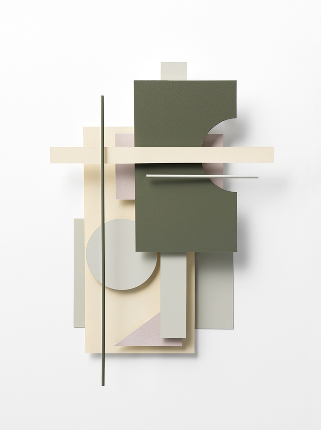
The colour collaboration you have created for us here is exactly as you have described above – based on a play of soft, diffused light and shadow. What inspired you?
NM: I took a number of photographs of Otago on a recent road trip during the holidays. The light in Otago is very different from the light where I’m based in Auckland and it reminded me of Richard Diebenkorn’s work, particularly his Ocean Park series. While it might seem weird to talk about a painter based near the ocean in California and central Otago in the same breath, Diebenkorn was really interested in capturing the soft light on the landscape near his home and that’s what I was struck by when driving around Otago: the play of light and landscape.
Tell us about the colours you selected. Why do you find them so appealing?
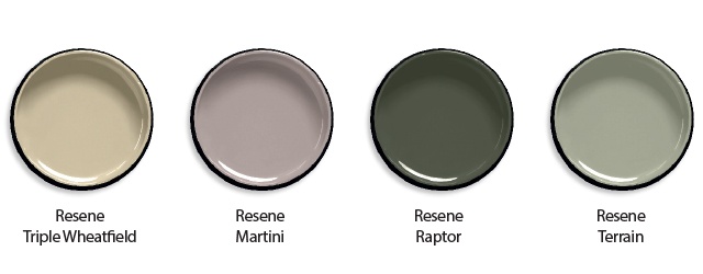
NM: I’m always drawn to greens and I knew I wanted a dense hue to form the foundation for the palette. Resene Raptor draws on the tones of mountain scrub and the shadows cast by clouds as they move across the land. Resene Terrain has a mineral quality to it that you see in the rocks and rivers, while Resene Triple Wheatfield and Resene Martini both reference the dry grasses, the wildflowers and the soft light at either end of the day.
The work, and particularly its deliberate-yet-abstract forms, takes its cues from artist Tilde Grynnerup. What motivated this?
NM: I’m relatively new to Grynnerup’s work but I’m really enjoying the playfulness of her pieces and the fluency with which she expresses her ideas across different mediums. Her geometric woodwork wall sculptures are wonderful explorations of form and colour, while her textile projects – such as the Mini Oki quilt – have a real landscape quality to them, particularly
with the way the light hits the fabric.
See more from the Resene Colour Collab series here.
ArchitectureNow works with a range of partners in the A&D supply sector to source appropriate content for the site. This article has been supported by Resene.


