Colour me tender: the MX House
At the heart of this project is a series of playful balancing acts – between vernacular Brazilian architecture and the inevitable influence of globalisation, between classic design and a contemporary aesthetic, between art, architecture and interior. In the hands of Brazilian architect Guilherme Torres, these seemingly disparate elements meld into a seamless whole.
Located in Recife, one of the largest cities in northern Brazil, the original 1980s triplex apartment was all dark surfaces and granite. “It resembled a granite tomb!” Guilherme laughs. “During the process, we demolished all the internal walls and reconfigured all the spaces, the circulation, the layout and the finishes. Once the new shell was ready, we started from scratch with the décor.” The resulting apartment spans three levels, culminating in an almost impossibly picturesque roof deck.

One of the real joys of this project is its unself-conscious playfulness. Guilherme’s holistic approach to design – “To me, it’s impossible to separate where architecture ends and where design begins,” he says – blurs the line between structure and design. The result is a series of spaces rich in character that demonstrate the studio’s deft approach to residential design.
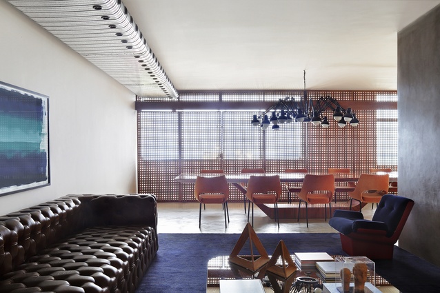
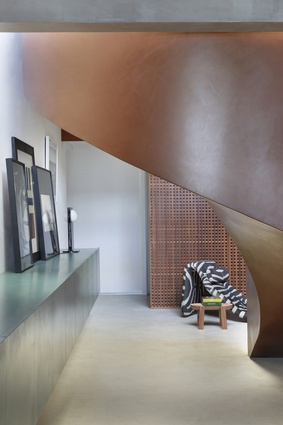
At ground level, the entry opens into a perfectly scaled living and dining zone. To modulate the openness of these zones, the team installed elegant lattice screens. Known as mashrabiya, these screens borrow from Moorish architecture, folding and sliding to articulate the space and moderate light, airflow and enclosure, and at the same time, tracing intriguing geometric shadows on the polished concrete floors throughout the day.

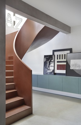
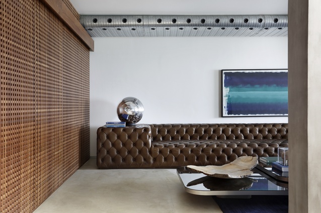
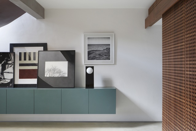
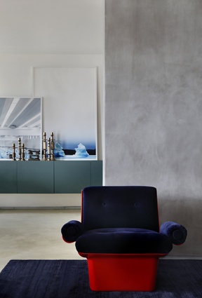
Guilherme’s skilful balancing of form and function is evident in the visible architecture – for example, the suede-like concrete pillars – and the composition of furniture and objects within the space. Above the dining table hangs a chandelier by Ron Gilad for Moooi, its multitude of individual lamps stretching in all directions. There are bold colours too – the teal joinery unit that cantilevers from the wall, the royal-blue rug underfoot or the plush orange velvet of the vintage dining chairs. Overhead, an exposed metal ventilation duct is perforated with almost comically oversized holes.
Guilherme nominates the sinuous semicircular staircase as one of his favourite elements. It is a strong sculptural piece, its curving form accentuating its metallic finish as it connects to the first floor.
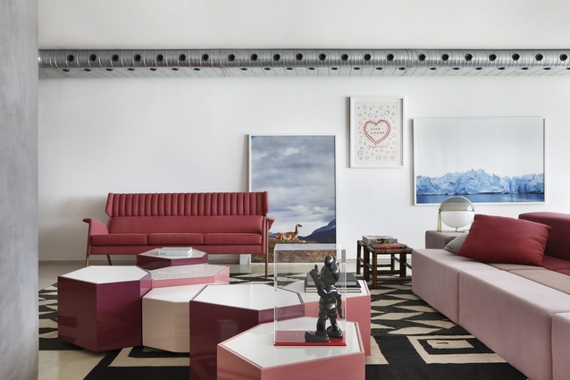
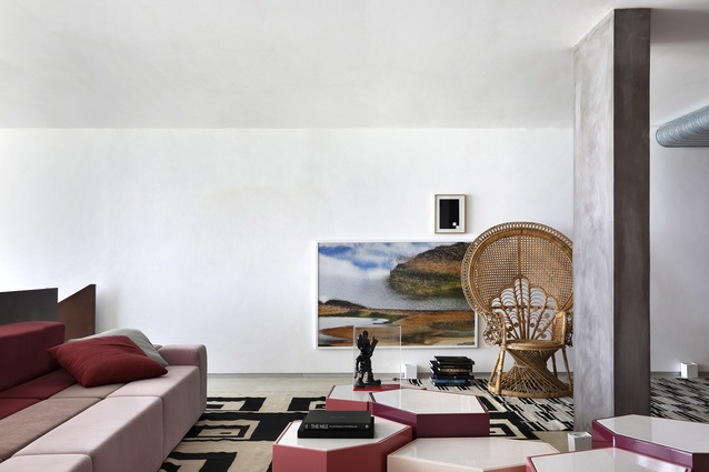
A second living zone occupies this middle level. Here, the harder edges of the ground floor give way to softer elements. The palette brings together jewel-like shades of pink and red – see, for example, the cluster of hexagonal Voronoi side tables of varying heights or the infinitely configurable Slice sofa that Guilherme designed for Nos Furniture.
Around the walls, an enviable art collection is casually stacked, including contemporary pieces by Brazilian artists Marcelo Catalano and Andery Neto and large-scale photographs. “The client has a very close friend who is a photographer, Yuri Serodio. Through that connection, we decided to use several of his artworks,” Guilherme explains.

Up another flight of stairs, an open-air kitchen and informal dining space steps out to the pool deck. Here the palette is all gradated blues and greens, inspired by the colours of Thailand’s coast. It provides amazing views of the city fondly known as the “Brazilian Venice”.
While the apartment’s public zones are all about openness and flowing space, the private zones offer more intimacy and enclosure. At ground level, a streamlined kitchen is structured around a central island bench, with folding chairs in a zesty Pantone green. Alongside, there are two guest bedrooms and a service zone, providing accommodation for domestic staff and a secondary staircase to access the other floors.

On the first floor, the private zone incorporates a guest bedroom and a master suite with a generously scaled ensuite and dressing room. This interstitial space employs the same pared-back materials palette, with a hefty concrete-topped double vanity floating below a mirrored wall alongside patterned black and white wallpaper.
In parallel with his architecture and interior projects, Guilherme has an impressive range of furniture designs to his name. Many of his pieces are on show here: in the dining floor, there is the sleek timber form of the Jet table, inspired by a trowel; beside the leather Otto sofa, a twenty-first-century update on the chesterfield sofa.
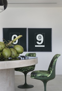
On the roof deck, alfresco dinners take place around Guilherme’s spool-like Spin table – a concrete base with a mirrored surface. These contemporary pieces are paired with design classics such as Saarinen chairs with tropical upholstery, Oliver Morgue’s mid-century Djinn chaise longue in a zebra print, and a vintage armchair from Polish designer Jorge Zalaszupin.
For Guilherme, real-world experience, from today or yesterday, is a fundamental element of any design project: “My function is to translate the world into design,” he says, “whether it’s drawing a building or an ordinary object.”

