Commercial Bay: Saxon + Parole
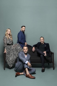
We spoke to AvroKO back in 2017, when the Commercial Bay Harbour Eats precinct was still just a concept design. This weekend, their equestrian-themed, New York-style steakhouse Saxon + Parole is set to open to the public, boasting some of the best views of the Waitemata Harbour in the whole complex. We caught up with the US-based design firm, which is made up of partners Adam Farmerie, Greg Bradshaw, Kristina O’Neal, and William Harris, to hear how the final project has turned out.
What are some of the main hospitality design drivers in this restaurant?
William Harris (WH): Near the entrance we have a large, open, warm oak-clad wine room which doubles as our host area. Guests are greeted while servers buzz around selecting wine while some guests are also invited to try wines at a tasting table incorporated in the room. The hospitable energy is further enhanced by the boisterous open kitchen directly opposite it.
Our sizable bar has our signature extended ‘surfboard’ design at the end, allowing guests to congregate as a group around both sides of the bar with great access to our staff and offerings. This is always one of the best seats in the house.
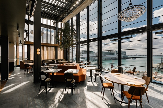
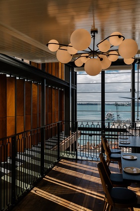
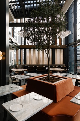
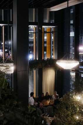
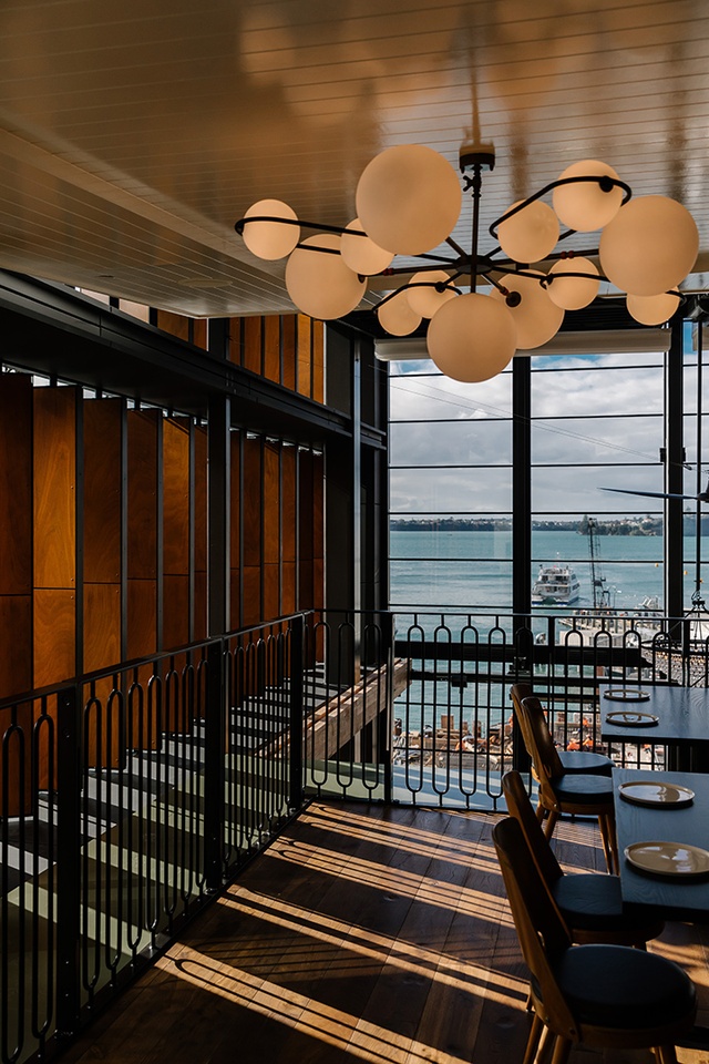
A strong hospitality design driver is also the mezzanine area perched high above our open kitchen and double height dining room. The mezzanine is built for larger groups and gatherings and has its own bar, so it is perfect for semi-private events while still maintaining absolutely stunning views of the bay.
What design elements from the NYC version of this restaurant went into the Commercial Bay iteration?
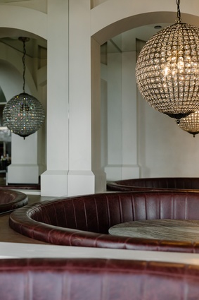
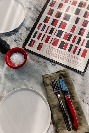
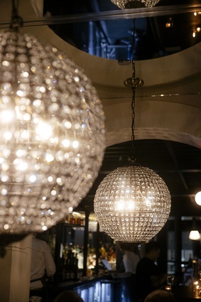
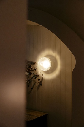
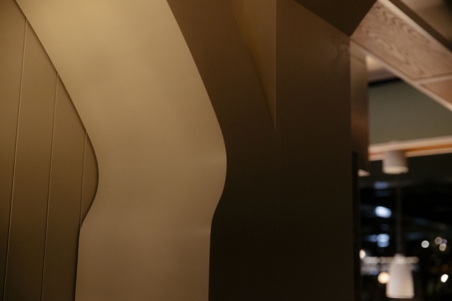
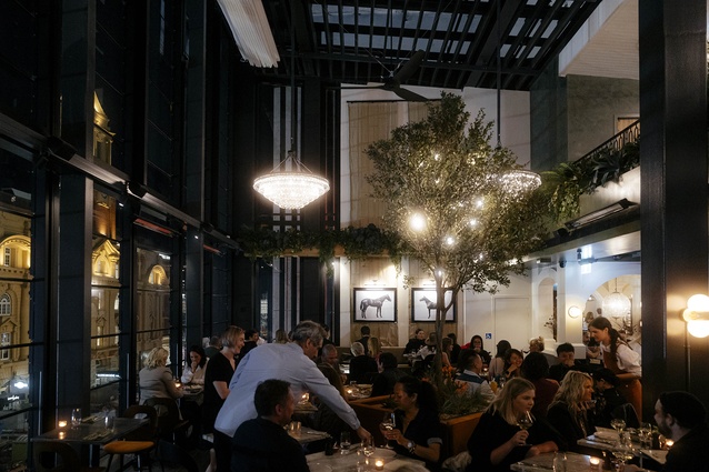
Kristina O’Neal (KO): Similar to our New York spot, the bar is a design centre-piece, welcoming guests into the restaurant. We also have continued our ‘Bauhaus-meets-stable’ concepts with strong wood members framing the bar ceiling, and have evolved our horse stable-esque booths to be even more dramatic with bold white wood arches at the thresholds, supple burgundy leather Hollywood banquettes and glittering oversized crystal globe chandeliers. Our namesake mascots - the New York-bred racehorses Saxon and Parole - have their large portraits hung side by side in the double-height dining room. Their signature racing colours - ‘cherry and black’ - are also featured in the space, most notably in the menus, a large graphic mural on the mezzanine, and in the Lorillard Room, which is a VIP experience specially built for two guests at a time.

What attracted you, as hospitality developers, to Commercial Bay, especially at such a high level of investment?
Adam Farmerie (AF): When we first met the leadership of the Commercial Bay development, we were taken with both their kind nature and bold vision for the development. We originally were introduced in Auckland with an initial plan to help them with strategic planning for the food hall, Harbour Eats, but additional meetings and many lively late night dinners at Saxon+Parole in NYC furthered our relationship. It soon just felt right to dive deeper and become a part of the project by bringing our brands to this special site, and we feel lucky to have been invited to do so. Since the beginning, we have been connected to staff, wines and products from the region, and now feel like our journey has come full circle. We’re incredibly proud to finally open our doors here in Auckland!
The New Zealand locale and its maritime context is quite different from the NYC one, how did that influence the interior design?
Greg Bradshaw (GB): The bay view is central to the space design and is the star of the show. We maximised that by creating a soaring, double-height volume with an adjacent mezzanine. Our NYC restaurant is much more enclosed, dark and classic in feel, while this iteration is very modern, open and airy by contrast. We’ve also utilised much more nature and greenery in this space to celebrate the locale by bringing the outdoors in. There is a subtle nod to the boating culture as well, reflected in our high-gloss, white wood plank mezzanine, which is slightly reminiscent of maritime vessel design.
What were the biggest challenges you encountered while trying to design and build four, very distinct hospitality venues (Poni Room, Liquorette, Ghost Donkey and Saxon + Parole) here… 14,000kms from where you are based.
WH: This was certainly not an easy endeavour, but well worth it. One of the biggest challenges was design sourcing. We tried to source as much as possible from the region but had to supplement by shipping select items and materials from New York and Europe. For example, many of the Poni Room Noren flags are made from deconstructed vintage horse blankets, which we found impossible to source locally. We also sent a bunch of styling elements for our back bars like vintage pewter vessels and cut crystal decanters.
Did you work with many local craftspeople/designers, artists, etc to achieve this space?
KO: This project wouldn’t have been possible without the incredible talent and can-do attitude of local architecture firm Mitchell Addison Architects. They helped bring our designs to life and were instrumental in much of the local coordination and problem solving.
WH: Our dramatic, 4-meter-tall organic red Muehlenbeckia chandelier in the Lorillard room of Saxon + Parole was made by the team at Xanthe White Design. The jaw-dropping New Zealand seashell-clad host stand at The Poni Room, as well as other Poni Room styling, was created by Hayley Brown, The Art Dept. The beautiful custom lighting at the bar and mezzanine of Saxon+Parole was produced by local lighting group Coombes & Gabbie, while the bauhaus-inspired mural above the kitchen was painted by Berto Reed.

