Compact living, big ideas
I grew up in New Zealand in the 1980s and ’90s, when space was never an issue. Okay, my siblings and I did fight over territory within our shared bedrooms but only before fleeing the confines of the house for the big backyard beyond. When I moved to Amsterdam, the Netherlands, in the late 2000s, I realised just how little living space I actually need.
That said, a reduced residential footprint requires a different mentality. Kiwis are much too accustomed to the notion of large, empty spaces. Every time I return to New Zealand, the next person is discussing their plans for ‘building on’. But, as the Auckland housing crisis continues and New Zealand’s population swells, smart small living could provide at least part of the solution.
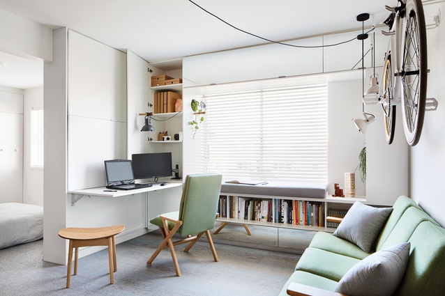
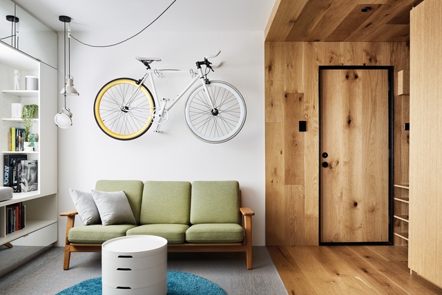
Jack Chen moved to Melbourne from Sydney and needed a cheap and convenient place to stay while working. The director of Tsai Design nabbed a top-floor spot in what’s colloquially called a “six-pack apartment”, with “a harsh box profile and harsh repetition”, says Chen. “The development was popular in the 1950s – a way to squeeze residential apartments for 12 families into a single-house site. It’s efficient in one way but the living conditions of such environments have been harshly criticised.”
Chen decided to turn himself into a test case for small living while attempting to give the typology a second life. When dealing with limited square-metreage, the obvious challenge is how to include the required functions and furniture without suffocating a space. Chen’s answer was to determine a hierarchy in spatial planning. What important elements need to be easily accessible and permanently in place? Which spaces are less important and can be concealed when not in use?
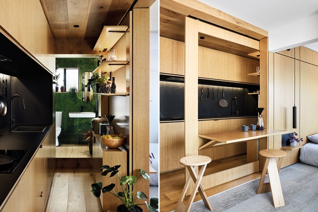
The process is “somewhat subjective”, says Chen. “It depends on your lifestyle. For me, dining is not a key space so I created a dining set-up that slides into the kitchen and disappears. You also need to prioritise your spending. In Type St Apartment, about two-thirds of the budget went to one-third of the space: the timber box that houses the entry, kitchen and bathroom. These key spaces make an impression for both the occupants and visitors.”
‘Plan Melbourne 2017–2050’, a report by the Victorian State Government, predicts that the city’s rapid population growth will necessitate 1.6 million new homes over the coming 35 years. It states that “the issues that need to be addressed include housing affordability, the types of housing available to cater for different household needs and lifestyles, and the provision of medium- and higher-density housing close to jobs and services.”
Chen hopes Type St Apartment can be a case in point: “I think Melbourne – or Australia, in general – is slow to catch on to the idea of small living, but I believe the tide will turn once they start to see more examples of how well small living can work. It would solve a lot of stress surrounding home ownership – one of the main concerns for young Australians at the moment.”
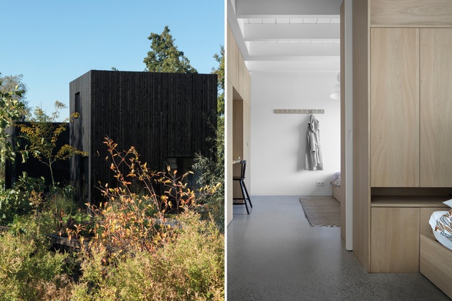
And what if sites themselves are smaller? This particular situation is commonplace in the Netherlands, where population density is 415 per km2 (to put that figure into perspective, New Zealand has only around 18 people per km2). Having renovated apartments as small as 40 m2, Amsterdam-based studio i29 interior architects was recently handed a petite plot of land on which to develop a holiday home for its client. Limited in terms of volume and height within a 55m2 footprint, i29 collaborated with Chris Collaris Architects to ensure “we could use every small corner of the house”, says Jeroen Dellensen, who co-founded i29 with Jaspar Jansen. “It’s a fully integrated design – that’s why it’s successful.”
The clients basically gave the designers carte blanche – as long as the scheme accommodated them and their two children and included “everything you need in a house”. The challenge, says Dellensen, is to “provide the same functions and the same feeling of luxury and comfort, regardless of size. We prefer not to delete functions but to downsize them – and to combine them in a smart way.”
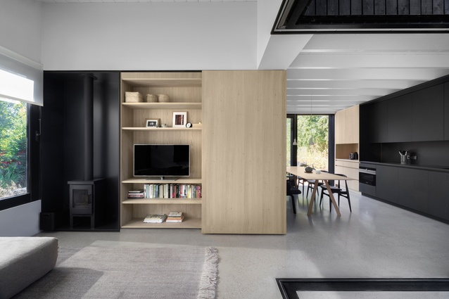
Tiny Holiday Home’s spaciousness belies its size. It is, indeed, a complete house for four people; there are even two toilets. The design is based on four volumes, each with its own programme. These ‘building blocks’ encircle a patio, connecting the interior to the outdoors and bringing “a lot of air into the house”, says Dellensen. “Wherever the inhabitants look, there’s always a view to the outside.”

Apartment living brings different challenges but part of i29’s secret recipe for residences is universal: integrating both functions and cabinetry. “It’s about thinking what to hide and what to show – and creating places for both.”
Their approach is perhaps even more evident in The Invisible Kitchen, a residential project in Paris. That client wanted a luxurious kitchen with all the trimmings so i29 decided to conceal it behind sliding doors, leaving only a thin island out in the open. The designers opt for bespoke kitchens rather than branded ones; each of the former “becomes a single object in space”, says Dellensen. “We always try to integrate such functions within the architectural elements.”
Dellensen notes that, while requests for small-living solutions by clients are not necessarily increasing, i29 is attracting more inquiries from developers for modest, modular homes to sell worldwide.
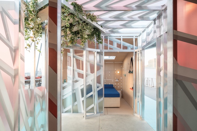
Brands, too, are beginning to board the small-living train. Take Mini Living, for example: an initiative that investigates how the car brand’s key principle – the creative use of space – can inform the future of urban life. Going minuscule with its recent Urban Cabin project, the brand teamed up with local architects in four populous cities – London, New York, Los Angeles and Beijing – to create homes, each with a meagre 15m2 footprint.
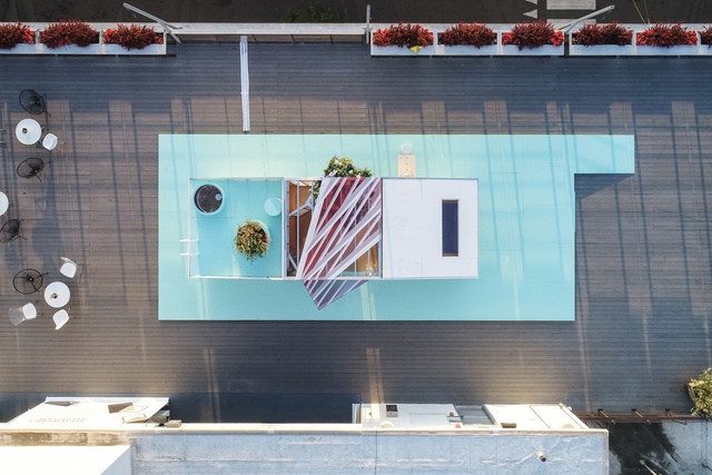
In LA, FreelandBuck was brought on board to explore “how these smaller homes can use design to be both cost effective and beautiful”, says the architectural office’s co-founder Brennan Buck. The team relied on spatial effects and the use of experimental materials to visually expand the cabin. Unlike i29, FreelandBuck chooses to “edit out unnecessary aspects and consolidate elements into objects with multiple functions”, says co-founder David Freeland.
“We work hard to avoid the space ‘feeling’ smaller by focusing on proportion, light and colour to create a more expansive space.” The common thread among the new breed of small-living spaces is perception; just because a home takes up less room, it shouldn’t seem that way.
This article first appeared in Urbis magazine.





![Jack Chen says of Type St Apartment that "dining is not a key space [for me] so I created a dining set-up that slides into the kitchen and disappears."](https://cdn.architecturenow.co.nz/site_media/media/cache/25/4d/254dc4f2084ef7c74d018ff8e2015610.jpg)
