Corporate Cathedral
Michael Barrett takes a tour through Telecom Place's four buildings and voluminous atrium and decides it's quite possibly New Zealand’s most significant corporate building project of recent times.
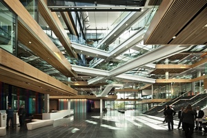
Telecom Place is the new kid on the block (it is, literally, a whole block) on the site of what was the NZ Post distribution depot on Victoria Street West. It’s a low-rise agglomeration of four buildings surrounding a massive atrium criss-crossed by crisp white bridges that facilitate the horizontal connectivity that Warren and Mahoney architect Dominic Plume says is the key to the success of the building’s organisation. As far as atriums go, it’s safe to say that this one is a stunner, a full panoply of corporate life. It’s expansive and light-filled, a people-watching place, a place to eat and, thanks to a building consent condition, a public place - but only on the ground floor.

“From the outside, Telecom’s new home is quite unassuming. It’s not until you enter it from the street that you realise its true presence. The quality of space within the atrium, the flow of people along the bridges and the hive of activity from the staff occupying the open corners of the working floors all helps towards Telecom being better connected, not just visually, but also in terms of its deeper core values. The quality of light in there is amazing - once inside, the place immediately feels good.”
Plume is right, it does feel good. It’s an inward-looking building for a small town’s worth of workers and, as such, the atrium is the building’s most obvious navigation device. Telecom Property Manager Jim Robb attests that if you ever want to find anyone in this building, “just go and stand in the atrium and they’ll see you there.”
Gary Young, from Manson TCLM, the building’s owner, says the initial building proposal was for four separate buildings. “The design that didn’t really look a lot like what we have today. It was speculative, four buildings, fully glazed into the interiors and no atrium.” That original proposal had council approval as long as public access was guaranteed along the axes of the four buildings. When Telecom came on board the design changed, with an atrium enclosing those accesways, but the stipulation remained. Telecom, says Young, was one of the few clients who made the decision to move in a time frame that allowed design flexibility.
“Almost every tenant makes the decision to shift too late, and they end up having to put up with what’s already designed. Here, and I think it was a lot to do with Warren and Mahoney, Telecom came up with the idea of interconnectivity throughout the buildings. They wanted the atrium and bridges and we had sufficient time to get that design done.”
In actual fact it was workplace strategist Geyer, who during an earlier strategic consultation phase with Telecom came up with the idea of interconnecting walkways and bridges. As Laurie Aznavoorian, director at Geyer, puts it, “The reason the buildings were joined was a direct response to Telecom’s business position. They were percieved as being out of touch with New Zealander’s. The building was a tangible way for them to reconnect”.
“The building provides a launch pad to shift behaviours and attitudes; Telecom is looking to retrain their people towards a very different customer service approach that will require different skills,” she says.

Some background. Two New Zealand architecture firms were involved at Telecom Place. Architectus, employed by Manson TCLM, were responsible for the base buildings, and Warren and Mahoney, in association with Geyer, were responsible for the fit-out and design integration with the base buildings. Geyer, working with Telecom since 2006, helped define the principles that became a strategy called “One Telecom”. This included an emphasis on a high percentage of mobile staff, a worldwide trend for large companies. An example of this trend can be seen in the behaviour of Hewlett Packard. Chris Hood, worldwide head of real estate for HP, and a recent speaker at the CoreNet commercial property symposium earlier in the year, said that HP has halved its corporate real estate. With 300,000 staff to accommodate into half the space, mobilisation was a crucial part of its strategy. One Shelley Street, in Sydney, by Clive Wilkinson Architects, with Woods Bagot, is another example of a flexible working style . The Activity-Based Working (ABW) platform used there was developed by Dutch company Veldhoen & Co. At last report, 55 per cent of employees change workspace each day. One advantage of ABW is the reduction of churn: the ongoing cost of moving groups and redefining spaces.
Through collaboration with Warren and Mahoney during the design concept and integration phase, it was Geyer that provided the opportunity and the intellectual property to understand how mobilising Telecom’s workforce could be achieved. The baton was then passed to Warren and Mahoney, who developed the detailed design and managed the delivery of the internal environment, which will hold 2,700 people at capacity across 28,900m2 of office space.
Interestingly, the percentage of “dynamic” staff is much higher than at One Shelley Street - 82 per cent of them will work dynamically at Telecom Place, says Robb.
“We really thought that we’d get 25 per cent of our staff at fixed desks - the key support staff - and 75 per cent working in different ratios of flexibility,” says Robb. “That’s changed. We’re down to 18 per cent fixed. We’ve gone through a training process and challenged everyone who thinks they should be fixed. My objective is to keep that moving. The risk is that you revert back to type and default back to one body, one desk. If we do that we’ll have ruined the economics of the building.”
Reflecting on Telecom’s growth in past years, Robb says business units grow and become too big for a site, or they shrink and you can’t use them. “Consolidation was part of the One Telecom business strategy. That’s why we were so passionate about getting a low-rise building, where people will move horizontally rather than vertically.”
It’s the horizontal nature of Telecom Place that sets it apart from other, more vertical, activity-based workplaces. It’s the building’s bridges, usable spaces wide enough to meet, greet and work, connecting the one tenant across all four buildings that is the greatest organisational asset. This coupled with a plethora of choice for staff to work differently throughout the entire development reinforces the design mandate: “One place many ways”.
“It was about moving away from the verticality that you typically get in an office building, where you’re physically separated from the person above you, and the lift cores are the main way of getting up and down,” says Plume.
“The whole space-planning idea in this development was focused on a horizontal plane. From levels three to six you’re connected by the central atrium bridge and stair. This brings a degree of theatre within the large open space and provides a more practical way of getting from A to B. At Telecom there are business units that spill over from one floor in one building across onto the same floor in another building. It was important to move away from a vertical stacking process where possible.”
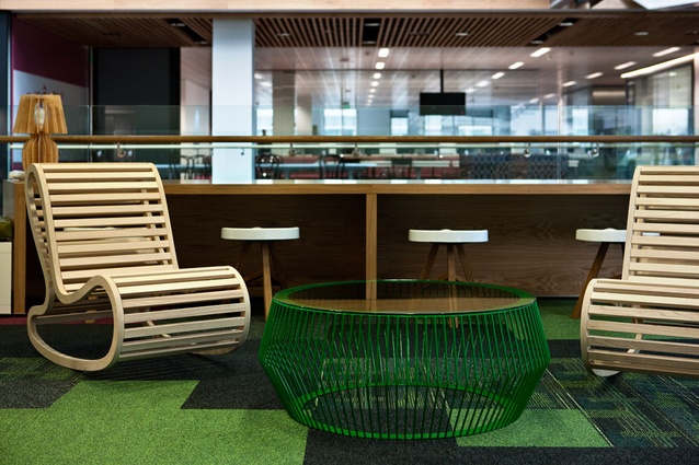
The building’s numerous breakout spaces, each so well dressed it’s like walking through every showroom in New Zealand, at once, are intentionally positioned on each corner of the floor plates, at the end of each bridge.
“As soon as you arrive in another building you’re immediately greeted by those active edges, the dressed spaces that have a distinct character. It was very purposeful: ‘How do I encourage a person to get over there?’ Well, create something of interest, pique curiosity, make people intrigued about what’s over there,” says Plume.
The character of the corners was driven by core values identified earlier within their stragetic document and then crystallised over the next two years through working with the Telecom steering group coupled with their brand direction. Rather than being too literal in the theming of each building, Warren and Mahoney and Geyer instead aimed to create character spaces that embodied an idea rather than a literal concept.
Plume also mentions that a lot of the decisions with respect to arrangement of space were predetermined by the adopted basebuild design and its engineering and that many solutions were also acoustics-driven.
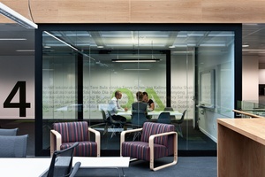
“The placement of meeting rooms around the atrium’s perimeter provides an acoustic buffer between the atrium noise and the people engaged on the floors. We’ve also created active edges where breakout and collaborative areas have been incorporated at each corner of the work floors. This encourages informal team meetings and community-based activities and serves a number of purposes. It provides people with a choice of working styles away from the more traditional meeting room idea, and by populating the open corners, people are more visible amongst their wider community. By activating these edges, the atrium space becomes more lively and engaging giving the workplace a constant hum.”
The cultural change required to make such a work environ a success should not be underestimated. Robb says it required a massive leap forward in fixed networks, mobile networks and very clever printing technologies. “To work dynamically, you’ve got to have those tools.”
Change is often gradual. “In a large community you’ll always get those who lead the way,” says Plume. “However, it’s also human nature for people to resist change, but the more they deal with it the more it becomes a natural process. To say to someone, ‘There’s your desk in that building on that floor and this is your business unit,’ and then to suddenly change and say ‘Why don’t you go on that building on the floor above and sit in that meeting room?’ Instinctively people think, ‘why would I do that?’ The answer is simply because you can, go and explore, physically communicate with your business partners. It’s about engaging, being connected, and it’s about enabling the many facets of Telecom’s business to act as a real community.”
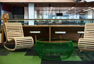
The idea of creating a more humanist, people-driven work place also led to the individualising of spaces with intriguing furniture pieces - a carrot to draw people through the building. Overall, the aesthetic is quite opulent, but this was balanced with economy in other places, says Robb, mostly in the products specified for core work areas.

“We put some discretionary money into those small but important feature corners to really lift the building. Some of the furniture choices have been quite contentious. Good or bad, though, the fact people are talking is the measure of success. Warren and Mahoney really had to beat me hard to get me to agree to this. But, in the end, you have to say, ‘We’re paying these people, they’re the experts, we have to trust them’.”
Aside from the aesthetic “dressing” of the building, it’s the unseen elements that contribute to the atmosphere here. The sustainability measures help the building run efficiently also create a light, quiet and healthy environment. Mansons were awarded with a 5 Green Star - Office Design rating for the building. The interior is not Green Star-rated, although materials and furnishings were selected along best practice guidelines.
From a tenant’s perspective,” says Robb, “I get true operational savings - genuine cash savings from the base building being 5 Green Star. The interiors tool gives us compliance but doesn’t deliver operating savings.
“Three years ago I was pretty naive. I thought I got given the opportunity to build a big building, but that’s just a small part of it. It’s an entire change-management journey. The resistance to change from within was huge, but we had to get it done. It has not been easy.
“People are fundamentally averse to change, and you’ve got sell it, promote it, love it and, occasionally you’ve got to kick it.”


