Crafting cosy spaces
Kiwi-born architect Antony Martin is making waves in his adoptive Melbourne. Justin Foote spoke to him about his work and design aesthetic, and how he came to settle across the Tasman.
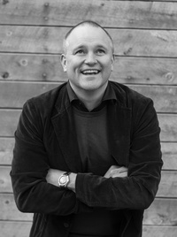
Justin Foote: Were you born in New Zealand?
Antony Martin: Yes, I went to the University of Auckland, where I completed my degree in architecture, before moving to Melbourne for a few years. Then I went over to work in New York for eight years, mostly with David Howell. After that I moved back to Melbourne, eventually setting up my own practice.
JF: What is it about Melbourne that piques your interest?
AM: I came to Melbourne for the architecture: the allure of the quality of public buildings that were being completed when I arrived here, by the likes of Ashton Raggatt McDougall and Denton Corker Marshall, and other larger public buildings that have a very high level of architecture. Also, there’s a very good, supportive architecture community here, which I’ve always enjoyed.
JF: How has living and working in Melbourne and New York shaped your original Kiwi sensitivity?
AM: At the risk of generalizing, in New Zealand you deal with an incredible sense of place and location and essentially the building sites are that much more stunning than a lot of the sites we deal with here. I like the challenge of creating quality architecture without
relying on the landscape. There’s also a very high degree of peer review and involvement in design here. The nature of the community is that it’s large enough that there’s a fantastic diversity to it but it’s not too big that there’s alienation within it. They’re a very inclusive group and you’re constantly striving to do better within your own work because you’re strongly aware that others are aware of what your work is.
JF: Was that your reason for leaving New Zealand in the first place?
AM: Part of the reason why I left New Zealand was that there was, undoubtedly, fantastic residential architecture, but it was not transferring into the public realm. When I left, it was partly as a result of the first (failed, thankfully) Britomart scheme, which I felt was poorly handled. Subsequently there was a much higher level of design input into that scheme, but at the time it was fairly typical of what was happening in New Zealand, in that there was a low sense of really good quality architectural engagement in larger projects. That wasn’t the case in Melbourne; there was a real flow from public projects through to residential work and there was a high degree of just general public awareness of what architecture is, and I’d say that’s still the case.
JF: What was your experience of working in New York?
AM: New York is interesting because that community is too large to function in a particularly critical way. So it’s sort of broken into the factions of your university-based contacts – professors and tutors; then you’ve got your design offices, which are often overseas architects with a New York presence; and then there were a lot of medium-sized New York firms. So there wasn’t really much of a network that occurred there.
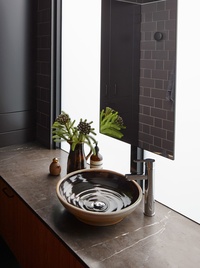
Having said that, I really had the best of both worlds working for David Howell; we were essentially operating an antipodean office out of Union Square. It was brilliant, a lot of fun. Also, it was really good for my skills because we were mostly dealing with apartment renovations – stripping an apartment out to bare walls and then basically fulfilling the design through cabinetry and finishes, so that really honed my interior skills, which complemented my architectural design-based skills I had been working on in Melbourne.
JF: Where are you most comfortable working: public or residential realm?
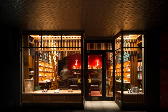
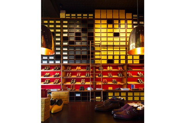
AM: You know, I’m most comfortable working with appreciative clients. That’s what excites me about having a private practice, getting to work with individuals who have a particular vision and passion for what they’re doing. That could be the very small residential Carlton Cloister project to the Double Monk shoe store, which is two brothers creating a bespoke shoe shop. That’s the main driver for myself to get into private practice, to have those relationships and to create a response to people’s drive.
JF: When you’re dealing with constrained space, then obviously the relationship is all-important. How do you set up those relationships?
AM: The way that we approach design, we always talk about it being a collaborative endeavour. We spend a lot of time at the very beginning of the design process discussing what might be precedents for the project and design directions and just discussing in more general terms what is possible for the project. So it’s quite a different response to getting a brief and coming back with a floor plan – we don’t do that. We really analyse each component of the project, and in that way, what we hope to do with the client is bring their understanding of the opportunities with the project along with ours.
Also, we don’t want to make decisions too quickly and try to put off firm decisions for as long as possible to keep things unknown. That way you’re not eliminating any possibilities at those earlier stages. Also, it means you can present things to the client without them being so invested in a particular concept. If we keep things more general and just sort of talk proposals and things to look at, we find clients are very able to then comment freely on what they like and dislike before we start on the design solution. We find that even with people who have a very definite brief or direction that it’s still worth going through that process. When we get delivered something that’s perhaps more highly defined, it’s still worth investigating each of the components that make up that project and testing the assumptions the client may have made when they’ve come to us.
JF: With the Carlton Cloisters project, the obvious solution would have been to slap something on the back of the house. What drew you away from that?
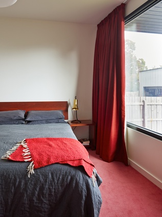
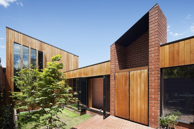
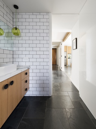
AM: There was a fairly standard brief with that project to provide a bedroom and an ensuite for a growing family and typically that would be provided on top of the living spaces. There were, I feel, a number of arguments against that. Those single-fronted terraced houses are only about five and a bit metres wide, so part of the problem is, to incorporate a stair into that plan, means you’re losing very valuable, useable area. Secondly, with the setback concerns and height requirements you end up with a pancaked space, so while you build the bedroom upstairs into a roof space, you’re setting up a downstairs living space with a flat ceiling and not a very high one. The third thing, for that particular site, is that north is to the side of the property and there were some quite good skylights getting northern light into the plan, so if we had gone up we would have actually reduced natural light getting into that living area.
JF: Was the design solution for that project relatively easy to come to, or were there several iterations involved?
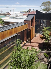
AM: The idea of doing that came early, but it wasn’t presented to the client as a fait acompli. Like I said, we like to keep all the options open, so we delivered proposals for going over the living areas and options for going to the rear of the property and looked at the advantages and disadvantages of both schemes. The disadvantage of the main bedroom being over the garage is that the parents are quite removed from their children who are at the front of the house, but, A, they were comfortable about that, and, B, you work through the balance of the arguments for and against and that was decided, overall, to be a better position, particularly in the longer term when the kids are older and more independent.
JF: Were you able, through the Cloister design, to give the clients more than they were asking for?
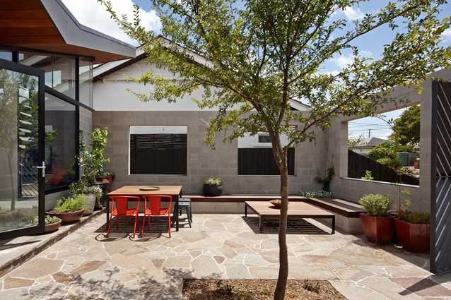
AM: They came with a minimum requirement of a bedroom and a bathroom and then through further conversations with them we learned there were other frustrations that they were experiencing with the house in terms of storage and in terms of a place for one of them to be able to get away and do their work in the house while still being part of the family, but having an ability to do that within the house. And also, just those living patterns of a Victorian terrace that are commonly plagued by poor light access, of little ability to create smaller living areas within the house and also some discussions about the garden. They really did love the garden but it was kind of an in-between space rather than being incorporated into the house.
JF: You mentioned creating intimate spaces within the plan, is that something you try to do with every project?
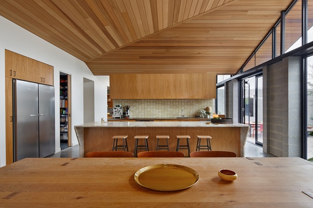
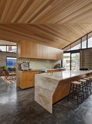
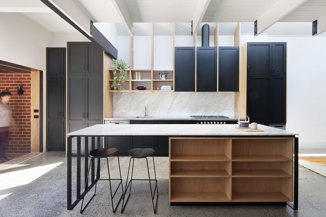
AM: It is, in different configurations. One of the things we often talk about from the outset with one of our new houses or the more typical kitchen/living extension projects is that we don’t tend to plan an open-plan, kitchen-living-dining experience, rather we prefer to create smaller spaces within that grouping for a number of reasons, but a lot of it is family life. It’s nice to be in the same space as the family but also have the ability to retreat a bit as well.
JF: In this push to open-plan living, do you think we’ve lost the art of intimacy?
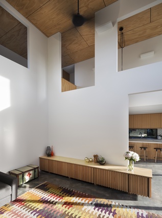
AM: I think we’ve been seduced by the plan diagram of the open-plan space and there’s this assumption that it encourages this great flexibility and I just don’t find that to be true. Often with the open plan, there’s the place where the table goes and a space where the sofa goes and that sets it up and that flexibility is gone. A truly flexible space could be quite exciting and a nice thing to contemplate, but open-plan living just sets out floor area zones for those activities and they are often awkward spaces to inhabit. It’s nice to actually create separation in those living spaces, but I also try to vary the volumetric experience in those areas as well, so there’s a varying in the ceiling height and material treatment in those spaces, which becomes harder if you’re going with just a general open-plan arrangement.
JF: So something akin to the Venus Bay Bach project where you step down from the kitchen/dining level to the two-sided lounge area…
AM: Exactly, that one was such a tight plan and probably if you laid that plan out as a single-level, open-plan living scheme, you would think the actual areas are not sufficient to support the activities that would take place there. Because there’s a change in level, it creates that sort of intimacy in the floor plan areas, which makes them work very well and then, also, as you step down, you get that increase in ceiling height as you go from the dining area through to the living area, which helps to create that sense of space as well.
JF: How do you convey a sense of warmth or cosiness?
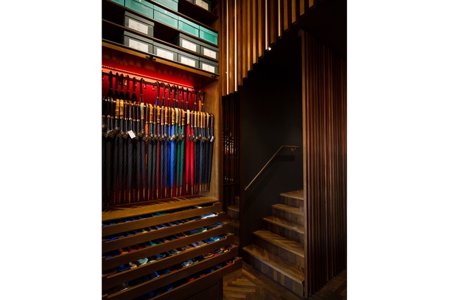
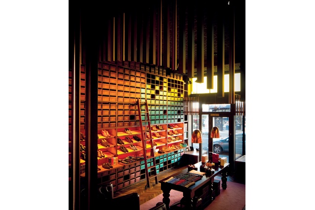
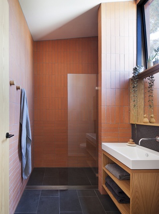
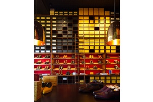
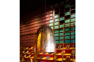
AM: The cosy spaces are often quite tight in plan. I think it’s a mistake with spaces that are tight in floor area, to think you can’t add much into them and you need to keep them white and light. There is another approach, which we use in those smaller floor-plan spaces: use texture and darkness and variation in volume, which then creates a lot of visual variety within that space, so it actually appears there is a lot more going on in there than if it was just a clean box. The Double Monk project was a good example of that. It is a small store with a beautiful, high Victorian ceiling line, but over the back counter, we actually dropped the ceiling and created a bulkhead, so we created two rooms within that one space, and then we introduced that screen above it to create visual interest.
JF: And a limited material palette – timber, felt and copper…
AM: There are logical, good modernist planning techniques in play and efficiency to the plan of that space. It’s the material palette that creates the space. As part of our initial planning phase, we like to discuss the materials that are to be used and we do like to pick, it’s almost like a material per project, that becomes the signature experience of what that project is to be. By not creating an overly complicated or busy palette, we can concentrate on the space and the materials that surround the people within it.
JF: Do you think the Double Monk material palette would translate to a residential project?
AM: Possibly. Our material selection is so much a part of that initial discussion with the client for that particular project. We really don’t apply a palette to a design that’s already completed. For Double Monk, for example, we showed a lot of images of almost Dickensian spaces and old libraries, even with that darkly stained timber, so we were presenting that material and those colours long before we were discussing the layout of the store.
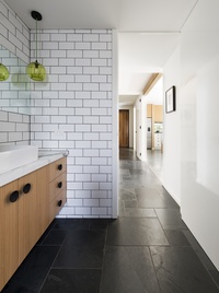
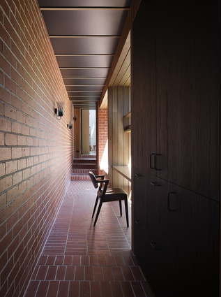
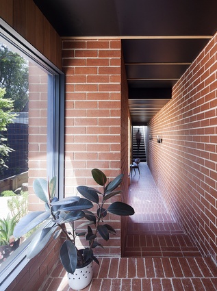
Similarly, with the Carlton Cloister project. We discussed religious, cloister-type spaces and looked at some Louis Kahn brick spaces and how they created a sense of space and intimacy through their singular use of material. With our design, it goes beyond a floor plan; we try to create a story for the project. That’s probably easier in a retail sense because the story creates the environment that complements the product. But it’s also something we try to bring to our residential projects as well. People often remark about our naming of projects – Carlton Cloister, Fairfield Hacienda, House Under Eaves – but those ways of describing the projects are central to the ways that we discuss the project with the clients.
JF: Had you always wanted to be an architect?
AM: I was always very interested in the spaces that I lived in. I always used to help out around home with the design choices and things that we were doing in the house and was always keen to be decorating my room. I had that background of being equally interested in the arts and maths and sciences, so for a long time I was considering architecture or engineering. Coming from a sailing background, I was fortunate enough to crew on a yacht with Peter Sargisson, Marshall Cook, David Mitchell and other New Zealand architects. I was helping out on the foredeck and then coming back to berth discussing the origins of reinforced concrete and that really settled it for me. The way those guys discussed and lived architecture was very appealing to me.
JF: Do you find yourself randomly critiquing the spaces you’re in?
AM: Constantly. The more I do this, the more interested I am in the social implications of the spaces we inhabit. Where I work, I have a shared office space with another architect and a furniture and lighting designer. It’s very important for my practice to actually be sharing spaces and being social. At home I live in a row of ten terraced houses and we share a common outdoor space and get along with all our neighbours, which is very important. Also, I’m one of the early supporters of the Nightingale project in Melbourne, which is developments without developers and 100 per cent owner-occupiers. Those are actually the spaces I think more of these days than the play of light on materials.
JF: Can you conceive of something you would be doing if you weren’t an architect?
AM: Not really, I’m very happy being an architect. Although, I could be a round-the-world sailor quite happily.

