Crafting perfection: Bayside Residence
This highly crafted addition to an Edwardian home by Hayball retains the existing building’s dignified formality while offering robust new spaces for celebrating contemporary family life.
The clients for Bayside Residence initially rejected Hayball’s design details because they weren’t difficult enough to build. This is an inversion of the usual parameters for successful construction detailing, but the client knew exactly what they were asking for: a return to craft. They wanted to challenge the skills of the tradespeople building the project, in a conscious counter to contemporary building practices – practices that foster mass production and streamlined assembly systems.
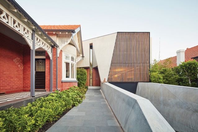
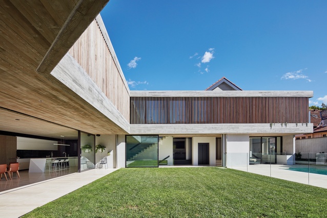
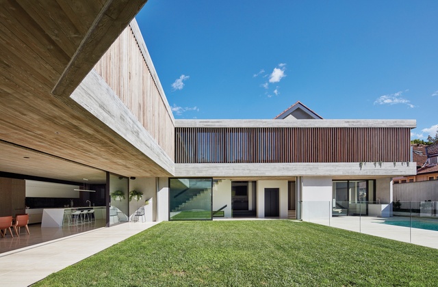
For example, the courtyard facade is wrapped by a screen of vertical louvres, but rather than partially prefabricating them in panels inside frames for ease of installation, the detail specified a direct fixing to the concrete, requiring each one to be installed individually by hand. The client was as deeply interested in the construction and assembly of the project as they were in the program and functionality of the spaces.
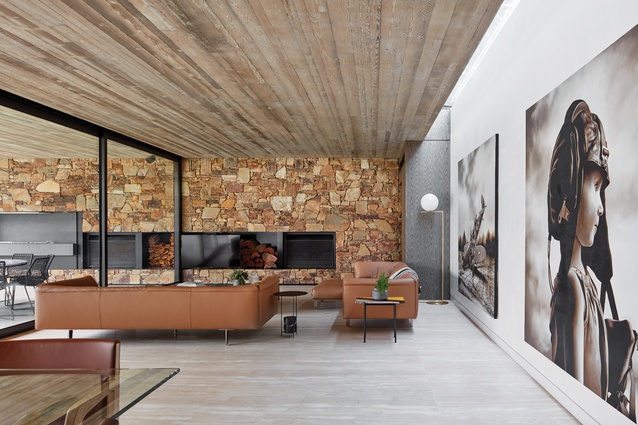
Their brief outlined a preferred palette of materials (stone, timber and concrete) along with spatial requirements (a living area that could accommodate extended family gatherings of forty people, walls to support a large art collection and a place to showcase their cars).
The client was familiar with Hayball’s history of using concrete, which goes back to the 1960s when Graeme Gunn was a partner. Today, most of Hayball’s work is multistorey housing developments and schools. Hayball takes on few individual house commissions, but when it does, the practice uses them to experiment with details and concepts that are difficult to trial in commercial work. In this sense, the brief for Bayside Residence was perfect – both the client and the architect were intent on going outside the normal constraints of construction economics.

Discoveries from education planning inform the layering of spaces in the largely open-planned house, which spans three levels, including a basement. “Each space, while connected, is unique,” says project architect Thomas Gilbert, and indeed there are moments of surprise at corners and thresholds.
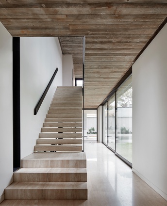
Descending to the basement reveals a far-from-standard garage – the flooring is the type preferred in car showrooms, acoustic panels attenuate the sound and a mural adorns the walls. A cinema and bar area are lit by porthole windows that open onto the walls of the swimming pool, affording glimpses of films from underwater and of swimming bodies from the bar.
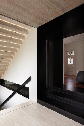
When we visited, our journey started from the existing house, which has been restored in heritage style, maximizing its contrast with the contemporary additions. The transition between old and new is marked with a wide, black steel reveal that wraps underfoot. A carefully placed wall panel, at the end of a view line down the old corridor, delays awareness of the additions until you round the corner. At this point the new light-filled courtyard, wrapped by a concrete and timber mass, is unveiled. The steel threshold also assists in the technical bridging of the gap between construction systems, from a lightweight timber structure to one of heavyweight concrete.
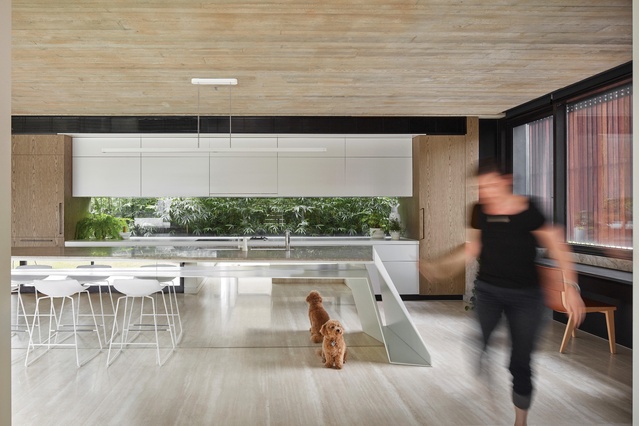
A lot of work went into the detailing to achieve subtle but powerful spatial effects, and the matching floor levels is one example. The living area floor plane was aligned precisely with the lawn and pool terrace, a seamless transition from inside to outside. The project was fully documented using BIM (building information modelling), a technology that allows the architect and consulting engineers to collaborate on a single digital model to resolve details in advance (normally reserved for larger projects).
But despite years of careful planning, the on-site experience and dialogue between the trades, client and architect fostered spontaneity and improvisation. It was almost as if the BIM model and the copious details resolving the design were set aside once construction got underway. “New shop drawings were done by hand on a beer carton at one point,” says Thomas.

In a parallel to the BIM process of detailed advance planning, the process of making an in situ concrete structure involves an extended period of preparation. The placement of infrastructure is critical – once the concrete is poured around it, there is no changing it. The pour itself is relatively quick: it took three months to assemble what is essentially sacrificial timber joinery and just a few days to pour the concrete. Even so, nature managed to intervene – a rain shower just prior to the pour stained the white concrete with tannins from the wood.
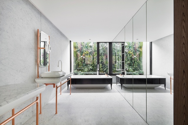
The colour change prompted a switch from white marble floors to a warmer travertine. The timber louvres were allowed to grey off, slowly merging with the colour of the concrete. A white rubble wall at the end of the living space was changed to a mix of browns, bringing it closer in look to the classic 1950s modernist crazy paving. One maple leaf made it inside the formwork to be immortalized in the concrete ceiling, but in general the level of perfection is impressive.

At the time of writing, the clients had been living in the house for eighteen months and were very happy – but how could they not be? They were intimately involved in the process, orchestrating a challenge for the designers and builders, and bearing witness to a form of architectural entertainment.
Does the process of its making have any effect on the function of the house? The robust, tactile materials and flowing spaces of Bayside Residence are, in the end, a facilitator and backdrop to family life. Nevertheless, there is a narrative embedded in the details that will go on telling its story for many years to come, to whoever is interested in “reading” it.
This article was first published on ArchitectureAU.com.

