Creative Arts Building – Te Ara Hihiko
Many an architecture critic will tell you that, on receiving a press release emblazoned with the words: ‘leading’, ‘award-winning’, ‘state of the art’ or ‘a world first’, they send it straight to Trash. These catchwords are now so ubiquitous as to render them meaningless. But, for once, it seems that we do have a first, although it is slightly complicated to describe. But more on that later.
The project – Athfield Architects’ new Creative Arts Building or Te Ara Hihiko, part of the College of Creative Arts (CoCA) at Massey University Wellington’s campus – is, quite frankly, long overdue. I say this with some experience. Back when The Stone Roses were in every design student’s vinyl collection and despite the excellent teaching, I endured several Wellington winters being taught in drafty prefab buildings on that poorly laid out Mount Cook campus. During this period, the creative arts weren’t as elevated in status as they are now; there was no such thing as a degree in many subjects and the school was known, more prosaically, as Wellington Polytechnic. It is, therefore, an extremely fortunate bunch of design students which is to be pulled out of its prefabs to discover the joys of ‘proper architecture’ – you know, joyful spaces created with purpose and consideration. Oh, and heating.
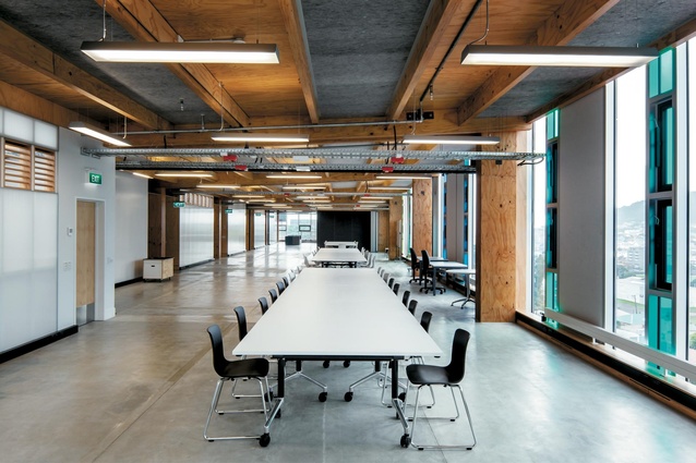
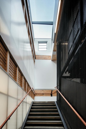
The students and staff are about to inhabit two 52.7m-long design studios and take in the panoramic view of the surrounding hills – the Town Belt which runs between Mount Victoria and Alexandra Park – which is all-the-more enhanced by glass panels in oceanic shades of blue and green. A preference for wood throughout lends warmth and homeliness, an art-clad grand main entrance cum gallery welcomes you in, bold typography adds youthful vigour, the double-height central atrium provides drama, the mezzanine features sculptural David Trubridge lighting, and walking on the stairs you are enveloped in the Wellingtonian mesh known as Kaynemaile. Te Ara Hihiko is almost too cool for school. But perhaps I’m just a little envious that I was a couple of decades too early for this kind of education.
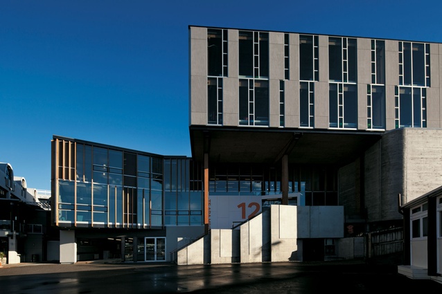
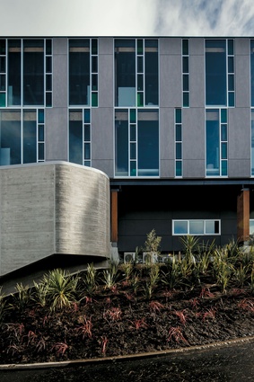
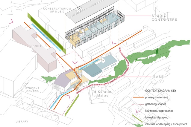
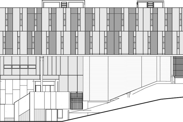
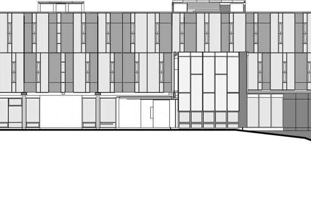
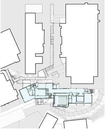
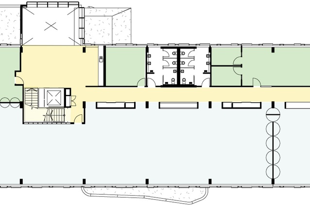
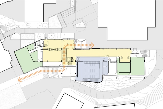
Covering 3,600m2 over four levels, Te Ara Hihiko is designed to provide CoCA’s visual arts and fine art students with new gallery and studio space, in addition to a main lecture theatre, workshops and a green space for film-making. Athfields Architects’ major triumph is the improved circulation across the overall site, pulling together a random hotchpotch of buildings. Set deep within the campus, Te Ara Hihiko picks up the Te Ara grid by stepping the structure down the contour of the hill from the direction of the National War Memorial, north to south, providing a circulatory hub for the rest of the campus and connecting the upper and lower terraces. CoCA’s relationship with the hill aids in breaking down the large mass of the building, which is further diminished by the vertical lines and colourful glass on the façade.
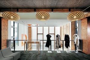
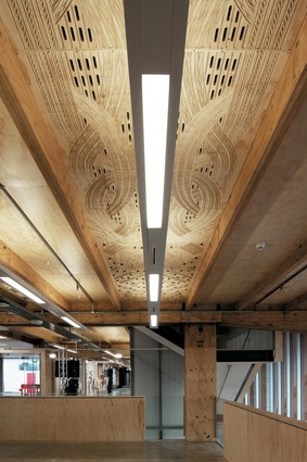
The generously scaled gallery space doubles for circulation and leads upstairs into a multi-purpose function, reception and congregation area. Unfortunately, my visit came too early to view an acoustic ceiling and soffit artwork by artist Jacob Scott. However, I’m told that it is a Maori design based on the concept of Te Kore or ‘the world beyond’, and is intended to create a dialogue between the popular Te Kuratini Marae next door and the mana whenua (history and power of the land). As well as the building’s connectivity with its neighbours and relationship to place, it is clear already that ‘super’ flexibility and adaptability are prerequisites, in preparation for new usage possibilities further down the line. This central core area also links into a theatre and various smaller studios and offices. A mesh-clad stairwell leads you up into the rectangular studios; these are epic spaces which can be broken up with furniture and dividing panels that clip into the joists. The construction is robust and raw, with exposed joints and fixings and it is here that the building’s ‘world first’ is evident.
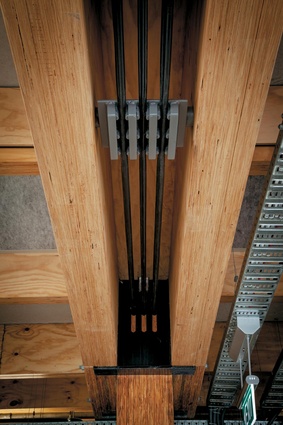
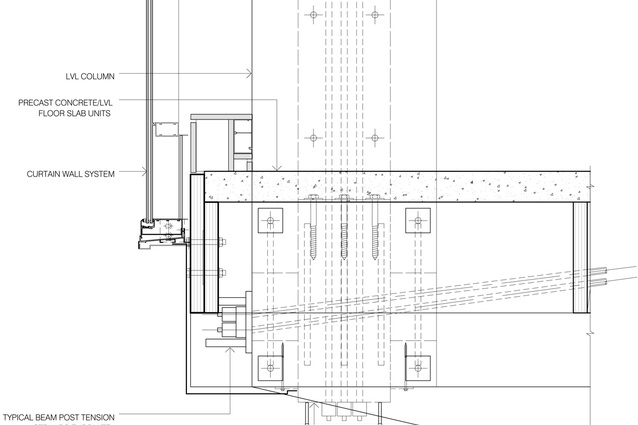
Te Ara Hihiko’s claim can be found in its use of several combinations of earthquake-resistant materials in a multi-storey building, which is where it gets hard to describe. Apparently, it is a ‘global first’ within a multi-storey in its use of a Laminated Veneer Lumber (LVL) structural frame, which is designed in components that are bound together by tensioned steel cables. So, basically, the columns are all rock ’n’ roll during an earthquake but the cables pull the structure back into its original upright position afterwards, without damaging the joints, only areas that can easily be replaced. Known as Pres-Lam, this structural system is an adaptation of the innovative PRESSS (pre-cast seismic structural system) but, instead of concrete, it incorporates LVL. The other clever element used is the lightweight, prefabricated composite timber/concrete floor units, which are efficient in terms of depth, span and installation.
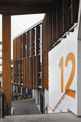
I was fortunate to be given a tour of the building during its construction by Ath and another project team member, Chris Winwood. I was expecting the usual celebratory spiel about the project, so it was refreshing to receive a rare show of frankness about faults within the building. However, to my mind, these are neither here nor there in the grand scheme of a well-considered and joyful design: a few detailing issues mainly, certainly nothing for a homesick student to write home about. There is no access onto an inviting green roof, because the deck was dropped from the scheme. And, the slightly plainer lower ‘container’ of the building is a little put out by the dedication instilled into the seismic gymnastics performed in the upper floors. But these spaces are mostly intended for workshop and film-making, so ‘robust’ and ‘functional’ is appropriate. And, here, the timber rain screening is very successful, with a similar vertical geometric pattern carried on throughout the scheme, including on the carpet.
So, having been given the ‘latest’ in technology, architecture and design – are these students just a bit too spoilt? Shouldn’t they be treated mean and kept keen – necessity being the mother of invention and all of that? Should they be sent back to the prefabs to see what they are made of? Or will exposure to inspirational architecture raise their spirits, aspirations and expectations and, better still, their talent? Either way, I’m absolutely certain that, within an increasingly competitive education sector, CoCA is sure to win a great deal of attention and admiration from local and international students, and beyond.

