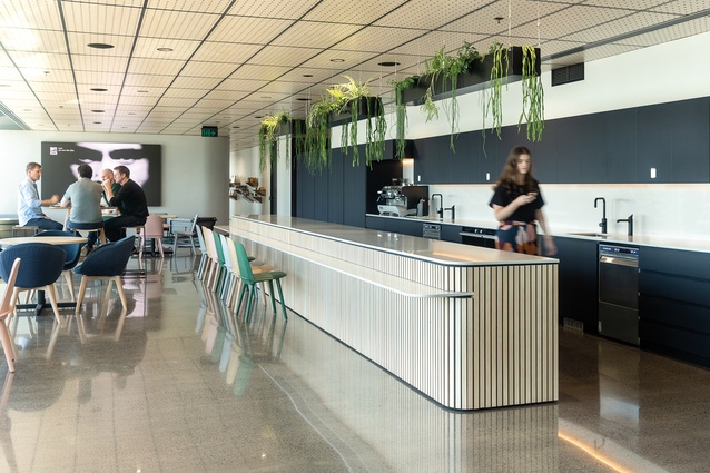
Creative chemistry: DDB Group

Click to enlarge
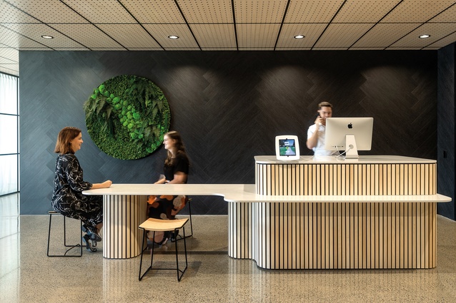
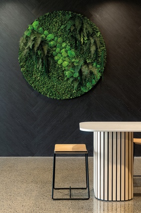
In the lobby of DDB a ‘welcome kiosk’ is positioned against a black herringbone vinyl feature wall.

In the lobby of DDB a ‘welcome kiosk’ is positioned against a black herringbone vinyl feature wall. Image: Michelle Weir

1 of 13
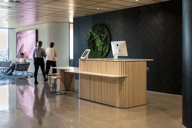
The welcome kiosk acts as a greeting point for visitors and is no longer attended by a receptionist.

The welcome kiosk acts as a greeting point for visitors and is no longer attended by a receptionist. Image: Michelle Weir

2 of 13
Exposed plywood staves line the kiosk’s exterior, giving it a sense of warmth and informality.

Exposed plywood staves line the kiosk’s exterior, giving it a sense of warmth and informality. Image: Michelle Weir

3 of 13
The warmth of ply is contrasted with black aluminium joinery, which runs throughout the design.

The warmth of ply is contrasted with black aluminium joinery, which runs throughout the design. Image: Michelle Weir

4 of 13
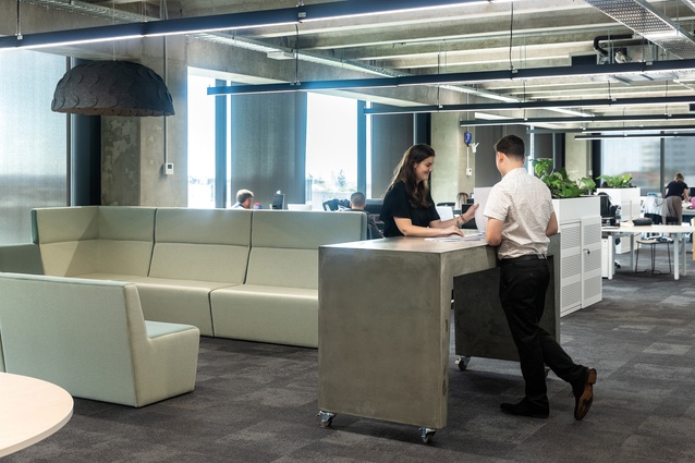
The colour palette was inspired by trends from 
Salone del Mobile 2018 and includes mint greens and muted pastels.

The colour palette was inspired by trends from Salone del Mobile 2018 and includes mint greens and muted pastels. Image: Michelle Weir

5 of 13
This meeting lounge features Tim Webber <a 
href="https://timwebberdesign.com/products/walker-chair"style="color:#3386FF"target="_blank"><u>Walker chairs</u></a> and a <a 
href="https://timwebberdesign.com/collections/sofas/products/walker-3-seater-sofa"style="color:#3386FF"target="_blank"><u>Walker sofa</u></a>, lending a homey feel to the space.

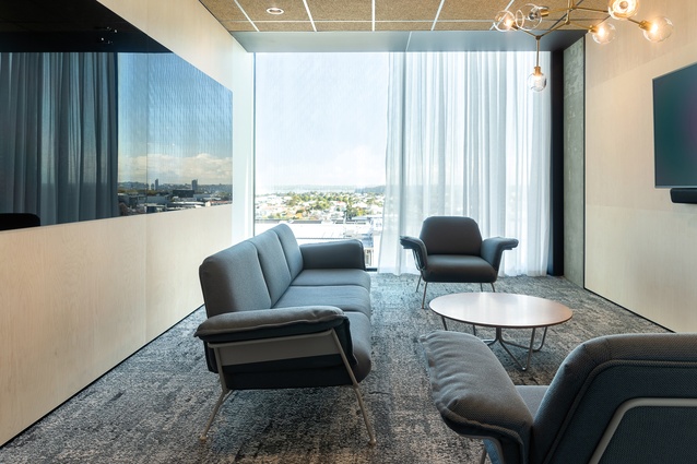
This meeting lounge features Tim Webber Walker chairs and a Walker sofa, lending a homey feel to the space. Image: Michelle Weir

6 of 13
The boardroom, located on DDB’s upper level, was positioned there specifically in order that it could soak in the best office views.

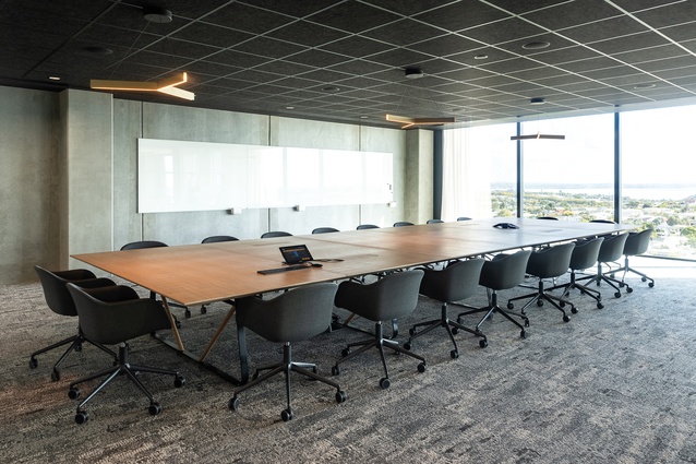
The boardroom, located on DDB’s upper level, was positioned there specifically in order that it could soak in the best office views. Image: Michelle Weir

7 of 13
Clients walk through the social hub to get through the boardroom, which designer Kevin Russ says makes you feel "part of the business before you arrive..."

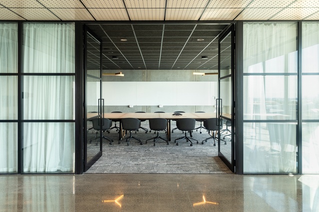
Clients walk through the social hub to get through the boardroom, which designer Kevin Russ says makes you feel “part of the business before you arrive…” Image: Michelle Weir

8 of 13
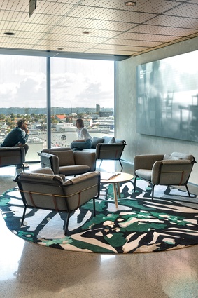
The informal client lounge features a large <a 
href="https://www.designerrugs.com.au/collections/monarch-by-boh-runga/"style="color:#3386FF"target="_blank"><u>Monarch rug</u></a> by Boh Runga.

The informal client lounge features a large Monarch rug by Boh Runga. Image: Michelle Weir

9 of 13
Though each department is housed within its own space, there is opportunity to reconfigure spaces to suit changing needs over time.

Though each department is housed within its own space, there is opportunity to reconfigure spaces to suit changing needs over time. Image: Michelle Weir

10 of 13
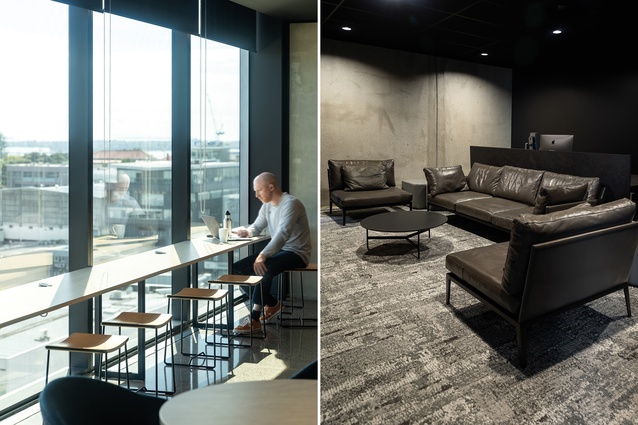
Armchairs and a sofa from <a 
href="https://simonjames.co.nz/"style="color:#3386FF"target="_blank"><u>Simon James’</u></a> Archive collection can be found in the more-relaxed, dark production and edit suite, which houses photographic and recording suites.

Armchairs and a sofa from Simon James’ Archive collection can be found in the more-relaxed, dark production and edit suite, which houses photographic and recording suites. Image: Michelle Weir

11 of 13
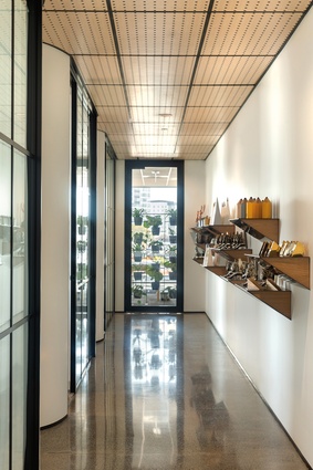
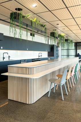
Finnish birch plywood brings in warm accents by way of ceiling, joinery and wall details.

Finnish birch plywood brings in warm accents by way of ceiling, joinery and wall details. Image: Michelle Weir

12 of 13
The two floors of the workspace are unified by many of the same soft furnishings, which were selected predominantly from New Zealand designers and take in a soft palette of warm colours.

The two floors of the workspace are unified by many of the same soft furnishings, which were selected predominantly from New Zealand designers and take in a soft palette of warm colours. Image: Michelle Weir

13 of 13

A long-established advertising agency has taken a fresh new approach to collaborative space.

The cliché is for advertising agencies to lean towards a Google-esque aesthetic: ping-pong tables, slides and pops of neon are what automatically come to mind. But DDB, one of New Zealand’s oldest and largest advertising agencies, was after a fresh approach.

Its new space, which spans two floors in a building that takes in spectacular views of Auckland’s Upper Harbour, connects the 250 staff members in a sophisticated and collaborative environment.
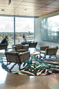
The informal client lounge features a large Monarch rug by Boh Runga. Image:  Michelle Weir

GHDWoodhead creativespaces design director Kevin Russ says: “The desire here was to be more refined and represent all the work groups within the agency” and the new approach is evident immediately in the light-filled reception space.

A curved kiosk welcomes guests to sign in unassisted, while also providing a barrier to the back-of-house area. The adjacent social hub is the obvious place to sit and wait for a meeting, or work after a meeting (some clients never want to leave), and the conviviality of the space means any division between staff and visitor is transcended.  

The full-height glass windows in the hub showcase views of Kauri Point and the Upper Harbour right through to the Waitākere Ranges (on a clear day) and flood the space with light.

When negotiating the layout of the upper floor, the placement of the boardroom was a priority, given that it is this space that clients are most likely to frequent.

Therefore, locating it in the prime corner position with the best outlook was self-evident but the psychology of leading clients through the social hub to arrive there is unique, says Russ.

“You already feel part of the business before you arrive there, rather than being led down a corridor. That openness is a really nice way of working – a lot of corporates wouldn’t go that way.”

In back-of-house, each of the finance, planning, creative and human resources departments has its own open-plan space. But despite it not being an ‘agile’ office, there is opportunity to reconfigure spaces to suit changing needs over time.

During the design and build period alone, the brief changed from a 2400m2 space for 220 staff members to a final staff count of 250 come move-in day.

The boardroom, located on DDB’s upper level, was positioned there specifically in order that it could soak in the best office views. Image:  Michelle Weir

With these types of fluctuation in mind, the furniture was chosen for versatility and the workstations, designed by McGreals, were reduced from two metres in length down to 1.4 metres. 

“The square metres per work point would be incredibly efficient,” says Russ, especially considering the huge amount of space the full production suite takes up on the downstairs floor.

In its former offices, the production team was scattered over five floors but, in the new space, having all of the team members work on one floor was a priority. The solution was to create a kind of creative cave – a full production suite with photographic and recording studios.

It’s where clients come to see their ads during or post production, and the aesthetic of the entire floor has an industrial feel, with exposed services, steel, glass and robust finishes. It’s essentially the engine room to facilitate DDB’s creative arm and the energy is dynamic and busy.

It sits in direct contrast to the upper floor, where acoustic ceiling panels soften the space, the colour palette is lighter and curved walls cocoon the staff.

However, the two floors are unified by many of the same soft furnishings, which were selected predominantly from New Zealand designers and take in a soft palette of warm colours.

The two floors of the workspace are unified by many of the same soft furnishings, which were selected predominantly from New Zealand designers and take in a soft palette of warm colours. Image:  Michelle Weir

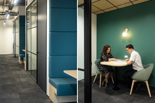
A symbiotic relationship between the various collaborating sections of the business is also evident in the great uptake of communal workspaces, including numerous booths and small conference spaces.

Achieving good chemistry between departments and people is central to DDB’s philosophy. Instead of an initial ‘pitch meeting’, GHDWoodhead was asked to come for a ‘chemistry meeting’. It’s an uncommon approach to building relationships between businesses but it’s one that GHDWoodhead has taken on board in its own practice.

So, was the chemistry any good? Russ says the match between the two creative agencies made for a harmonious design process and it shows in the way members of staff are taking ownership of the space: “it’s because you have that connection of ideas, it’s much easier to ‘get’ each other”.

This article first appeared in Interior magazine.

Subscribe here


More projects