Crisp and coastal
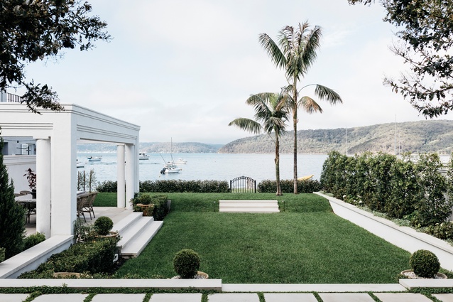
The Mediterranean meets the Pacific on a grand scale in this luscious Australian duplex.
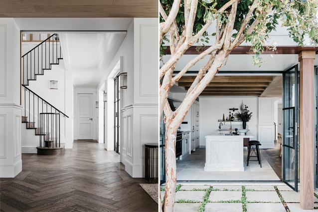
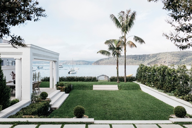
A sense of sophistication and a lightness of being means that, at first glance, this could be a modern-day apartment on the Med. But where olive trees should shade the courtyard, a crepe myrtle drops blooms onto concrete tile – and it’s not classic Riva launches that await the next play date on the waves but sleek-hulled Palm Beach motor yachts.
On a good day, it takes a little over an hour to drive to this exclusive enclave on a peninsula in Sydney’s northern beaches. In this playground for boaties, there is surf on one side and the harbour on the other. With views towards Ku-ring-ga Chase National Park, this is the quintessential Aussie holiday escape: Home and Away is often filmed on these very shores.
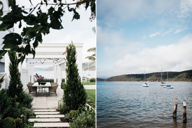
So when architect and interior designer Jeremy Bull of Alexander & Co. was asked to completely remodel this two-level ‘80s duplex for a professional couple with one child, his first thought was to create spaces that framed the romantic location. Although the dwelling’s concrete structure was substantial and fittingly grand, the rooms were small. The layout also did not properly embrace the home’s waterfront position or its internal garden.
“The house was under-scaled. There were low ceilings and doors – and no discerning finishes,” says Jeremy. What began as a simple plan to refit the interiors turned into a stripped-to-the-bare-bones project where only the original masonry skin and slab remained. “It was never our ideology to move in with a jackhammer, but we realised the spaces needed a clearer programme.”
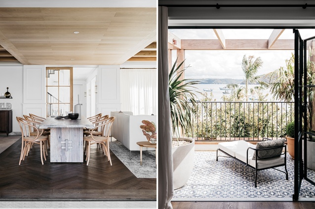
Almost every single wall was demolished before some were rebuilt for better room flow so the clients, a sociable couple who love to entertain, could host visitors in the open-plan living, kitchen and dining zone and, if desired, move effortlessly into the garden.
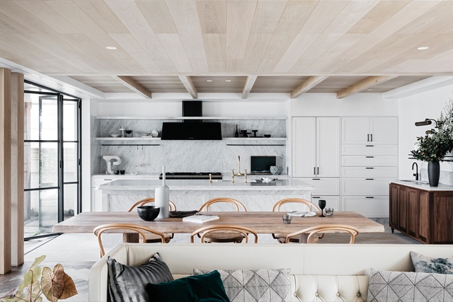
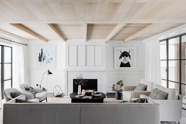
Constrained by the existing 2.4-metre ceiling, the designers accomplished spatial illusion by installing full-height glazing and doors. Jeremy says that simply texturing the ceilings made them seem loftier. “Coffering them amplifies the scale,” he explains. Soffits now run flush from inside to out, bringing continuity to the visual experience.
The result is that, although nothing has been added to the footprint, the volumes feel expansive and more connected. Within the re-planned shell, the team had carte blanche to start from scratch. They rebuilt the kitchen and bathrooms, the stairwell and fireplaces.
Jeremy says his clients are meticulous individuals, and their request for a European-inspired feel was carefully considered by the Alexander & Co. studio. They might very well have suggested a different pathway if the house itself did not have a European sensibility in its DNA. Its pale masonry, colonnaded porticos and timber double-door entry lent authenticity to the idea. “But while we tried to create something European in flavour, it is cleaner and more youthful,” says Jeremy.

For inspiration, they turned to the master of sparse opulence, Belgian antiques collector, curator and interior designer Axel Verwoordt. “There were many discussions about the way he expressed texture and created a patina where really there was none.”
The bespoke and the crafted became key criteria for selecting finishes and furniture. Imported oak flooring was turned into marquetry by local craftsmen, engineers custom-made steel-framed joinery and doors and pendant light fittings were designed with the same ‘cross in a circle’ motif that appears on the original black timber front doors.
Within the yin/yang palette of white walls and pale timber ceilings set against dark-oak flooring and black steel joinery, the owners were keen on a ‘lived in’ atmosphere that had a sense of place and history. The conundrum of this design is that although the visual impact is streamlined and serene, many effects are packed into the minimal look.
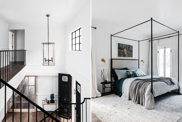
Those white walls are not merely painted but textured with marmorino stucco; upstairs the ceilings are lined with boards, and the flooring changes pace and pattern depending on the function of the room. “The challenge was amidst such dense texture to keep the feeling serene.”
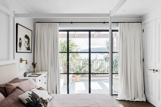
Moments of decorative magic are abundant, from the steel four-poster, which holds a headboard and frames an artwork above it, to the tactile simplicity of white sandstone pavers in the garden or the cool, rich formula of Carrara marble tile in the bathroom offset by brass shower heads.
Even Jeremy Bull is not immune to such engaging embellishments. When his interiors team drew up a wardrobe upholstered in felt with a brass edge, he acknowledged it as “a beautiful thing”. “As a guy who focused purely on architecture for the first six years of my career, it’s wonderful to find myself enjoying it as a surprising but lovely moment.”
Design success, of course, should never be judged purely on its aesthetics, but by rational and practical measures. The restrained approach to the top-to-toe transformation of this holiday home feels cohesive, and it works. Although the quality fittings and exemplary detail came with expense, the owners were willing to invest to achieve a level of intricacy.
“This project was never done as a capitalisation proposition,” says Jeremy. It was meant to please. The couple can now entertain groups of family and friends, have guests to stay – and even many kids since there’s a dedicated bunk room.
Alternatively, they can find joy in a quieter connection to place, looking out to their boat in the harbour or engaging with the beach as they watch dog walkers from the upper floor balcony. This is luxury in the everyday. “The house has a sense of calmness that’s really special,” says Jeremy.

