Critique of the unbuilt
Unbuilt design demands two key things: one from the designers, and one from the community of critics. For designers, the challenge is one of effective representation and communication; and for the critics there is a need to meaningfully engage with the representations before leaping to a judgement. This needs to be a pact, in which both sides of the conversation fulfil their obligations to one another. Without this mutual understanding, communication and critique talk past one another, each asserting a position but without speaking clearly or listening carefully.
As the city goes about the rebuild, Christchurch is overrepresented in the number of unbuilt proposals that make their way into the public realm – proposed projects are shared online and in print media. This flood of unbuilt works is met by the rising-up of a public with a heightened interest in the design of their city. Before the earthquakes, there was little debate beyond the design community; but now there are many groups involved in imagining the city’s future from a range of perspectives. Expanded debate is a positive outcome for the city, and the mix of voices is heartening. The downside is that many of the voiced comments are resoundingly negative, and also indicate a lack of understanding about what is being proposed.
One response to the misunderstandings might be to aim for increasingly realistic renderings of unbuilt works in an effort to leave no doubt in the critics’ minds. However, as landscape architecture academics Katy Kingery-Page and Howard Hahn ask: “Just because designers can create incredibly realistic virtual landscapes, should they?” Their caution relates to some of the consequences of ever-more-realistic renderings. They warn that hyper-realism can have a dulling effect on perception, and can even suggest ideals to the audience that are simply not possible, and therefore misleading. The potential to mislead is supported by the increasing ability of digital rendering to manufacture atmosphere and mood. Renderers are able to carry out a sleight-of-hand, in which otherwise dull imagery is given a virtual makeover.

During his recent lecture in Christchurch, Jacob van Rijs of Dutch architecture practice MVRDV talked about the idea of a ‘happy filter’ that could be put over images, and showed an example of a grimy city image magically transformed into a place of light and colour. The tongue-in-cheek terminology of ‘the happy filter’ came from a firm of architectural renderers who claimed they could make any project look good.
So, while seducing the viewing public leads to potentially unethical deception, the efforts to be precise and clear about what is proposed require specialist skills in interpreting drawings. Lay people often have no sense of how to read a plan, section or elevation. Scale and materiality can be difficult to discern from renderings. The knee-jerk reaction is inevitably to assume an understanding, usually based on some other known landscape or building.
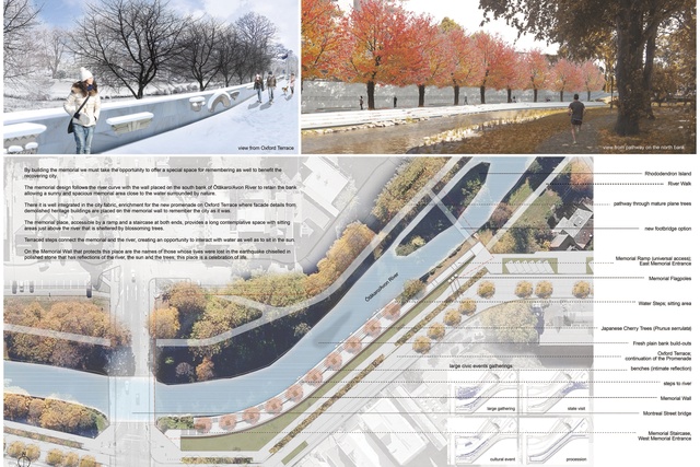
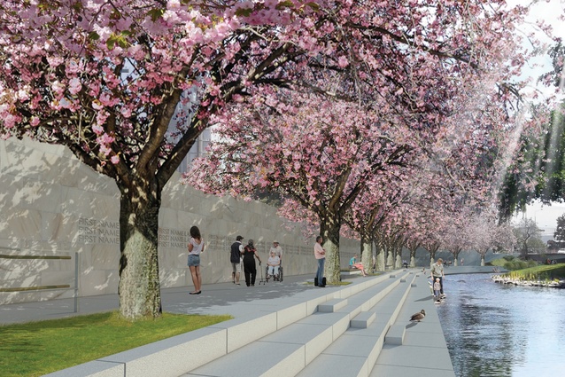
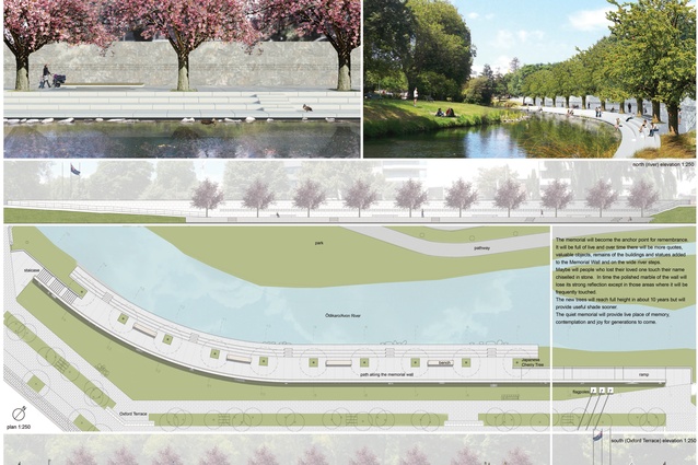
The drawings here are of the proposed Canterbury Earthquake Memorial for Christchurch, to be built on the banks of the Avon River near Montreal Street. The competition attracted over 300 entries from more than 30 countries. Slovenian architect Grega Vezjak’s winning entry is based on a memorial wall set into the river bank on the north-facing river bank. Bringing people down to the river’s edge would afford a whole new view of the landscape in this part of the city, with a panorama extending over a broad arc up and down the river.

However, the anonymous online critics did not always understand what was proposed, and criticised the wall for blocking views of the river – despite the fact that it is below road level, with only the balustrade at footpath level. Other misunderstandings were about funding, with the presumption that building the memorial would mean other essential projects would be prevented.
This is a common misunderstanding in online critique, fuelled by the misconception that everything being built is funded from one common pool of money, rather than being specifically tagged to different projects and coming from different sources. Alongside this fallacy is the disbelief over how much things will cost to realise, and therefore everything from replacing the public library to repairing city parks is seen as being outrageously expensive.
The situation in Christchurch throws the dynamics of the criticism of unbuilt works into sharp relief, aided by social media which allows rapid and anonymous criticism. This emphasises the onus on designers to communicate as clearly as possible, and for critics (in the broadest sense of the term) to make the effort to fully comprehend a proposal before making a judgement. Like that great line from Bob Dylan, ‘Don’t criticise what you can’t understand…’


