Culinary theatre: Kitchen Things
A new showroom for eight, high-end appliance brands uses design detail to create a truly immersive and tactile retail experience.
The experience centre-styled retail showroom is nothing entirely new and in the high-end appliance sector it is becoming the norm rather than an anomaly.
Manufacturers such as Miele, Fisher & Paykel, Bosch and the like have, for years and with varying degrees of success, been trying to create hubs where customers can test drive as many of their appliance features as possible in live, actual cooking conditions that can replicate the full prowess of their wares.
The working-kitchen-styled showroom is a reaction, perhaps, to the lack of tactility in the e-stores. These brick and mortar spaces have hoped to become a complete antithesis to the digital shopping platform, increasing the possibilities for costumers to indulge in the scents and tastes, the feeling of materials, the highly visual and social stimuli that cooking is capable of offering.
Kitchen Things – the retail subsidiary of the 32-year old, New Zealand appliance-industry Jones Family Business – opened its Luxury Collection Showroom in the heart of Auckland’s Newmarket last August.

The elongated, 900m2, former mechanical engineering workshop acts as experience centre for multiple appliance brands and complementary furniture, tapware and bathroom specialists. Their list of suppliers reads like a who is who of the high-end market and includes European and North American offerings such as: Smeg, Miele, Gaggenau, Asko, Neff, Bosch, Wolf and Sub Zero from the appliance sector and complimentary products from Design Denmark, Artceram, Zucchetti, Samuel Heath and Grohe.
The immediately obvious interior challenges to such a grouping include not just how to prevent the space from looking like a glorified warehouse, but how to retain divisions and offer enough variety between competing brands while preventing each from shouting ‘buy me!’ in too loud a fashion.
“It was all about being refined and not braggish,” confirms Matthew Godward of Godward Designspace, the firm entrusted with coordinating the design of the showroom, “letting the luxury of the appliances speak for themselves.”
Godward, who often refers to this project as a “jigsaw puzzle,” was in charge of, among other things, creating parameters for the more than eight separate design teams in various corners of the world who had to design cabinetry and working display kitchens.

“We were fairly clear from the start about what we wanted from them. We did a number of visuals and mock-ups to guide people as to what the place was all about,” Godward says. He admits the difficult process required significant communication, reviews and some re-designs to achieve the right mix between brand exposure and a somewhat refined subtlety.
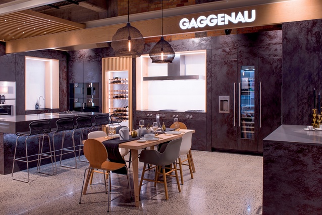
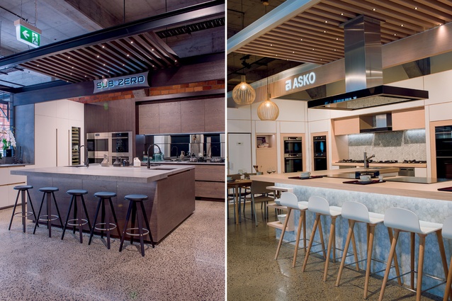
One of the main, unifying moves here included compart-mentalising the showroom into smaller alcoves that provided individual tenancies to each manufacturer without blocking sightlines to any of the adjacent ones.
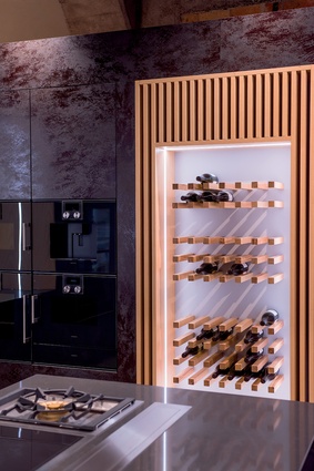
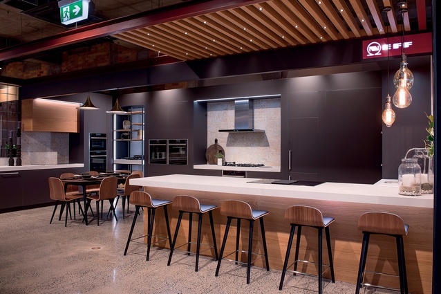
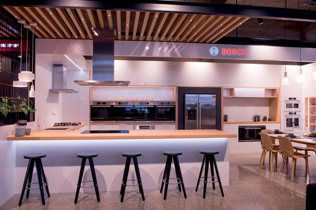
These alcoves were defined by custom made, open, coloured steel frames with overhead timber lattices. The move brings the ceiling height down and creates a sense of intimacy and cosiness over each of the showroom’s eight display kitchens. The plan is that at some stage, greenery will grow over some of the steel further cementing a domestic vibe here.
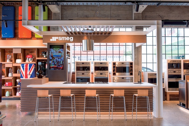
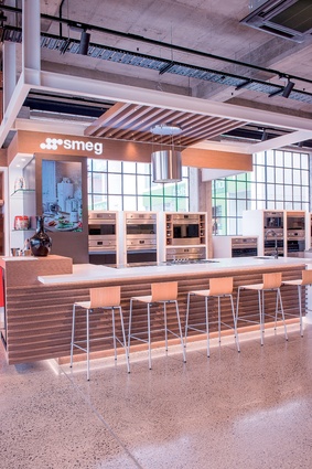
The glass-clad front of the showroom is dominated by a small waiting area with a concierge-styled attendant and, to the left, the largest of the tenancies (Smeg) which was also fully designed by Godward. Here different families of cabinetry were custom made to enhance three collections of appliance.
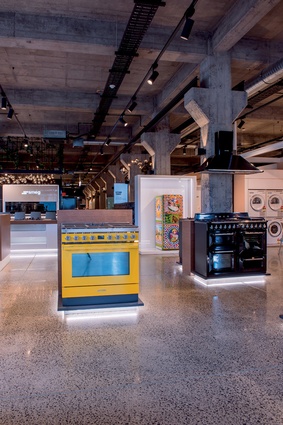
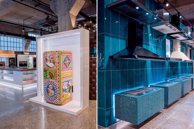
A subtle, timber version aims to let a colourful, retro inspired collection shine; a more streamlined and a black version hope to allow more classic and a luxury range to take centre stage. Godward also devised a set of art gallery-like plinths varying in heights and accommodating various sizes of appliance. The plinths are white lit from below, a solution that, on the glossy concrete floor, creates an island or floating-like effect.
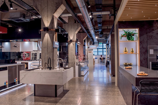
Another challenge encountered by the designers in this building was a large number of structural, concrete columns which dominate the centre circulation.
“Typically, retailers don’t like columns. They like open spaces,” confers Godward, “given that you can’t move them, our feeling was that this space wasn’t going to be about open space… it would be about discovery… about little peek-a-boo areas and revelations.”
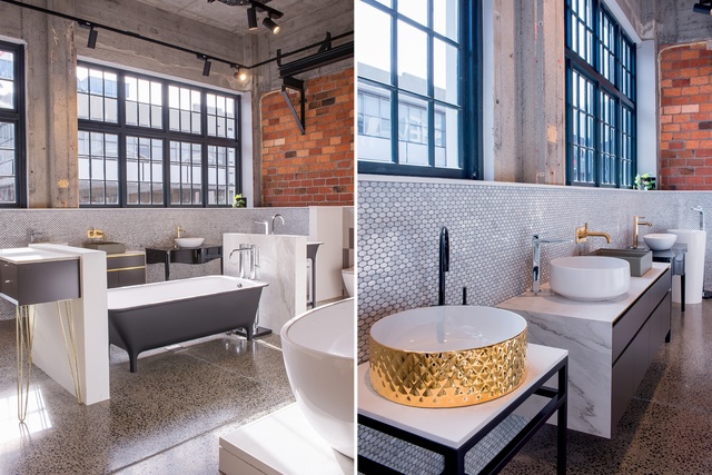
With this in mind, the designers used the columns as display units, affixing wash basins around them, often relishing their utilitarian aesthetic through lighting that complements the porosity of the material and the ‘old European train station’ aesthetic.
The concrete and brick walls were sandblasted back to their original state, new flooring was put in to include all the services of data, electrical, gas and water added underneath to allow the eight kitchens to operate.
The result of all these moves is a highly tactile environment, one that, although busy, offers nooks and crannies, moments of spatial and visual rest and a beautiful solution to a complex brief that is part interactive exhibition, presentation theatrette and social hub.
The ‘experience-centre’ component of this showroom has gone a step further than most of a similar ilk by accomplishing the co-habitation of several, competing brands, each with a fully working display kitchen and with a very robust schedule of events, cooking demonstrations and subtle enough sales pitch to make the space comfortable and highly tactile for potential costumers.
Client brief

Rachel Louie – Executive Director
Jones Family Business
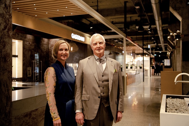
Rachel Louie, along with her father Mark Jones, are the main clients behind the new Kitchen Things Luxury Collection Showroom. Here, Louie explains some of the research, aspirations and designer brief for this project.
Interior: What was the catalyst for this type of retail space and what led you to believe that the New Zealand market is ready for it?
Rachel Louie (RL): The last five years has seen an increase in international wealth to New Zealand as well as seeing Kiwis becoming more and more brand conscious. Making international trends accessible in our country was becoming a high demand. As we see more and more homes being built in the multi-million dollar bracket, Mark could see that the market was ready for additional brands in the luxury space, and a brand new way of shopping for them. The showroom is a new concept in retail that has been in the works for many years, but we were wise to wait until the New Zealand retail landscape was ready before we realized our dream.
Interior: Were there retail spaces overseas that you admire and that served as inspiration for this?
RL: We spent many years studying appliance and retail trends across the globe. We visited retail showrooms, luxury showrooms, high end product, furniture and grocery stores to understand important trends and to consider what the future may look like in New Zealand. The showroom pulls inspiration from pioneering retail spaces in America, China, Singapore, Italy and Australia, modified to serve the unique Kiwi lifestyle.
Interior: What was your initial brief to Godward Designspace?
RL: It was very important for us to break down ideas of traditional retail spaces, and to convey a luxury experience in every aspect of this showroom so our original brief was very detailed around that concept. We asked our architect, Matthew Godward, to conceptualise the ultimate space for designers and architects to bring their clients, and to create an award-worthy space in terms of architecture and the experience within it. Matthew delivered an overall design and look that each of our international appliance brand partners would need to work within to ensure this luxury collection showroom vision can be realised.
Interior: It is a fairly daring undertaking to ask these very distinct companies to adhere to strict design guidelines being stipulated by you. What made you think it would work?
RL: Working within a new concept presented some challenges as each brand has their own corporate identity and are used to using a consistent, standard design approach. We asked for these boundaries to be breached with a look that creates intimate spaces and showcases our partner products within each space. The showroom breaks down traditional ideas of retail, so ensuring that these brands understood the sturdiness of our concept was paramount in securing their buy-in. They understood that the luxury sector was in search of a different experience and embraced our ideas of a combined experience center as the right solution.
Interior: How do you see the space being used in the future, what is your best-case-scenario in terms of activating the space?
RL: We have an events team that will oversee all events to ensure the use of the space meets our guidelines. However we are also encouraging all of the brands and our connected celebrity chefs to explore new and interesting opportunities for events. Therefore we see the events evolving every quarter with new and interesting opportunities to be developed.
This is a place where designers and architects can bring their customers to get inspiration for their home. Our research has found that customers don’t want to have to go from showroom to showroom to be able to look at products for their home so we see the specifier, designer and architect community utilising this space as a meeting place to talk through their customer’s project.
So far we have been approached by other luxury brands looking for experiences for their customers so collaborations of events are a natural progression. Whether it be luxury cars, fashion, magazines and jewelry the interest has been high.
We have also had many chefs approach us on how they can utilise the space for pop-up dinners, testing of recipes in the experiential kitchens, and as a location for videoing recipes. Having celebrity chefs on site doing advanced cooking demonstrations activities is part of the interactive showroom that we see will bring more vibrancy to the space.
We also see the ongoing education as a huge activation piece. We want customers (whether specifiers, designers, architects, or end consumers) to be able to select the right products for their needs and the eight working kitchens will enable customers to have this experience.
Customers can book an appointment so we can create a personalised experience whether that it includes an introduction to just one brand, a complete overview of all brands and, where applicable, the addition of all categories of kitchen and laundry appliances, bathware, furniture, lighting, tableware and materials. Our partner businesses can meet on site and crate a one stop shop where multiple components in the decision making of a new home or renovation can be decided within the space.
Interior: Do you think the showroom will need to stay ‘on trend’?
RL: We have already considered how the showroom can be updated to be on trend and also in season. Partners like our tableware partner will be changing out the table settings and accessories on a seasonal basis to give the showroom a new look and feel. The same can be done for furniture as new models are introduced. Appliances will be evolved as new models are launched – as our appliances are fashionable, the various brands introduce new models on a regular basis and the space can be renovated to fit new opportunities. The new trends in style, colour and an expanding range will require constantly changes to the cabinetry and finishes as we sell fashion.

