Culture or commerce: the battle for London’s skyline
From the Cheesegrater to the Scalpel, the built legacy of London’s planning restrictions is plain to see. On the second stop of the 2016 Dulux Study Tour, the group explores the friction between the city’s commercial and cultural objectives.
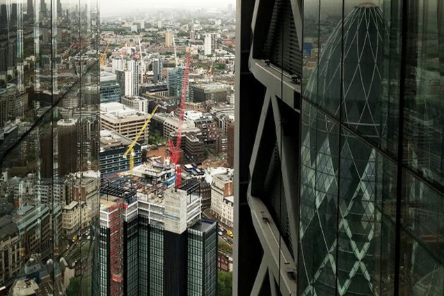
London is booming. Cranes, building sites and overflowing architecture offices were everywhere the 2016 Dulux Study Tour team went. When there is financial instability elsewhere in the world, London appears to be the safe place to invest, and as a result the London skyline is experiencing unprecedented growth. According to The Guardian, London has “436 buildings over 20 storeys in the pipeline” and this is “almost double the number of tall buildings in the pipeline compared to two years ago.”1
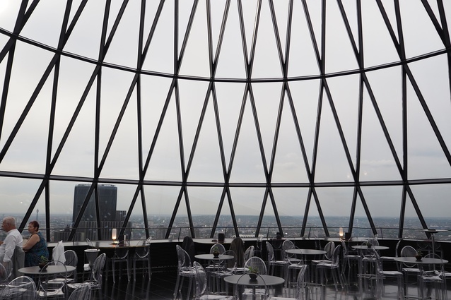
Iconic commercial towers with fond (or derisive) nicknames such as the Scalpel, the Gherkin, the Shard, the Walkie-Talkie, the Cheesegrater and the Can of Ham continue to emerge. A layering of planning restrictions, including that of maintaining view lines to the dome of St Paul’s Cathedral, often determines the shape and size of these buildings.
For example, the Leadenhall Building – or Cheesegrater – by Rogers Stirk Harbour and Partners leans back to the north to make way for the view of St Paul’s from Fleet Street, and the newly planned Scalpel building by Kohn Pedersen Fox across the street has a mirror-image incline to do the same thing. Meanwhile Wilkinson Eyre’s 6–8 Bishopsgate and 150 Leadenhall Street Tower is designed so that it “hides within the shadows” of the Cheesegrater. There are many more examples of the impact of such restrictions and more still to come.
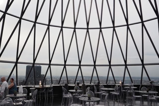
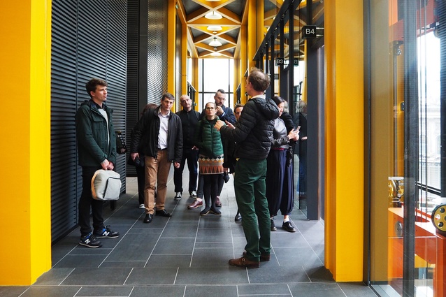
Whether it’s compromised by planning restrictions or not, the Leadenhall Building is, as Dulux Study Tour recipient Mathew van Kooy said after our visit, “an extraordinary building in so many ways: spatially rich, visually and organizationally complex and equally pushing the edge of construction technology and systems.” Similarly, a practice visit to Foster and Partners exposed all the research, testing and prototyping that goes into the firm’s work. As Moir pointed out, “Foster and Partners is broadening the scope of what an architect is, and what it actually does.”
Dulux Study Tour participant Hannah Slater questioned whether these planning restrictions are having too much of an impact on the London skyline. She said, “you’re saving view lines to significant architecture, but then you’re potentially compromising what could be a significant new piece of architecture.” Another Dulux Study Tour recipient, Chris Gilbert disagreed with Slater, arguing that the planning restrictions “generate a really interesting urban type. Restriction is the best thing to work against.”
The impact of planning restrictions on any city is an age-old debate, particularly as some decisions on regulations, such as aviation paths, appear to be arbitrary. In the case of London, these decisions are intended to preserve heritage and culture in a society dominated by commerce. As Gilbert said of St Paul’s, “it’s culturally significant. It’s more important for London as a whole to see St Paul’s than only the individual developments benefiting from that view. It’s choosing society over the commercial developments.”
In a city like London, messages like this are important. But how are these restrictions decided and is the general public involved in this decision? Dulux Study Tour recipient Katy Moir questioned the type of building – a church – the view lines are directed towards, saying “as a contemporary society, we’re not looking to the church as much. What do we value as culture now?”

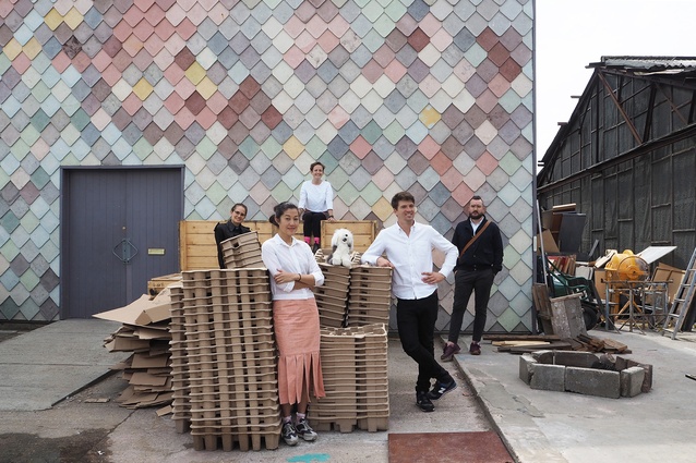
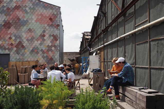
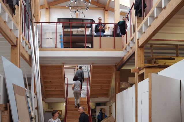
Though operating at a completely different scale to Foster and Partners, architecture collective Assemble shares the same focus on broadening the scope of architecture. A visit to Assemble’s current base at Sugarhouse Studios in Stratford, east of London, uncovered the free spirit of this Turner Prize-winning group. These twenty-somethings look for potential within the existing urban fabric of London and try to make something of these disused spaces. For example, Folly for a Flyover was a temporary structure in a motorway undercroft in Hackney Wick, which became a new public space hosting a program of cinema, performance, play, temporary cafes and other activities.
Although there seemed to be a variety of approaches taken by architectural practices in London, there wasn’t much variety in the huge amount of architecture that was being created. Slater noticed “a consistency in the way materials and surfaces are dealt with, which is distinctly different to the way we deal with surfaces in Australia. Zaha Hadid Architects is about creating one surface, and using materials to express the form. Wilkinson Eyre is creating large spanning canopies, which again are about creating a consistent surface.”
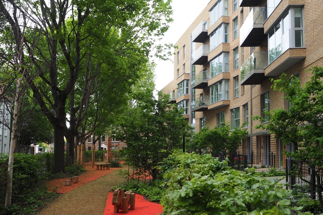
Often the uniform surface treatment comes from a desire to stitch into the existing historical fabric, as is the case in Turnmill by Piercy and Company and Trafalgar Place by dRMM. Like the view lines in the city, the long history of London is perhaps consciously, and subconsciously, influencing architects’ contributions to the urban fabric. As Slater commented, “the historical urban fabric is about flat, consistent facades. Is that just an embedded way of working in London?”
According to Assemble’s members, with this project, they were able to convince the London Legacy Development Corporation “to invest in permanent infrastructure, which has allowed the site to continue as a public space.” Where practices like Foster and Partners and Rogers Stirk Harbour and Partners are going beyond the scope of traditional architecture in their research, testing and prototyping, Assemble is pushing the boundaries of the profession by encouraging different ways of involving the public in the creation of their own city.
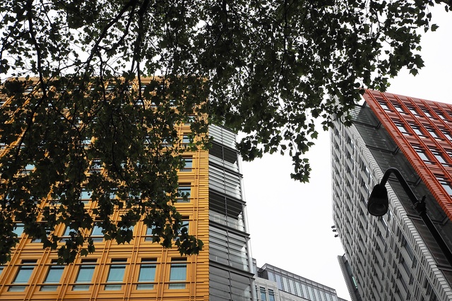
In Australia, there is a desire for a layering of different textures to break up the mass of the building. In London, by contrast, the mass appears to be emphasized. One building that strives to break the mould (and the grey of London’s climate) is Renzo Piano Building Workshop’s Central St Giles Court. Each block in the complex is delightfully clad in ceramic tiles of a different colour – bright orange, green, red and grey. This serves to break down the mass of the building.
London is thriving – at least in a commercial sense. But how will this continue to affect its skyline and urban fabric? There seems to be real opportunity in this city right now, but perhaps it’s being restrained by London’s embedded history – something we’re not nearly as familiar with in Australia.
1 Nick Mead, “London’s changing skyline: planned tall buildings ‘almost double in two years,’ The Guardian website, 9 March 2016, theguardian.com/cities/2016/mar/09/london-changing-skyline-tall-buildings-planned

