Curtain call: Hiro-En House
A unique design element brings this home by Matt Gibson Architecture + Design into the twenty-first century while preserving and celebrating the original Victorian home.
It’s astonishing how the same set of architectural problems can be solved in so many different ways. Consider the brief for the renovation of this double-storey Victorian house in the Melbourne suburb of Kew – it hits all the classic notes. The owners, a couple with three kids, needed to transform the old building’s rabbit-warren plan into a contemporary home for the next stage of their lives, with spaces and zones coordinated rather than clashing.
They wanted connected indoor and outdoor living areas; the back of the house was barnacled with a series of dodgy add-ons, which had to be prised off. Finally, there was the scorching afternoon sun – the legacy of an exposed western orientation – that had to be dealt with. Architect Matt Gibson and his team must have heard variations of this brief a hundred times before, yet their response was anything but predictable.
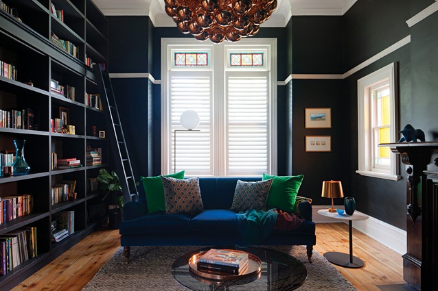
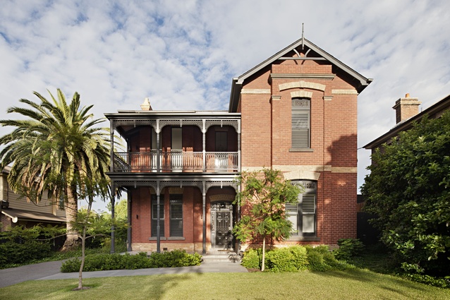
A fundamental decision was made to reinstate the integrity of the old house, by stripping back the inconsistent newer additions (goodbye, barnacles) and renovating the formal front rooms on the ground floor and the kids’ bedrooms upstairs to a contemporary traditional style. (A little more work was done upstairs to open spaces up and improve amenity and access to a bathroom.)
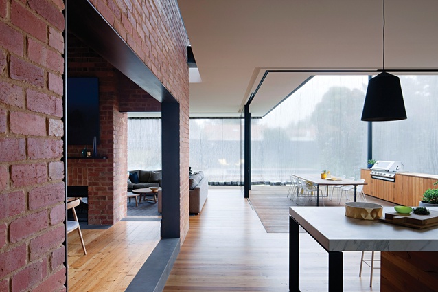
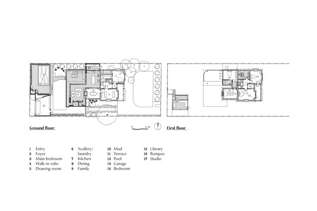
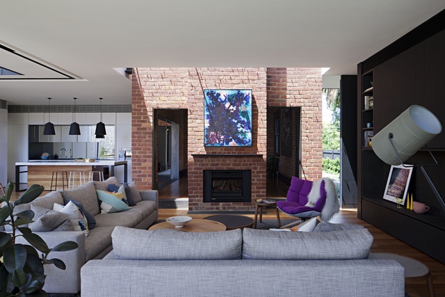
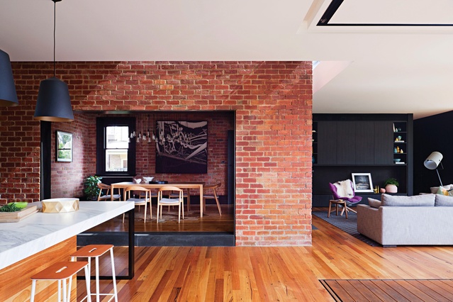
This respect for the existing building fabric was extended to the new parts of the home, not by replicating its Victorian aesthetic but in the way that the old and new structures work together. Behind the original front rooms, the house now opens up into a large but cleverly zoned living area. On the left, a dining room sits within the red-brick building envelope.
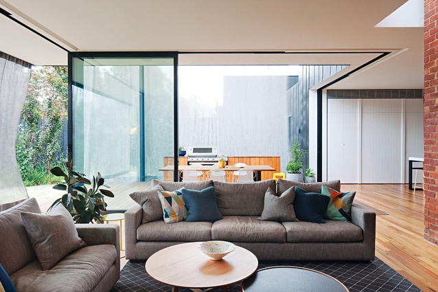
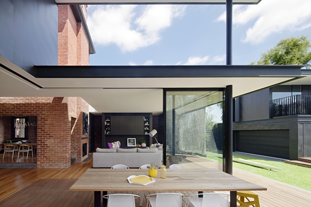
With a large opening punched through the wall to connect the room to the modern kitchen, and the ceiling removed to expose zigzag timber joists, it feels almost like a new room excavated from within the old structure. Behind the dining room is a new family room, with those two rooms and the kitchen area forming an L shape around a large outdoor deck. Most of the glass panels that separate the interior from the deck slide away to create a single, almost seamless space.
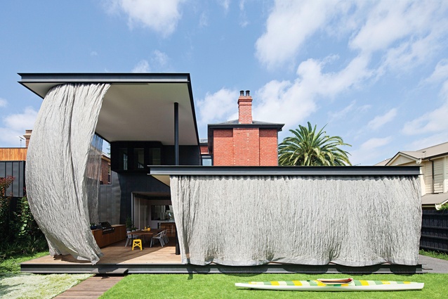
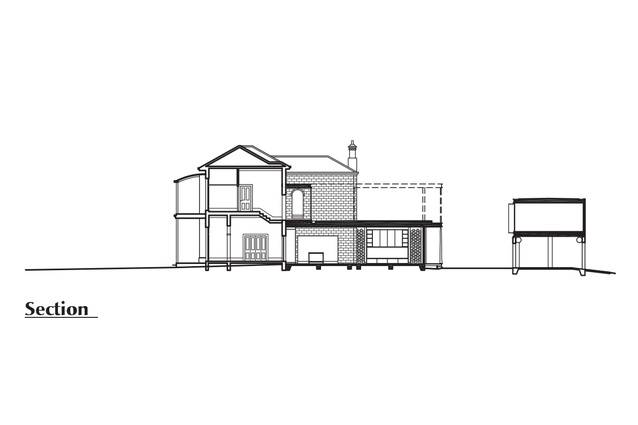
Matt’s description of this section of the house as “a set of canopies without too much wall” is apt – with its floor-to-ceiling glass and very-low-profile roofline, the new extension is mostly transparent. When viewed from the backyard, the form and materiality of the old house are clearly legible through the extension. Old and new elements are linked through subtle use of colour, such as dark paint to sections of the renovated interior and zinc trim on the extension.
And the new structure touches the red brick very lightly – the 130-year-old exterior might have been rendered in its new guise as an interior wall, but instead has been brought back to bare brick; where it meets the new roof, a thin strip of skylight provides visual separation.
The design move that most obviously sets this house apart, however, and which you’re probably already fixated by in the photographs, is the use of large-scale outdoor curtains. The roof-line over the northern half of the extension is a level higher than that over the southern half, to shelter the deck and admit northern light into the family area. This left the interior on both levels, and the deck, exposed to the harsh afternoon sun.
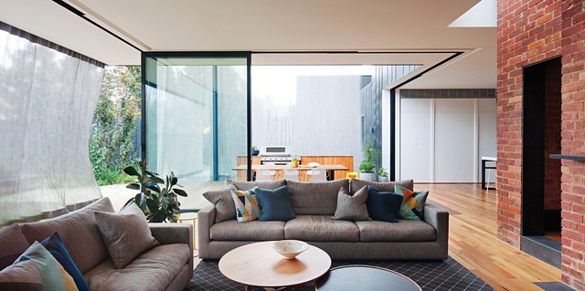
Enter the curtains! A two-storey-high sheet of fine stainless steel mesh fabric hangs from the higher roof, with a smaller sheet hanging from the lower roof; both slide on tracks and clip into fixings along the edge of the timber deck to enclose the deck and shield the western side of the family area.
By day, the wall of fabric is translucent; at night, thanks to strategically placed uplighting, it becomes opaque. With the glass walls slid open and the curtains closed, the effect is quite magical, like being in some impossibly glamorous marquee. There’s a clear “inside” and “outside,” and the curtain is a robust, protective barrier, even against rain and wind, but the hard boundaries of the house just disappear.
There’s a Japanese influence at play here, with Shigeru Ban’s famous Curtain Wall House among many examples from that part of the world that came up during research for the project. And the strip of timber deck that acts as a transitional zone between the living space and the smaller of the two curtains is an interpretation of the traditional Japanese engawa or hiro-en.
The house also brings to mind the building-wrapping artists Christo and Jeanne-Claude, except that the wrapping on this architectural present isn’t trussed up with cables like theirs tend to be, instead left just loose enough to billow and shimmer seductively.
Perhaps it’s wrong to emphasize the curtains’ ephemeral beauty over their essential utility, but the visual lightness they bring to the house fits perfectly with the nature of the new work here. The sense of lightness and transparency, in combination with its new modern amenity, is what’s most impressive about this project – it’s enabled Matt Gibson Architecture and Design to create a contemporary and undeniably unique home for its client while also celebrating and preserving the integrity of the original house.
This article was first published in ArchitectureAU.com.

