Customhouse chameleon: XXCQ tower
Studio Pacific’s XXCQ tower sets a new standard on Wellington’s shaky waterfront ground. Guy Marriage dissects the building’s diagrid DNA, rippling façade and stolid base isolators.
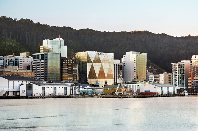
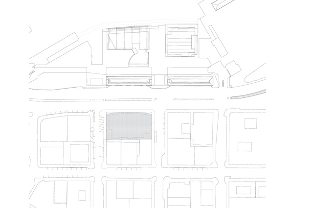
XXCQ, the capital’s newest – and easily best – office building, sits in pride of place on the waterfront at 20 Customhouse Quay, looking directly up and down the prime avenues, as well as straight out to sea. Situ suprema indeed.
Despite being clad in one single tint of glass, the building has a chameleon skin, at times rippling in sea green and sky blue, and at other times gunmetal grey with steely silver; at sunrise and sunset, there are bold gold and black diamonds of colour reflecting the mood of the sea and the sky. Never a dull moment. There’s only 278mm of ripple vertically in the surface, but it curves nearly 2400m in plan and those slight variations are enough to collect reflections from completely different parts of the surroundings.

The new building is a combination of the design talents of both engineers and architects, with Dunning Thornton Consultants (DTC) (structural) and eCubed (e3) (services) having as much input into its success as have Studio Pacific Architecture. This is a triumph of both engineering and architecture.
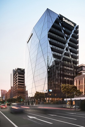
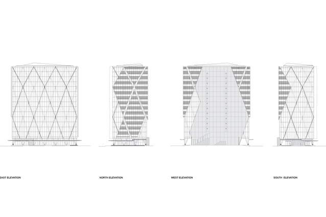
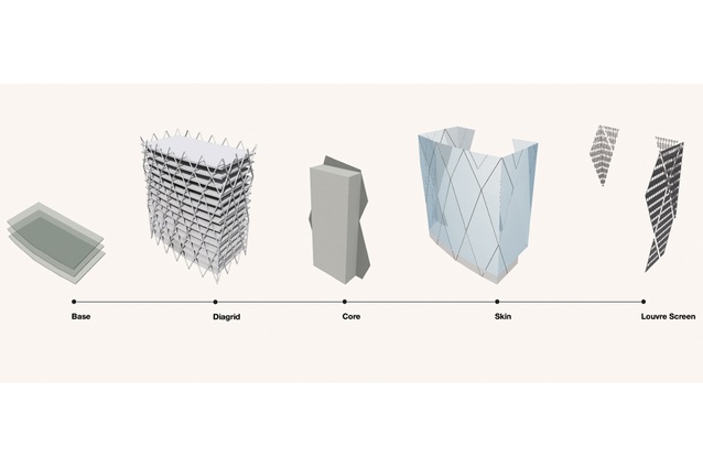
The most obvious clue to this collaboration is writ large all through the building: the powerfully strong diagonal grid structure. As project architect Marc Woodbury says, the perimeter diagrid is in the very DNA of the building – the driving force from the largest decisions right down to the smallest details.
What’s more, this building is base isolated, even though it is 14 storeys tall. That makes it the tallest base-isolated building in New Zealand and a role model for all new buildings in our rocky isles.
The diagrid is not a stylistic element but an important structural response from DTC’s dynamic duo, Chris Speed and Alistair Cattanach. Far more rigid than the more-usual rectilinear response of columns and beams, it permits the structure to be 25 per cent lighter in steel (a major saving in materials): one of the many reasons that this building has gained New Zealand Green Building Council 5 Green Star accreditation.
Studio Pacific’s previous multi-award-winning office building for Meridian (New Zealand’s first 5 Green Star building) sits directly in front of XXCQ: both only 2m above the high-tide mark. While Meridian copes with wet feet by deleting the basement altogether, XXCQ makes clever use of the former basement of the now-demolished BP building as a site for a rigorous base isolation scheme.
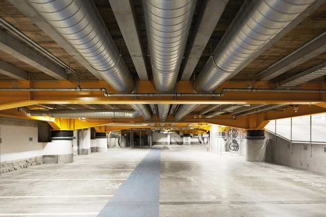
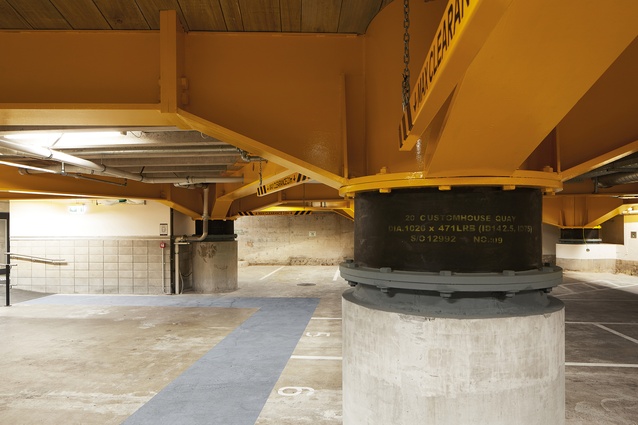
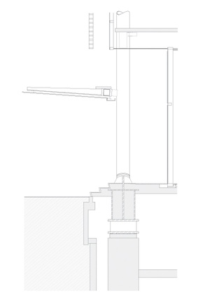
The new building has deep piles reaching down to the bedrock, bored right through the old floating basement slab, with 28 hefty new lead/rubber base isolators sitting on stocky columns just below ground level. In the event of a massive quake, these will allow the building to move laterally in any direction up to 650mm in the predicted one-in-2500-year quake for which this building is designed. Above the isolators sits a grid of oversized, bright-yellow, haunched steel beams, forming a sturdy plinth just three steps above ground level, on which sits the entire structure above.

Detailing for base isolation is notoriously tricky but, here, it has been dealt with very smoothly. The new structural plinth hovers a mere fraction above the asphalt pavements outside in the ultimate negative detail. The plinth and building will move quietly from side to side in the event of ‘the big one’. I’m picking that, after this quake happens, Wellington will have only a half-dozen buildings remaining fully functioning – including Parliament, Te Papa and XXCQ. No wonder it is fully occupied already.
Designing a building like this is so much harder than it is for one in which the columns go straight up and down. Full credit must, therefore, go to young grad Thomas Seear-Budd, who started on this project straight out of Victoria University and has been on it ever since. He has an eagle eye as a photographer and, under the careful guidance of architect Bruce Green, as a building detailer as well.
There have been many iterations of the design over the past five years and Studio Pacific has used the full suite of design tools at its disposal, with 3-D modelling, 3-D printing and VR, both for presentation to the client and for design. Full structural modelling between DTC and steelworkers MJH Engineering enabled construction manager for Scarbro Construction Lachlan Collett to carry a full digital model of the building with him on his iPad.
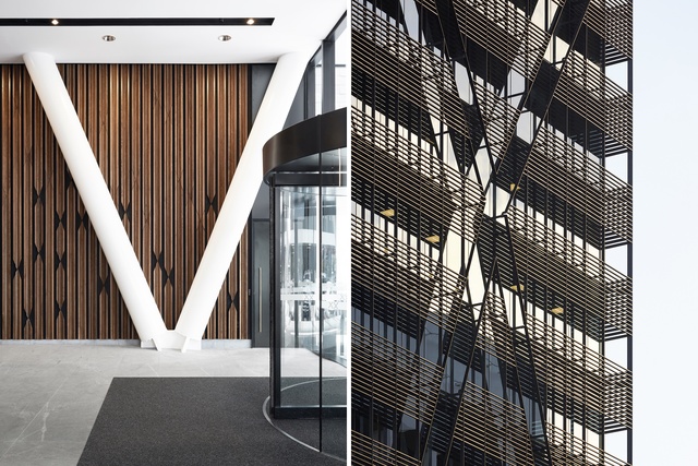
The XXCQ tower has superficial similarities with other famous diagrids: the Hearst Tower in New York and The Gherkin in London. Designed by my former colleagues at Foster + Partners, the Hearst proudly wears its super-strong diagrid structure on the outside, while The Gherkin has captivated worldwide attention with an outrageous shape. XXCQ is a lot more subtle.
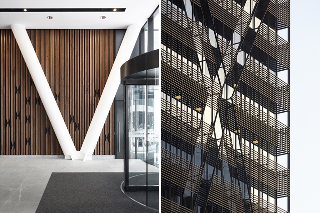
Indeed, Woodbury notes that the emphasis for this building was a relentless reduction down to a bare minimum palette of materials: white-painted CHS steel diagrid; a flamed Atlantic grey granite stone for the ground-floor plinth; black aluminium flush-glazed mullions setting off the Viracon crystal grey insulated glass units imported from the USA; and brass handrail fittings, unpolished, ready to age with their own patina. A delicious wall of stained American oak makes up the patterned rear wall and lift lobby.
But, the last material is one previously unseen: a custom-tooled extruded aluminium cladding, like the rear grille of a Testarossa, finished in the blackest shade of night. The black carries on through to the mullions of the cladding above and is echoed in the black external shading louvres that stand just off the façade to the north and west.
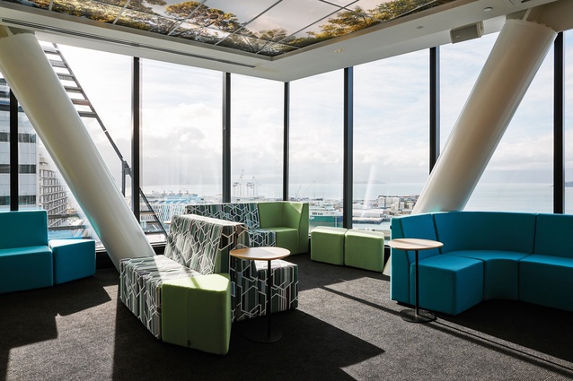
Studio Pacific also undertook fit-out works for the naming-rights tenant Deloitte, under a separate team, and that, too, is a tour de force. Carrying the same material palette through to the inside, the reception floor is seriously svelte. Honey-coloured oak fittings and brass handles continue, along with a wall covering that looks like ancient tesserae, while meeting rooms are luxuriously embellished in richly coloured blues and greens.
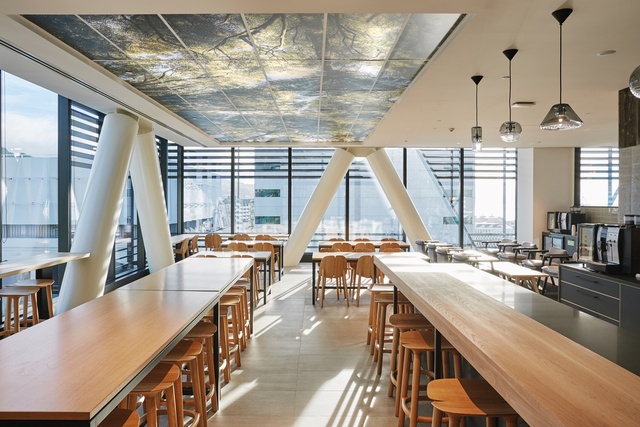
The office floors are something else again, with the white ceilings, a lofty 3m above the floor levels, hiding most of the structure up above. Volker Ehrmann from e3 has arrayed chilled beams around the perimeters of the floors, with an infuser variable air volume system in the centre, but the suspended ceiling is anything but standard. It features areas of LED back-lit scenic views that you might get if you were in the New Zealand bush, looking up to the sky through the ponga tree ferns, from the partners’ lunch room right down to the workers’ open-plan offices.
Lincoln Fraser, the development manager for Newcrest, was all over the project. Hugely knowledgeable about the building and the construction process, Fraser was, apparently, tireless in pursuit of perfection and reduction. The end result clearly shows this effort.
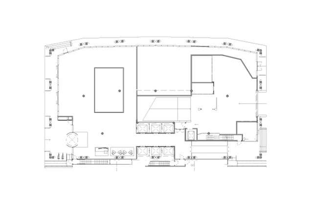
Despite its innovation, it is a very un-fussy building. Calmly, methodically, the building rises up the full 61m above the pavement, the structural logic still plain to see behind the subtle grooves in the faceted Thermosash façade. The building all comes together in the spacious 6m-high ground-floor volume, fitted out with a delectable oak-panelled café for The Lab and a lofty lift lobby in black and oak.
XXCQ really does show the way forward for beleaguered Wellington. It’s strong. It’s beautiful. It won’t fall down. It’s all very tasty.
This article first appeared in Architecture New Zealand magazine.


