Death and Architecture
Sometimes, modern architecture can feel like a teenage party – everyone attempting to look different and interesting, yet somehow ending up looking the same. Mimicking fashion, façades and materials to reflect the latest trends. At its best, architecture always has expressed abstract ideas and feelings that meld seamlessly with the pragmatic – becoming more than the sum total of its parts. However, such buildings are, and always have been, rare. Few typologies remain in which the triangle of speed, cost and quality does not define outcomes before a single brick is laid.
A crematorium is such a building. Dealing with the requisite physical process for the body and the creation of spaces for the rituals of death, it is a rare example of design necessarily encompassing the pragmatic and the abstract, yet one we tend to think little about.
Completed over the last two years, projects in Italy and Sweden illustrate the power of cemetery architecture to embody spaces that evoke emotion while accommodating the bureaucracy of death. Andrea Dragoni Architects has added to the Gubbio Necropolis, located at the base of Mount Ingino in the Apennines. Meanwhile, in the southof Stockholm, a new crematorium has been built in a UNESCO world heritage site by Johan Celsing.
Both projects confront the complexity and often contradictory nature of such buildings. As municipal facilities, they adhere to strict budgets and regulations; yet they seek to create spaces that can match the thoughts and feelings of people at particularly vulnerable moments in their lives.
Hugging the lower slopes of Mount Ingino in Umbria, Italy, is the medieval town of Gubbio with narrow laneways punctured by magnificent vistas over the valley below. Andrea Dragoni Architetto was tasked with extending the historic necropolis of the town with the aim of redefining its place within the structure of the city.
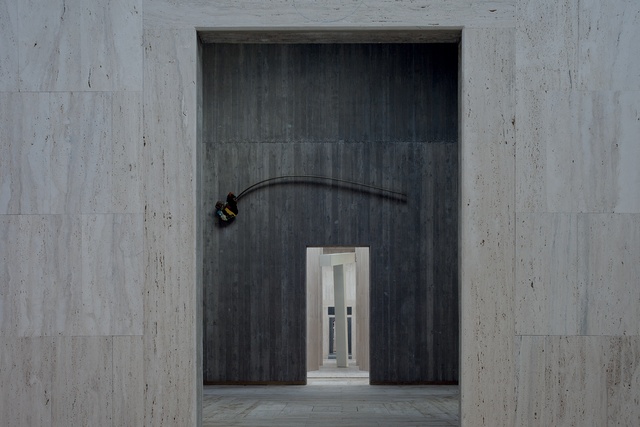
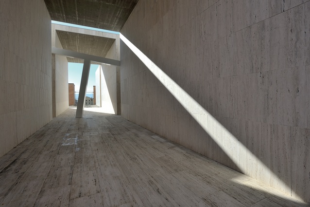
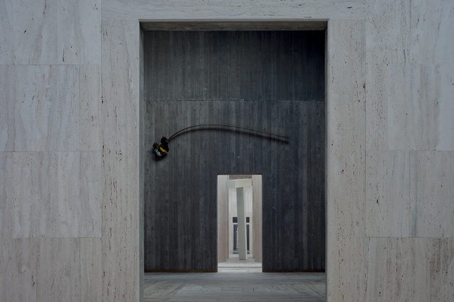
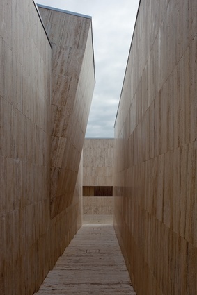
Dragoni proposed a formal layout based on four courtyards of the same size, which reflect the street pattern and landscape of the town. With a large site of 4,000m², construction involved a smaller portion of 1,800m². Vistas, pathways and openings are controlled to influence how the necropolis is used, accessed and understood. Separating the courtyards are large concrete walls clad in travertine, a material that dominates each surface of the new addition.
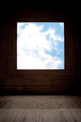
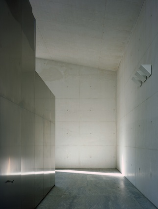
Influenced by James Turrell and his work on Skyscapes, vistas to the sky have been created within the courtyards and walls. Andrea Dragoni refers to these spaces as “cubic squares of silence, with open ceilings evoking windows to the sky”. These spaces each contain site-specific artwork by two Italian artists – Sauro Cardinali and Nicola Renzi. The pieces are the only counterpoints to the formal layout and limited palette of materials of the crematorium.
The placement of public art at the centre of the proposal refers back to a time when cemeteries, while always considered special places, played a more active role in the daily life of Italian towns and cities. Dragoni adds, “This contribution, strongly linked with architecture, helps to define a new space for silence and meditation within the city.”
Skogskyrkogården, meaning ‘woodland cemetery’ in Swedish, is a UNESCO world heritage site in the east of Stockholm. Johan Celsing won a competition for a new crematorium located in a densely forested landscape of rolling hills and century-old pine trees. To add to the pressure of the competition and unique site, two of Sweden’s most famous buildings lie only 150m away down a wooded path.
Appearing to the casual observer like a primitive wooden hut, a small chapel by Erik Gunnar Asplund was an important building in the development of modernism in the 20th century while adjacent to the chapel is the original cemetery and Gunnar Asplund’s last building.
Celsing’s sensitive response has a quiet dignity appropriate to both its function and its location. Celsing refers to the low-slung and compact brick structure as sitting like a stone in the forest; this became the title for the firm’s competition entry. The competition jury was clear with its assessment of the project, describing it as “characterised by a refined simplicity: a down-to earth feeling of form, colour and weight, with an architecture verging on the ascetic”.
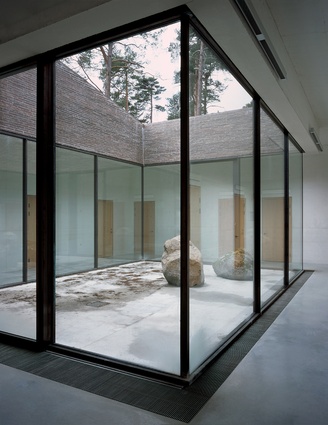
A patchwork of granite slabs directs mourners through the forest to the crematorium. The brick building appears as one form with windows and openings puncturing the rock-like volume. The entrance mimics that of the original Asplund building where a canopy, separate from the crematorium, appears as one form with the supporting columns and roof line tying the two together. This separation creates space where light can filter down the brick walls of the intimate forecourt.
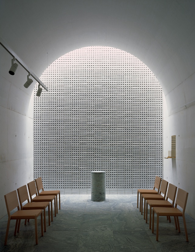
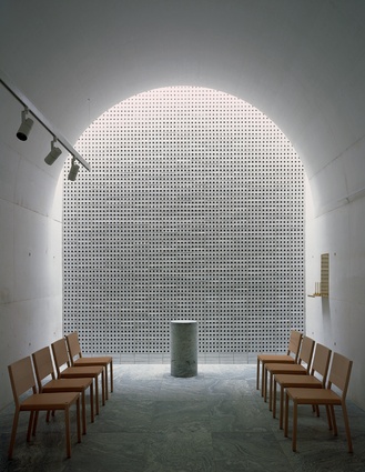
White concrete, created with dolomite aggregate has been left exposed as a finished material. With timber joinery used sparingly, ceramic bricks with perforations to improve acoustic performance are the only other materials used in the interior. Direct light sources are controlled tightly; instead, spaces are lit by skylights slotted into the ceiling along with an interior courtyard. This is shown to great effect in the vaulted ceiling of the ceremony room – finished in rawconcrete with light entering from above the back wall of ceramic bricks.
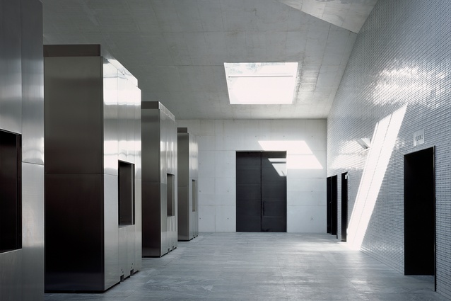
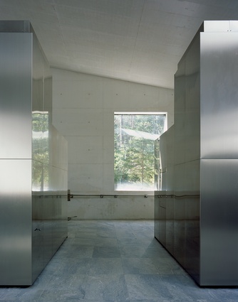
The working heart of the crematorium is below ground level. Stainless steel and an efficient layout well connected to the upper level define this space. The compact volume provided many practical benefits, as Celsing explains: “The compact figure of the plan gives the staff overview as well as making limited encroachments in the precious forest.”
Today, many public buildings emphasise their egalitarian natures. Libraries look like coffee shops, schools show their inclusiveness and governments attempt to demonstrate transparency. A cynical eye would say architects did a bait and switch. Building types that once reinforced authority with solid walls and sombre materials now show openness with glass walls and café-like interiors. Whether authority is any less strict or institutions any more transparent than they were remains to be seen.
These crematoria are not the flashy showpieces or bland banality we have come to expect from public buildings. Instead, they seek to create spaces that engage with a fuller range of experience that can be hard to define and consequently, is edited out from any public procurement process. I am sure our public buildings would benefit if this attitude and approach were included more often, regardless of building type.

