Designer flair
Four kitchens that feature colour, pattern and a multitude of hard-working materials, from the latest issue of Houses.
Beaumont Quarter Kitchen by Mal Corboy
As Auckland’s first wave of quality apartments begin to age, owners are looking to replace the original kitchens and bathrooms with something a little more special. On face value this wouldn’t seem to be an issue, but in many cases the designers are encountering stringent access problems and also restrictions on where services, such as water, gas and electricity, can be hooked up.
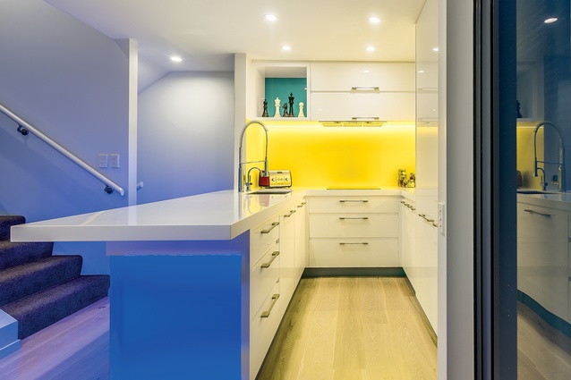
This kitchen – a renovation of a small apartment in the popular Beaumont Quarter complex in Auckland – is a case in point. The original dark-coloured kitchen was well past its sell-by date in terms of style and functionality, and so they took on the services of Mal Corboy to give the whole area a revamp.
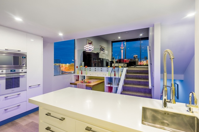
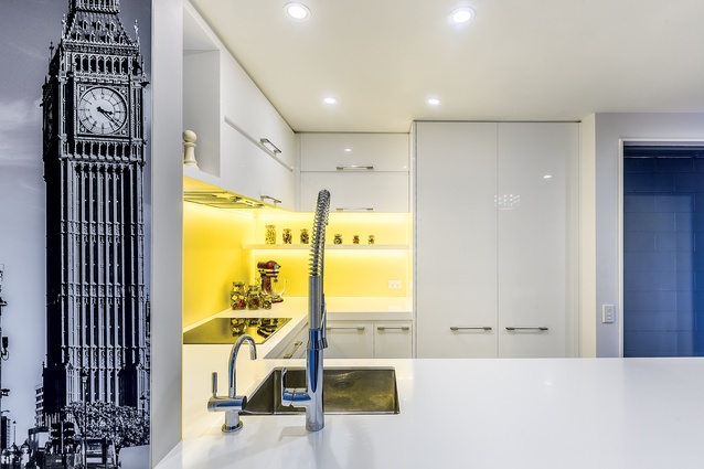
“The clients wanted colour – lots of it,” says Corboy. “They also wanted a reminder of where they’d met each other – hence the image of Big Ben facing you as you walk up the stairs into the kitchen.”
The narrow stairwell was the designer’s first challenge. Typically, the benchtop is the biggest item; so, white Corian was chosen because it could be easily transported in pieces, then joined seamlessly on site by the fabricator. The resulting U-shaped worktop offers almost double the original surface area. Given that kitchens tend to be larger these days, the new kitchen extends beyond the original footprint and now includes a space-efficient bank of ovens and floor-to-ceiling storage on the adjacent wall.
Corboy finished off the space with a custom, built-in dining table backing onto the elevated lounge, incorporating playful pigeon-hole storage in a Modrianesque pattern that matches the bright primary colours found in the main kitchen.
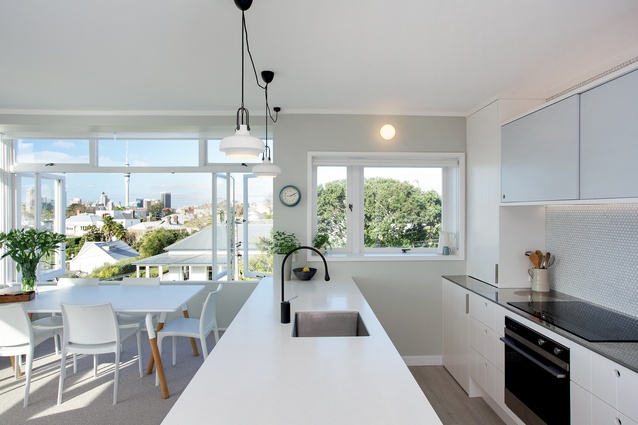
St Marys Bay Kitchen by Von Sturmer’s - Kitchens and Living
In the early 1950’s, across the pond on the West Coast of America, the origins of the modern open-plan living space were emerging, mainly thanks to the Case Study Program. Back here in New Zealand, we were getting out first taste of apartment living – and they weren’t open plan, as many are today.
One of the first of this new breed were the Seymour St flats in St Mary’s Bay, all of which had spectacular views back over the city – except for the kitchens, as they resided in a closed-off corner of the main living spaces. Herein lay one of the issues for one of the current residents – that and the need for modern-day convenience.

With this in mind, kitchen designer Leonie Von Sturmer was engaged to remedy the situation, but with a strict brief to remain true to the heritage of the building. “Being an older-style apartment, the new kitchen had to mimic the existing layout, more or less,” says the designer.
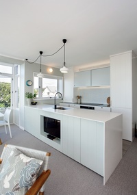
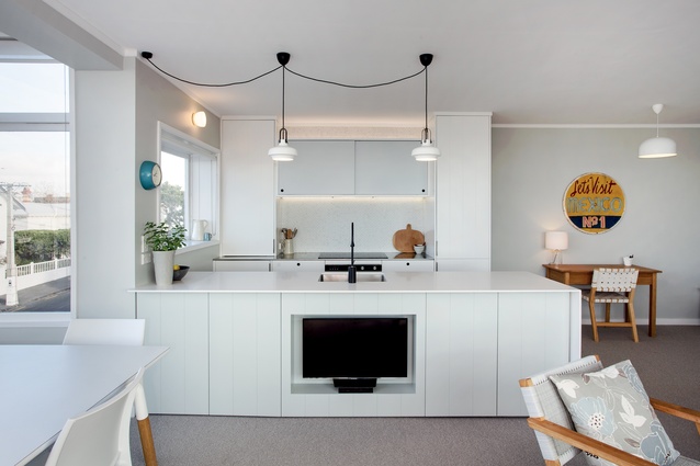
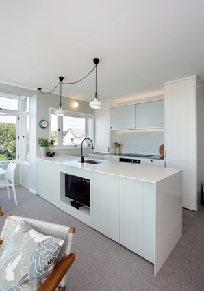
A ‘peninsula’ was chosen where the wall used to be, to give a degree of separation from the living space. “When entering the room, we wanted the kitchen to feel generous in size and beautiful, yet unobtrusive, because the outside view did all the talking.”
Remaining true to the 50’s theme, lacquered v-grooved board was used on the cabinetry fronts, light pastel colours, sliding doors and circular tiles and finger pulls. Lighting was also chosen with this theme in mind; the exposed cord an unavoidable, yet perfectly on trend design feature, due to the fact the ceiling couldn’t be drilled to accommodate new light fittings.
“One of the biggest constraints was we had to use the existing extraction ducts and keep the windows,” says, Von Sturmer. “This meant the cooktop had to go on the back wall of the kitchen and to gain symmetry, we mirrored the integrated fridge with an adjacent cupboard.”
The result fits the brief perfectly – a thoroughly modern kitchen, in keeping with the heritage of its surroundings.
Whangaparaoa Kitchen by Du Bois Design
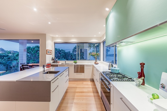
As is often the case, kitchen designer Natalie Du Bois was referred by an existing client to the owners of this kitchen, and was given an open brief to design their new kitchen, with just two words for guidance – ‘coastal feel’.
“The house was a new build on a clifftop, with huge ocean views,” says Du Bois. “I was brought on board right from the outset, and was involved in the spatial design of the room as well as in the kitchen design itself.”

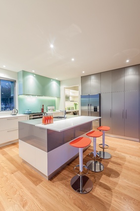
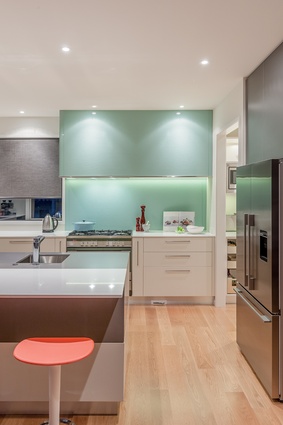
The connection to the ocean was obvious and needed to be exploited, so Du Bois deliberately downplayed the impact of the kitchen in the space by choosing simple forms coupled with a neutral colour palette – except for the aqua-coloured, rippled-glass splashback and rangehood, which was her nod to the sea views.

“The central island was imagined as being carved from a single block of stone,” says Du Bois. “And to break it up visually, the cantilevered breakfast bar was fabricated out of the same engineered stone, only in a contrasting colour, then seamlessly inserted into the island.”
From a functional angle, the kitchen is split in two, with the prep and cooking area on one side (fridge, sink, cooker) and the clean-up area, with the ocean views, on the other (extra-large sink and side-by-side DishDrawers). Large sliding windows allow easy access to the BBQ area on the deck, and there’s a large walk-in pantry, which extends to the corner of the room, near the fridge.
Sticking to the clean-lined theme, Du Bois chose a matching suite of Fisher & Paykel appliances “for their simplicity and uniformity”.
Riversdale Kitchen by Melanie Craig Design Partners
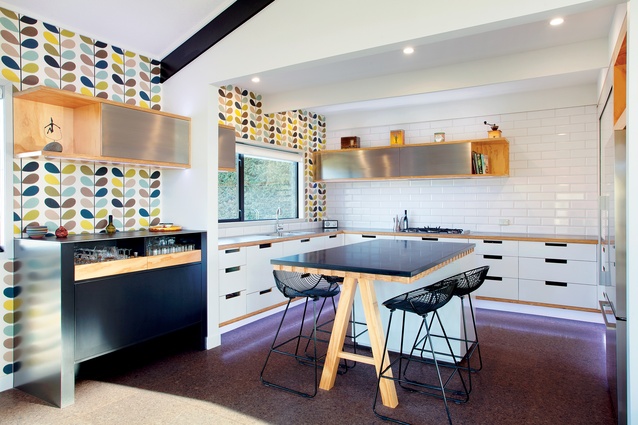
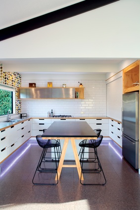
With its functional design and retro looks, the heart of this family kitchen lives firmly in mid-century New Zealand. Built using raw, honest materials, and housing the latest bombproof hardware, the kitchen retains a sense of business without losing its nostalgic integrity. At its centre is a large island, deliberately left void of appliances or a sink. It is topped by a slab of black stone, supported at one end by an exposed plywood trestle, allowing it to be used as a social, gathering area, or for informal dining.
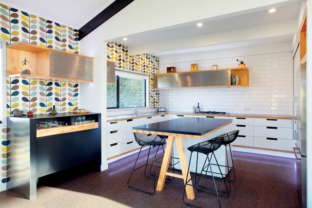
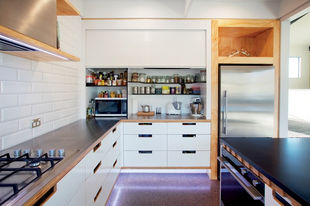
The island is surrounded on three sides by low-level cabinetry that again uses the exposed plywood detail to visually link it to the island. It also provides a contrast to the white-gloss lacquered cabinetry. The cut-out ‘handles’ in the cabinetry drawers are a great cost-effective design feature borrowed from the past. The negative detail behind the drawer fronts has been darkly stained to enhance their depth and also to reference the black benchtop.
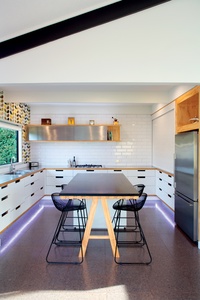
Naturally, the kitchen sink sits under the only window in the space, while on the wall opposite, the fridge is accompanied by a large pantry and prep area, which can be hidden by a full-width roller door. The drinks nook in the adjacent room is wrapped entirely in stainless steel, with half-height, plywood drawer-fronts that expose the glassware inside. Overhead, the wall-hung, stainless-steel-fronted cabinetry unit mimics the one above the cooktop that houses the extractor unit – connecting the two spaces visually.
Orla Kiely wallpaper adds a colourful finishing touch and goes perfectly with the retro-themed design, along with the butcher’s tile splashback and the natural, dark-stained cork tile on the floor.

