Uniformity without the repetition
Interior talks to Matt Nash, a clothing designer, who is being called upon increasingly often to craft uniforms for some of the freshest spots in the country.
Interior: Where does your passion for uniforms come from?
Matt Nash: I love the authenticity and the back story, and I love that historical, functional reasons have led to the design and details that are present as details on all clothing today. I have always been a keen vintage shopper and can never not stop when going past a vintage store.
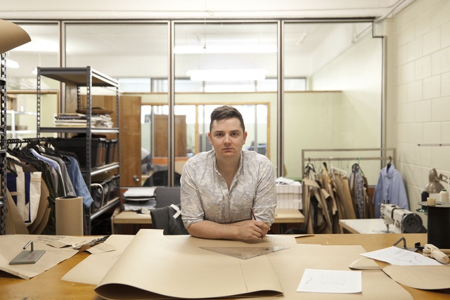
Interior: Your academic work sounds fascinating…
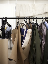
MN: My master’s thesis diluted down to the fact that the only menswear truly created in New Zealand was workwear. So I looked at a couple of New Zealand photographers who had specialised in the subject. My favourite is Glenn Busch. He did this series [and book] in the ’80s called Working Men and went around the country taking photos of men in their workroom environments. The book has this amazing series of AFFCO workers, boat builders and meat workers covered in blood, and with jobs like ‘chicken plucker’ and things you don’t see today, and their uniforms were amazing. What I did was I went back and recreated [these garments], detail by detail, from the photographs. I started trying to recreate the age of everything, beating them down and working with coveralls and aprons. I’ve always been really quite obsessed with utilitarianism.
Interior: And from there?
MN: I did menswear. I worked for Crane Brothers for four years while I was studying and I designed Little Brother, assisted with Gubb & Mackie and cut most of their made-to-measure. After leaving Crane Brothers, I split my time between creating bags and working within a few different hospitality start-ups. It was a really natural evolution of working within hospitality during the day and sewing and developing my bag range the rest of the time. Working in different facets of hospitality led me to understand different roles and the requirements of uniforms needed by these people. I started to create aprons with all the materials I had on hand from my bag-making and something just clicked. I got to work with my favourite materials like leather and canvas, and to transfer this onto a body.
Interior: You designed the uniforms for two places we are featuring in this issue (Sherwood and Odettes). Can you tell us a little about how you arrived at their specific looks?
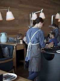
MN: I worked with Stephen Marr to develop the uniforms for Sherwood. They wanted to work with waxed canvas or oilskin fabric and were after something a bit Midwestern American utilitarian: something that didn’t look too crisp and had an easiness about it. These are worn with overprinted vintage tees that are by the awesome vintage stylist Charlotte Rust. We decided to use this amazing oilskin that isn’t laundered but you can wipe down and put in the sun and the sun re-melts all the wax. They were all sewn on a leather machine which gives a really solid stitch so the stitch becomes an important aspect of the design. We wanted to make one size for all so I did a herringbone tape on the hem with a raw edge so each staff member can cut their apron to the right length.
Interior: And for Odettes?
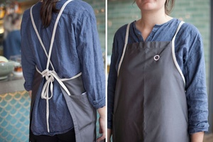
MN: It’s about moving away from the bistro shirt – with its popped collar and three quarter sleeve – which used to be a hospitality staple. I talked a lot with [Odettes’ co-owner] Clare van den Berg about what would match their aesthetic: it had a soft, Scandinavian luxe feel along with all the textures they had happening with wood and the different tiles and the linen they used. It came down to colour as well… trying to complement the interior palette. We didn’t want the girls to stand out; we wanted it to feel quite harmonious and calm. So far, I have done a washed-in linen women’s blouse with a pleat through the front… it is in this beautiful indigo, denimy blue and I laundered it and did a couple of washes to really bring out the textures (pictured above). Now I am doing a linen, mid-calf tunic which is really cool. I developed a bib apron, with no hardware to keep it all soft and European, with hand-cut linen slubbed herringbone used as the ties they wrap around the body. The ties are quite exaggerated at the back and loose so people can control how they fit.
Interior: So not just the usual two sets of the same uniform per worker?
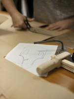
MN: No, it is not just everyone wearing the same thing but it’s a selection of stylised garments that people can mix and match. That’s where hospitality uniforms are going these days: giving the workers freedom within certain parameters. I have always worked in hospitality and, while talking to different owners, I have learned that it is always easier for staff to have a wardrobe that they can use… Hospitality operators are really busy people; if you can make their jobs easier by setting guidelines and providing easy-to-follow laundering instructions and a styling guide for their staff, it goes a really long way.
Interior: Are there clear fashions in hospitality or retail uniform design? Have there been distinct looks or specific trends?
MN: The biggest trend I can see happening is seasonality in uniforms: bespoke looks in line with the design of each brand. I’m working with both of these as well as on more consideration for the fit of the garments.
Interior: Is there any country that does uniforms particularly well?
MN: Japan. Japan has some amazing brands that slavishly recreate vintage clothing. This really appeals to me. They are all about heritage and love uniforms and military gear, which is where a lot of the styles of uniform have been distilled from. I love the [fashion design] Margiela stores and the Yohji Yamamoto workshops where they all wear lab coats when they go to work.
Interior: What would be your dream commission?
MN: My dream commission would be to work with Air New Zealand. I would love to develop luggage for them and return to a more natural look. The other brand I would love to develop is a uniform for Aesop. Its store design is so beautiful and I love its aesthetic.


