Designer profile: Tim Webber
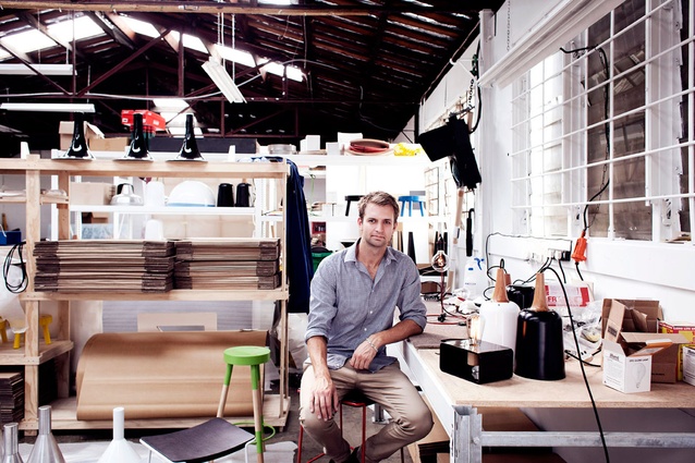
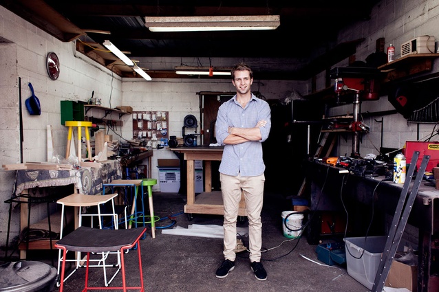
Inside the furniture designer’s Onehunga workshop, and some questions about art, colour, Milan and prototyping.
Tim, what was your first-ever design?
In 6th form woodwork, I designed and made a coffee table for my parent’s living room. Served us well for about seven years. That was my first piece of furniture, anyway.
How did things progress from there?
It didn’t seem like it at the time, but that project actually spawned my interest in furniture and design and led to a Bachelor of Design.
You have some sculptural projects under your belt. Were you tempted to throw your hat solely into that ring?
I was definitely tempted to give sculpture a go; all of my 4th-year uni projects were large, sculptural pieces. But, in terms of making a living, furniture seemed to have a few more options. Sculpture is something I like to do on the side; however, I’m not doing it nearly as much these days.
You have quite a range of products now – is there a common language, in material selections, expression?
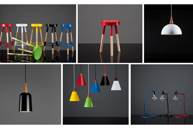
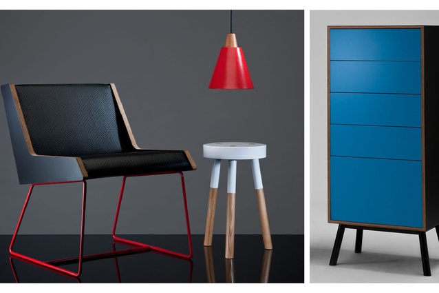
I do like to design products that can work in unison with each other through materials, finishes and the ideas based around them. I think this continuity is especially evident in my WM (Wood/Metal) series, which looks at the way wood and metal can contrast, yet complement, each other seamlessly in a single object. My Plywood Range seems to sit nicely alongside the WM series due to the similar kind of contrast between the matte HPL laminate surface and the Birch plywood edge.
The Tri Ampel Pendant, the Y Stool and the Wrap Stool have a standout colour palette. You’re not afraid of colour I take it or, as they say, honesty of expression…
I’m definitely not afraid of splashing a little bit of colour about. Colour has the ability to transform the atmosphere and experience of a space. We should never be afraid of using a bit of colour in our lives, and furniture is a good place to start with that! I’ve been told a couple of times now that my products have a certain honesty. I wouldn’t say that is entirely intentional; it’s just the way I design, perhaps my built-in aesthetic sensibility. I like to keep things clean and simple and don’t mind if there’s an occasional fitting visible, or that you can look up underneath the stool and see how it’s welded. That tells the story of how it’s made and openly displays the work of the craftsmen that have put their hands to it.
You were at Milan recently – how was it? Inspirational, depressing, overwhelming?
It was an amazing experience: an eye-opener to the scale and resources of some overseas brands, and interesting to see so many products in the flesh that I’ve only ever seen in magazines or online. In all, it was incredible, overwhelming, daunting, inspiring, thought-provoking , tiring… but mostly great to be able to go along for the first time and look around without the pressure of exhibiting. I got around all the sites and looked at ideal places to, hopefully, display in the future.
What’s on your drawing board, and, is it hard to follow one thing through at the expense of others?
I’m working on a few prototypes at the moment – a dining-chair version of the Wrap Stool, a new floor light, two-seater version of the Jet Chair. As always, there are a number of things on the go; it’s quite hard to juggle everything and decide what should take priority. There is a couch that I’ve been wanting to prototype for ages, but other things pop up that are easier and cheaper to do, so they queue-jump. I have just finished the first complete versions of my Sideboy, Tallboy and Fatboy sideboards and dresser units – so there’s been a few new additions to the range recently.
In the pantheon of designers, who do you admire?
I’m a big fan of Benjamin Hubert. He’s built quite an eclectic range of products utilising a number of varied materials, but he still keeps a clean and refined aesthetic. I’m partially a fan because he’s a young designer doing big things. It’s encouraging to see what can be done if you get yourself out there.

