Directional dimensions
Chris Barton discusses the whys and wherefores of Warren and Mahoney’s design decisions for Auckland’s Commercial Bay office tower and retail precinct.
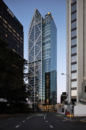
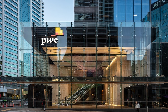
The arrival at the 180m silvery-glass tower, topped with its distinctive curved foil, begins at the corner of Albert and Customs Streets, one of multiple entries to Auckland’s $1-billion downtown office and retail development known as Commercial Bay. The space is glass walls and footpath canopies: small, a kind of ante-lobby off the street. Inside, there’s the obligatory suspended artwork/sculpture and surrounds of glitzy floor and wall finishes – imported Atlantic granite and Italian travertine. Very corporate but also a tasteful match to the building podium’s beige Jura limestone cladding.
Beneath one’s feet are the two underground tunnels of the City Rail Link beginning to curve their way from Britomart Station to the cut-and-cover trench of Albert Street – tunnels that have played a significant part in a public space trade-off crucial to the scheme, as well as bringing something of a headache to the design.
It’s from this street-level anteroom that the tower’s 3000-plus office workers (some of whom will have partaken of the end-of-trip facilities behind this entrance – stowed their bikes in the two-level bike stacker, stashed the Lycra in the lockers, showered and suited up for work) will begin their ascent up two flights of escalators to the light and nirvana of the tower’s real entrance, known as the Sky Lobby.

The Sky Lobby is indeed a sight to behold – a generous 6m-high, 1100m2 glass-walled rectangle, 41m wide and 26m deep with just three columns in the middle, a repeating floor plate of the 29 levels of offices above. It’s the sort of space that’s common at the base of most office towers – a semi-public corporate living room with café, comfortable couches and artworks for the tenancies’ occupants and guests to enjoy. The Sky Lobby of the PwC-branded tower also opens to a north-facing sky terrace garden, which wraps around the building to the east beside the adjacent Jarden House and to the west with dramatic sculptural artworks at the ends facing Customs Street.
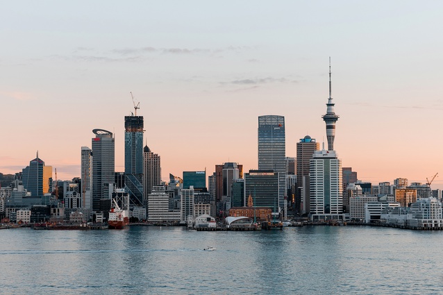
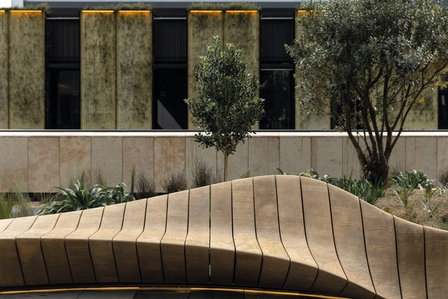
The spectacular urban rooftop, designed by LandLAB, features curvaceous, bespoke timber seating, native planting and arresting cityscape views across the roofs of the three-level Commercial Bay retail podium, past the former HSBC building (now One Queen Street, planned as a mix of hotel and offices but currently on hold) and out to Rangitoto and the Waitematā. Designed to cater across the day from morning coffee to evening cocktails, this is a lobby you may never want to leave.
The Sky Deck is a good place to appreciate the interrelated town planning constraints and complexities of the tower’s design that mostly relate to building over the City Rail Link tunnels below. Here, you can see the 6m street setback line that makes Auckland’s office towers the way they are – each centrally placed on its site and surrounded by a podium. To take maximum advantage of the northern views, the design has opted for a glass southern side lift and stair core – exposing the comings and goings of the building’s vertical circulation to Customs Street.

From inside the glazed lift cars, which, for the high-rise floors, travel at an astonishing 8m/second, the effect of watching Customhouse and the city below recede is literally breathtaking, not to mention ear-popping and, possibly, vertigo-inducing. The bonus of side core towers is that the stairwells and bathrooms receive natural light, plus terrific views. But with no central core for shear strength, a perimeter system is needed: hence, in this case, the steel frame diagrid to resist wind and seismic lateral loads.
At the Sky Deck’s south-western corner, Warren and Mahoney principal and the development’s lead architect Blair Johnston points out the building’s pivotal Loretta (Outrageous Fortune was popular at the time) column. This was the first point to land a column 6m back from the street and between the two train tunnels. Loretta carries a lot of load – some 5000 tonnes, resulting in a 700x700x75mm-thick, welded steel-plate column filled with high-strength concrete between the two tunnels. The next column to the north, landing beside the next tunnel, began to set out the building’s column grid. Three column landings affected by the tunnels’ paths needed to have their loads bridged across the tunnels, with huge lateral steel trusses, to off-grid columns.
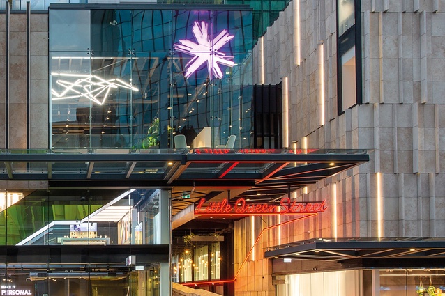
The next key move was to put a single vehicular entry ramp on Albert Street to service three levels of basement services and 280 car parks for the entire city block, comprising the retail precinct and the three office towers. The big curving truck ramp here cuts off potential ground-floor access to the retail zone, which is addressed by a Customs Street entrance – Little Queen Street – a laneway between the tower and Jarden House. It provides a covered, ground-level, semi-public, dog-leg pathway to Quay Street and a ramp up to the first level of the retail podium adding a great laneway/arcade amenity for the city. A pity it’s not truly public and always open 24 hours.

While we soak up the views from the Sky Terrace, Johnston explains the rationale for the tower’s exterior design. There is no height limit for the site but there is a harbour-edge height-control plane that runs at a 45-degree angle from a height of 40m from the middle of Quay Street: hence, a chisel top or, in this case, a curved foil to go as high as permitted. The front northern face is all about the glass. The western and eastern sides express the diagrid.
“We wanted to create a very directional building,” says Johnston. “We felt the Auckland skyline could benefit from a softer presence and relate to the water, carrying reflections across the day and through the seasons.” Splitting the front face into two halves emphasises the verticality. So, on the east and west, the diagrid isn’t actual structure but, instead, expressed as a kind of decorative element? “I’d choose different words,” say Johnston. “But, yes, it is applied as part of the curtain wall.”
After testing several iterations – flush, channel, co-planar, etc. – a peak profile was chosen. “It gave us something in the way it picks up the light.” He’s adamant this was the only responsible way to build a façade in this country. “A unitised approach is really robust and doesn’t have to deal with differential movements between structure and façade.”
The tower, designed in collaboration with Woods Bagot (San Francisco), provides a 40,000m2 gross floor area and a 91 per cent floor-plate efficiency. The percentage, referring to the area you can lease versus the area you have to build, is one Johnston is particularly proud of. “It makes this building one of the most-efficient high-rise buildings in the world.” More bang for your buck and the reason, for example, why the diagrid wasn’t expressed externally, because such a design move would have reduced lettable floor space.
The attention to cost makes sense, particularly in New Zealand, where Johnston says architects have to work harder because of our typically higher construction costs and lower rentals. As former Guardian architecture critic Jonathan Glancey says, all office towers clamouring for attention on a city’s skyline are essentially “machines for making money”. The ultimate aim is a machine that is “sleek and sensational”.
The PwC Tower stands out, not simply for its curved front face but also for the colour of its glass. “We wanted a skyline presence that was neutral to silver,” says Johnston. “We didn’t want a dark obelisk of building.” The low-iron glass provides more transparency and removes the greenish-blue tint of the glass most often used on city buildings.
But the decision, coupled with choosing a low-energy chilled beam solution for the building’s mechanical air conditioning, meant finding a way to reduce solar gain. After looking at various options, from exterior shading systems to a double-skin ventilated façade, the firm chose a grey, ceramic frit applied to the glass prior to its low-energy coating. Calculations showed that 25 per cent frit would be needed to make the chilled beam solution work. On each floor, this is applied most densely at the top and bottom of the glass, leaving the eyeline space and the building’s spectacular views uninterrupted. The shading effect is subtle, noticed only as you move closer to the perimeter where the generous 3.0m floor-to-ceiling height increases to 3.2m at the edge.

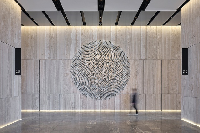
Descending at speed in a glass lift car from these heavenly sky offices with Waitematā views-to-die-for (some tenancies establishing super-elite enclaves connected by their own internal stairwells punched through several floors), Customs Street rushes up to greet us at an alarming rate. After pausing to admire the huge, swirling, circular Kevin Osmond art piece gracing the travertine wall beside the Sky Lobby lifts, we descend to the landing between the two sets of escalators and hang a right to another pathway to the retail precinct – this one taking us directly to the top-floor food zone. Don’t call it a food court. Either side of the corridor space taking you there is a set of adjustable meeting and seminar rooms, bookable as a shared resource for the tower’s tenancies.
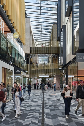
We pause at the Albert Street end crossing point of Commercial Bay’s pièce de résistance – the 95m-long, 6.2m-wide, three-storeys-high, covered public lane. Or is it an arcade? The east–west corridor, centred on the historic Central Post Office building and joining the newly formed Lower Queen Street Square, connects to a new Lower Albert Street Bus Interchange. It’s worth noting that, at ground level, the laneway is the only truly 24-hour public space of the entire 20,000m2 of the Commercial Bay retail precinct, which was designed in collaboration with NH Architecture (Melbourne). Don’t call it a mall.
The question the laneway confronts is whether or not the outcome was a good deal. In 2015, Auckland Council sold the former Queen Elizabeth Square to the site developer, Precinct Properties, for $27 million as part of an arrangement to build the City Rail Link under other property in the 1.2ha city block that Precinct owns. At the time, there was considerable public outcry about the loss of such valuable public open space. Overall, you have to say the current outcome is hugely better than what was there before and that Precinct’s development has given back a much-improved public amenity – especially in the way that it repairs what was a broken part of the city and enhances the burgeoning Britomart-downtown laneway circuit.
The lane was conceived as an extension of the city, with no glass entry doors and its façades designed as though they were exterior walls. Hence, the local basalt, chevron-patterned paving by LandLAB with a linear strip drain signalling its public function. The retail block is also conceived as a series of discrete buildings, each with its own material palette – timber for the Lower Albert Street and Quay Street corner, gold mesh with planting for a green wall in the middle and limestone at the Queen Elizabeth Square end. Those walking along the path and looking up receive a series of patterned references, including tukutuku weaving patterns and pātiki (flounder) diamond motifs associated with the location.

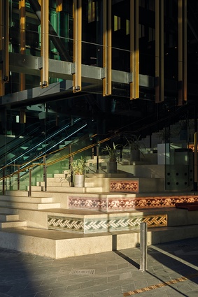
The most active part of the lane is undoubtedly the ‘Civic Steps’ beside the escalators, where the lane opens to the new expanse of Lower Queen Street Square. The steps are serviced by a café on the first floor and a sushi shop on the corner, which means that there’s regular activity, plus providing a great people-watching spot. It’s a shame more of this type of activation doesn’t continue along the path, making for a real laneway atmosphere. Unfortunately, there are covenants on the use of outdoor tables in the lane – planners, it seems, see the lane primarily as a through path rather than a place to linger.
Also working against laneway activation is the way in which the precinct is organised, with largely fashion retail on the first two levels and a wide variety of food offerings on the top floor to create a destination. The food options fall largely into two types: outward-looking around the perimeter, featuring some of the best, low-cost dining-while-viewing-the-harbour in Auckland; and more-traditional food court-style offerings located alongside the laneway. At times, the latter feel claustrophobic and definitely not good for social distancing – not that the throngs that are attracted there seem to mind.
So far, the formula seems to be working, with some two million people using the centre in two months – largely, it seems, for its food and beverage facilities. The other retail parts seem clearly affected by a post-COVID reduction in tourist trade, especially the lack of cruise ships.
Johnston says he likes the way the centre breaks down long-held tenets of retail orthodoxy, largely through having multiple points of entry and exit, and a circulation path that enables discovery. Key precedents researched were: Fünf Höfe in Munich by Herzog & de Meuron; One New Change by Jean Nouvel in London; and QV by NH Architecture in Melbourne. The essence of Commercial Bay’s success, says Johnston, was a design that departed radically from the exclusion of the outside that comes with traditional shopping mall typology. “We had a strong belief that the centre would be more successful if it felt like a connected part of the city.” What feels particularly good are the breezes you can feel at various times from the open laneway entrances – a sure sign of the outside coming in.

