Domestic monument: Maitland House
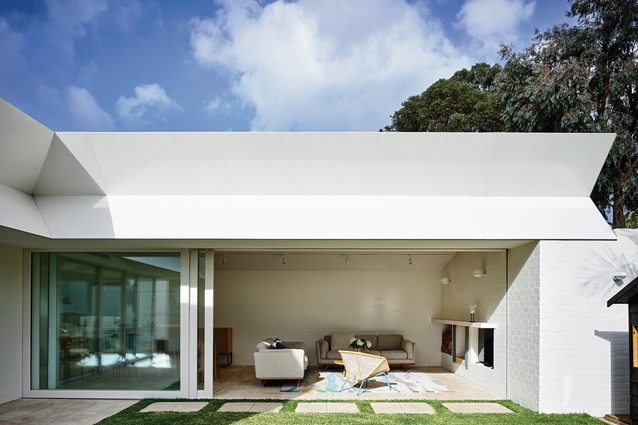
Bold “monumental geometry," a muted palette and the integration of indoor and outdoor spaces have revitalized an old orange brick home in this addition by Kennedy Nolan.
Some common threads have emerged in Kennedy Nolan’s work since the practice was established in 1999. Over the past few years, the practice’s portfolio of single residential projects, in particular, has developed a distinctive character that makes work by Kennedy Nolan readily identifiable.
The alterations and additions at Maitland House are, in many ways, part of that lineage of design thinking. The project continues the conversation of the practice’s approach to planning, materiality and formal assembly.
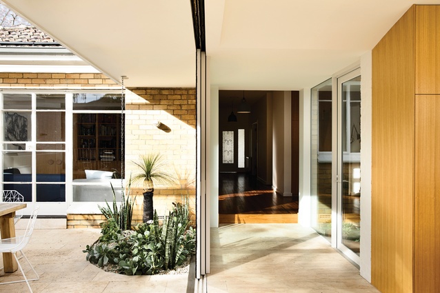
Similar to a number of Kennedy Nolan’s recent projects, such as Westgarth House and Park Lane, the Maitland House addition lightly connects with the existing house, leaving the original structure largely untouched. The addition occupies the former backyard with a circulation throat that connects to a new small opening at the rear of the post-war brick veneer house.
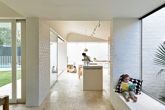
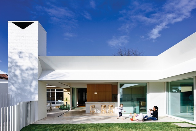
The new roof form slips under the eave of the original dwelling, with courtyard spaces flanking either side to give air and separation between the new and the old. There are view lines from the new kitchen to the back of the existing house, celebrating rather than concealing the original structure.
The Maitland House plan is yet another of Kennedy Nolan’s explorations of the courtyard typology. The extension is arranged around a new central courtyard orientated to capture northern light. The courtyard plan forms both indoor and outdoor rooms that bleed into one another. Rachel Nolan, a director of the practice along with Patrick Kennedy, notes that their studio considers the treatment of openings with great care. Glazing is very rarely treated as subtracted openings within a wall.
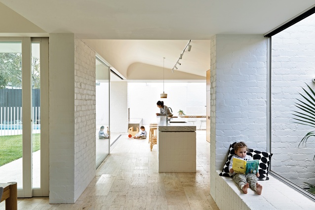
This approach reads clearly at Maitland House, where heavy brick volumes support the roof structure and glassy openings naturally find their place spanning the spaces between. This exaggerates the sense of openness and strengthens the indoor–outdoor nature of the courtyard plan.

The project adopts Louis Kahn’s approach to served and servant spaces; this is often central to the studio’s planning logic. Here, the servant spaces – including the laundry, storage and kids’ bathrooms – are tucked out of sight, strategically absent from the primary procession through the house.
Rachel identifies the editing of views as one of the guiding principles for their planning. For example, the barbecue in the outdoor dining area is concealed by a low brick wall, rather than exposed to the entry hall and kitchen. The practice has interrogated the view lines in its plans to carefully compose the experience of the space.
Aside from the plan, the aesthetic approach would be recognizable to many of those familiar with Kennedy Nolan’s work. The undertones of mid-century influence, the materiality and the use of monumental form are reminiscent of past works such as Westgarth House, Hampton House and Merricks Beach House, to name a few.
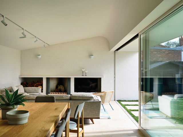
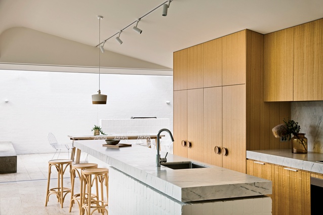
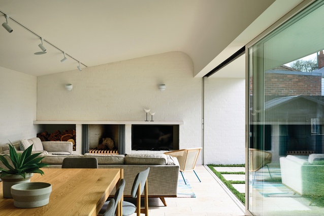
Lightly bagged and painted white brickwork has been keenly adopted by the practice, both for its aesthetic qualities and for the durability it offers young families. Avoiding plasterboard wherever possible, the practice has used brickwork for the walls at Maitland House, as well as for the fireplace and entertainment joinery, the kitchen island bench and the low seating plinth by the courtyard window.
The remainder of the palette consists of materials that are more specific to this project – oak, cork, marble and travertine – but these also remain consistent with the practice’s tendency toward neutral tones.
The restrained palette is countered by the playful use of geometry, or “monumental geometry,” as Rachel refers to it. This is something that has interested the practice since its early days, and this is evident through the clearly confident handling of geometry at Maitland House. The roof line is elegantly articulated by the outdoor fireplace chimney, which boldly extends above the building mass, terminating in an inverted triangle at its peak. The wide bird’s-beak-shaped fascia captures the depth of the roof form in a very considered and deliberate way.
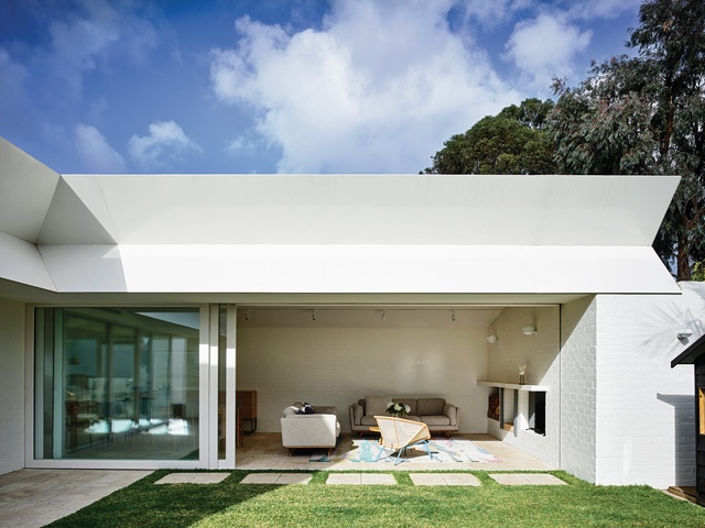
There’s no resistance to the potential awkwardness of the weighty roof structure. It is challenged head-on and treated as an opportunity for geometric exploration. The roof structure is particularly deep at Maitland House due to the curved “tick” ceiling form that glides over the kitchen and again in the living space. This ceiling form gives a soft dynamism to the internal volumes. The combination of these geometric gestures gives this home its own distinctive character. It certainly talks to past projects, but remains a unique iteration of these ideas.
While Maitland House certainly draws on tried-and-tested ideas, it’s in no way a simple reproduction. Armed with years of design research and finely tuned design intuition, Kennedy Nolan has intelligently applied that thinking to a new site and new client. The architects have drawn from their informally developed set of architectural rules to craft yet another gracefully composed, formally exciting home.

