Down by the water
35 resource consents, 45 building consents, 2 district plan changes, 16 months of construction and bam! Hello waterfront.
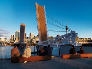
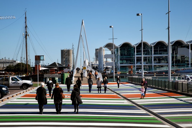
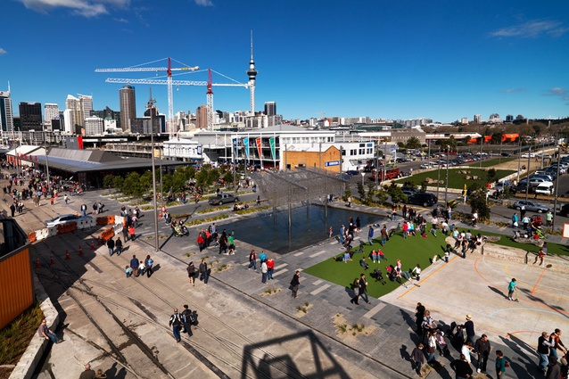
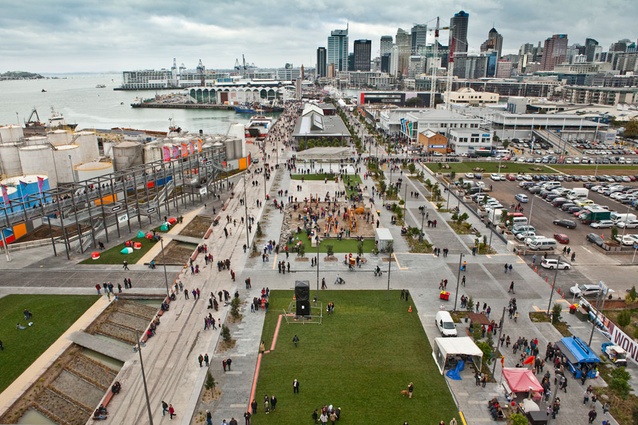
Auckland’s city centre, formerly bereft of quality open spaces, now has a few jewels, and Wynyard Quarter has the most carats. It all starts with the new bridge; without it, this quarter’s redeveloped stretch of industrial land would be disconnected. Now, a strong east-west axis has been unleashed. It’s possible to release your inner flâneur and perambulate down Quay Street all the way to the Silo Park, a concrete terminus on the watery cusp of Westhaven. On the way down the experiences are varied. Some are open and active, others sheltered and enclosed. There’s Karanga, the gateway, designed by Architectus, adjacent to the Moller-designed Viaduct Events Centre. Aussies Taylor Cullity Lethlean and Wellington firm Wraight + Associates designed Jellicoe St and the waterside North Wharf Promenade, as well as Jellicoe Plaza and Silo Park. Jellicoe St and North Wharf Promenade run in tandem for 450m, astride of new buildings designed by Fearon Hay, past the plaza with its titoki grove and Wind Tree, a sculpture, by Japanese artist Michio Ihara, recently absolved from storage purgatory. At the western end, there’s a temporary playground, designed by Isthmus, opposite a raw wetland that marks the edge of the sea wall under the wharf. And Silo Park’s massive metal gantry marks the point where the promontory of the wharf leans back into Jellicoe Harbour. There is a lot of ground to cover.
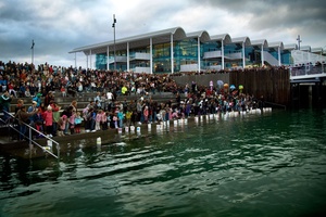
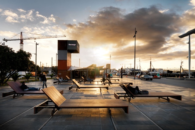
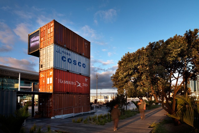
Karanga is a natural starting point, a place for crowds to gather after the bottleneck of the bridge. This plaza’s relationship with the events centre meant it needed the ability to accommodate marquees and crowds. It’s the frontispiece to Wynyard Quarter, bookended by North Wharf, and a foil to Silo Park down the other end, which also has massive, yet different, steps dropping into the water. Karanga is deceptively large, hence the gigantic moveable “loungers” and the stacked shipping container pavilion. These help address the imbalance in scale proposed by the events centre. The design features reference the precinct’s marine and industrial past and present, says Henry Crothers, urban designer at Architectus, and, importantly, give the space it’s own identity. The tidal steps help define it – they drop down into the water, framed on one side by vertical fingers of timber and concrete that indicate the line of the sea wall that runs under the precinct. These steps are bleachers, a place to play, wade or jump out of your kayak.
“The steps allow a physical connection rather than just a visual connection with the water”, says Crothers. “One of the ideas behind the tidal steps is that you can arrive by water – so there can be a ceremonial relationship to the Viaduct Events Centre.”
The steps feature subtle variations in surface treatment; some surfaces, those out over the water, have exposed aggregate. Predictably, there were questions about safety that needed to be defused, but, as Crothers says, “You can’t just fall down into the water; you’d have to try very hard to fall in.” Arriving by waka, as evidenced on opening day, wouldn’t have had the same cachet if upon disembarkation you had to pause to open a pool gate.
One of the challenges of the site must have been its size – 4855m2. The furniture and pavilion fill it and activate it. Because of the need for flexibility the furniture is moveable. It’s on tracks, a technique appropriated from boatsheds, where tracks bring the boats and into the water.
“The idea is that they can be arranged equally, or pulled together to make a stage, or put into little groups. They provide enough flexibility to allow varied recreational and events programs,” says Crothers.
Karanga also offers an experience within an experience. A wooden boardwalk provides a shady lane of indigenous planting, with 30-year-old pohutukawa trees a highlight.
Despite having its own identity, the plaza integrates subtly with the next piece of the strip, North Wharf. The ground plane of basalt contributes to the continuity of the connection, and bulky nautical sculptural objects blur the distinction of the fringe.
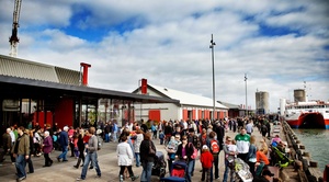
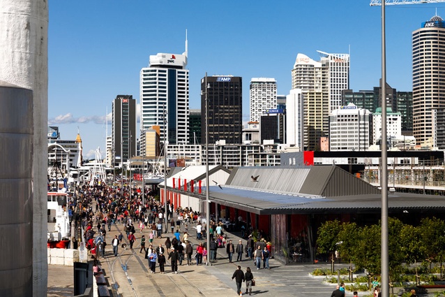
It’s opening day at Wynyard and it’s teeming – not with rain, but people, thousands of them. Who says Aucklanders never turn up to anything? The tram bells sound constantly, a reminder that at the media preview two days earlier the press contingent’s tram trip was unexpectedly abbreviated. Just 200m around the 1.5km loop a car was abandoned on the tracks. Despite a rousing cheer upon his return, the driver – fish and chips clutched tightly to his chest – departed unembarrassed.
I’ve just met Megan Wraight and Martin Bryant from Wraight + Associates (WA) and Perry Lethlean from Taylor Cullity Lethlean (TCL). Wraight recounts a near miss with a tram; Lethlean, over from Melbourne for the opening, is showing obvious signs of wear and tear – a broken pelvis, inflicted by a learner driver – “the only other person on the road one morning” when he was cycling to work. Anecdotes sorted, the designers provide some insights about the project. Bryant describes it as “something of a triumph for the landscape architecture profession”. He’s right, landscape architecture and urban design are clearly not afterthoughts here, they set the scene for future development.
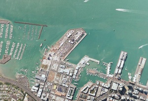
Perry Lethlean says that he was interested in connecting Wynyard with the bigger picture – Auckland’s mapping and morphology, and how you can connect back into the bigger network of the city. Wraight, he says, was really interested in the micro detail of the site.
“Megan did a really detailed mapping of this place, with partcilaur focus on its heritage elements. The project was a result of both those approaches coming together.”
Lethlean has waterfront design credentials in spades. He got a call up because of his experience in dealing with waterfront redevelopments in Geelong, Melbourne and elsewhere. He says that one thing that distinguishes this project from those is the approach to authenticity.
“With most waterfront redevelopments the history of site is cleared, and then there’s an attempt to reinterpret it. This project actually has culture and history – it’s a working wharf. It’s unique to retain that and it’s going to be the secret of this place in the future. The Geelong waterfront was very successful, but it was always referencing something that had been forgotten, it was referencing a past.”
The word “authenticity” recurs on numerous occasions on our jaunt around the precinct. Authenticity, says Lethlean, meant keeping as many “legitimate uses” on site. “The fishing industry makes this a destination, it’s an activity, not a memory of what once was.”
Jellicoe Plaza is a “connection and threshold space at the junction of the three larger spaces”, says Megan Wraight. It’s a central meeting point for the development, and the design includes abundant seating, a boon for the opening day throng, some of whom have taken advantage of the shelter and are clustered around a hand-painted piano. The keys are being tinkled by a random passerby. Shade from the grove of titoki will be well received in summer, and its clear the precinct has been programmed both for activity and shelter.
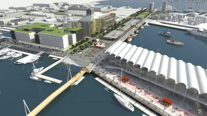
Jellicoe St and North Wharf Promenade are clear examples of this. North Wharf is exposed on the harbour edge, free from planting, studded with industrial strength furniture. Jellicoe is “protected and immersive”, green and lush. Originally, the plan was that Jellicoe would be the main boulevard, with North Wharf the narrower. The plan was altered, says Wraight, to favour greater space on the seaward side.
“We walked around and assessed all the spaces around the Viaduct and Princess Wharf and looked at them in sections. The public spaces are meanly scaled, so that was one of the key arguments for creating more space on North Wharf and pulling the buildings back,” says Wraight.
This meant reducing the width of Jellicoe Street and increasing the width of the wharf, “making a really good public promenade that would still allow the fishing boats to work here, let them come in and unload and let the ice trucks come in, and to allow this activity to have the right scale.”
WA’s resource consent application fills in some of the differences between these two parallel streets. North Wharf Promenade provides an engagement with the working wharf that is “robust, real and gritty” but at the same time provides for “promenading, dining and public seating”. Jellicoe Street is described as “an inviting green oasis; protected but active; a low-speed traffic environment; flexible for events and markets.”
Jellicoe’s landscape is dotted with pockets of mixed plantings – it’s a lush vegetated environment – not a shared space – but a highly pedestrianised strip. Bio-retention gardens in Jellicoe Street collect and filter stormwater. These are “tessellated” gardens, the edges of the plantings almost look pixellated. These gardens vary in size throughout the development. Stormwater is also collected from the hardstand areas of North Wharf, where it’s conveyed to Silo Park’s wetland and filtered.
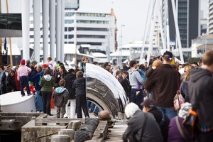
From an end-user perspective, the opportunities for sun, shade or shelter should guarantee the precinct’s success. The new buildings, for instance, make it easy to duck through to the ‘other side’ and get out of the wind. The building’s actually feel more like grand-scale roof planes, and a sawtooth-style deflection of the roof is a subtle nod to industrial architecture.
“Fearon Hay has done a fantastic job of keeping those buildings really open,” says Wraight. “They’ve achieved the permeability and the cross-links between the two axes. The buildings feel public. There’s a generosity to the overhang – you feel as if you’re allowed underneath that piece.”
A process of retain, preserve and restore was undertaken across the project, but it’s very evident on North Wharf. The original wharf was patched up, as was the sea wall beneath. On the ground, once the original buildings were removed, original rail lines were uncovered and cleaned, with the track grooves filled.
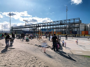
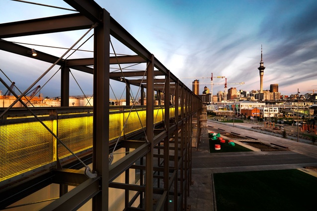
Anecdotally speaking, one feature of the development that the public struggled with on opening day was the gantry, which stands proudly on the edge of Silo Park, and provides brilliant views over the remaining silos. Amongst overheard snippets of “can we go up there?” and “what’s it for?”, Lethlean explains that it’s a multi-use structure, although it is “one part folly”. Eventually it will form part of a new playground. The garden next to the gantry features circular garden beds, which will be removed once development proceeds and the very “organic” looking citric acid tanks behind the colourful fence are removed.
“We also actually wanted it to be a functioning gantry for the marine industry, so we’ve multi-programmed it, as well providing the opportunity to get up there and be a part of the gantry landscape.”
At some stage, once base planting grows, the gantry will wear a livery of green. It will also be used to screen films.
Lethlean says he also considers the gantry as a hinge – an indication of a geographical shift in orientation of the promontory. “We wanted the gantry, or some object, to signify the change of geometry of the city,” he says. “If you do a mapping of the Auckland waterfront, you have the grid of Quay St and all the finger wharfs are doing all these different shapes. So this gantry is a signifier of the change of the grid, if you like, and to frame this view.
From the top of the gantry you can take in the entire precinct, gaze out across the tops of “tank world”– the remaining collection of fuel and chemical silos, or view the wetland, where storm water collects. That feature is a little like Waitangi Park, in Wellington, I suggest to Wraight.
“Well, we’re all at the water’s edge; we’re in a wetland environment. One reason to build a wetland through here was to expose the edge of the wharf, and reference this as the old edge. So this is the edge prior to Wynyard Point being retained. It was fantastic to reveal all this, to repair it but keep the roughness.”
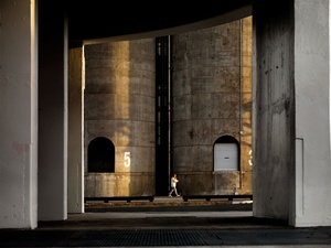
A measured roughness permeates through the development, helped along by re-use of industrial materials from the site and sculptural objects. The buoys at the bottom of the gantry were rescued from storage in Onehunga. Perry Lethlean spotted them from a taxi to the airport. The massive concrete retaining blocks – “industrial Lego” as Wraight describes them – are old Firth blocks. The pink-hued blocks down one side of the wetlands are from the old McCollum chip yard. Similarly chunky blocks were used for the construction of the tidal steps at the end of Jellicoe Street, around behind the “6-Pack” – the six closely spaced silos that stand near the solitary “Silo 7”, the old Golden Bay Cement Silo.
For most Aucklanders, Wynyard Quarter has been a bolt from the blue, but as John Dalzell, CEO of Waterfront Auckland mentioned in a recent report, “nothing comes from nothing”. The reason it is surprising is because almost nobody ventured beyond the fish market; nobody knew what was there. And this is just Stage 1. In the short term, there are rumours of Architecture Workshop being involved in a “lighthouse” installation for Silo 7. ASB’s head office for 1,300 people will open in 2013. Until then, planned markets and a schedule of events should keep the activity levels up. A new hotel is also on the cards. Over the next 5-10 years more of the headland will come up for development – that inlcudes 4.2 hectares of eagerly anticipated public open space.
Perhaps the best thing about the project so far is that the public has been shown what they can have – good quality projects based on considered design. A recent visitor, New York-based landscape architect Ken Smith, who is currently working on East River Waterfront Park, a redevelopment of two miles of the New York waterfront, was impressed with what he saw at Wynyard, calling it “world class”. He also said that he thought Auckland’s strengths were its natural features, it’s coasts and its hills. With that in mind, Wynyard Quarter is a good example of playing to your strengths.

