Draft of shadows
Art, greenery, sunshine and a touch of vintage blend effortlessly in this brutalist house for the co-founder of Mexico’s hippest hotel chain.
When Moisés Micha came across an abandoned four-storeyed townhouse in Mexico City’s affluent Chapultepec district, he purchased it without a second thought. The 1970s’ brutalist building may be startlingly oversized for a bachelor pad, but the co-founder of boutique hotel brand Grupo Habita saw its potential as an urban sanctuary and the perfect home to accommodate his extensive (and ever-growing) art collection.
There was considerable work involved to get it to a liveable state, though, especially since the interior had previously undergone a shoddy renovation, which divided it into poky apartments. So, Micha engaged Belgian architect Nicolas Schuybroek, who collaborated with Belgian interior designer Marc Merckx, to realise his vision, along with local architect of record Alberto Kalach, who was also responsible for the landscaping.
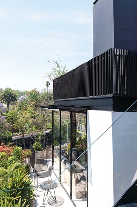
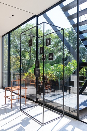
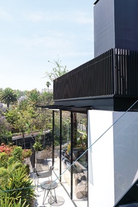
The home doesn’t have a garden – unlike the majority of houses in the neighbourhood – and, for this reason, the architects introduced a triangular concrete canopy, a rooftop terrace and a generously sized patio at the rear of the residence to afford it some outdoor space. These additions allowed Kalach to incorporate hanging gardens descending from the balconies; they provide the interior with a connection to nature and also function as privacy screens, particularly on the façade.
For Schuybroek, this landscaped panorama heightens the home’s appeal. “It was all about creating a secluded, serene retreat that was warm and welcoming yet sophisticated,” he says. “Reconfiguring it in this way not only gives the building’s original design a new twist but, also, it offers the opportunity to experience each floor differently, as well as enjoy breathtaking views from the rooftop terrace.”
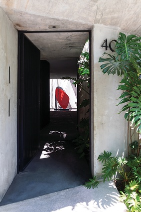
Their first task, internally, was to reinstate a sense of spatial logic and they did this by removing all unnecessary elements from past refurbishments, repurposing it as a single dwelling once again. Kitchen, dining and lounge areas are positioned on the first level, while the two bedrooms and two bathrooms are located on the upper levels. The exterior’s austere concrete beauty is extended inwards, beginning with the ground-level entry’s long corridor, which opens up to a small pool in the rear courtyard, upon which sits Terence Gower’s bold red and black steel sculpture, The Couple.

This courtyard and its resulting void is new, dramatically sliced away to ensure the once-gloomy interior now receives plenty of natural light and cross-ventilation. It’s quite the welcome for a home that simply becomes more and more impressive in materiality, scale and curation, the further inside one steps.
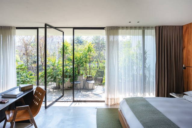
Clean lines and neatly proportioned rooms characterise the scheme, and Schuybroek and Merckx have continued the polished concrete floors and cemented walls and ceilings throughout. “We chose a restrained material palette to give the interior’s design a strong identity but, still, to have it appear soft and luxurious,” Schuybroek explains. The effect is utterly utilitarian, providing visual cohesion across all four floors. And, while the overall expression is brutalist, there’s a definite nod to mid-century modernism in each level’s distinct horizontality and floor-to-ceiling glass windows and doors.
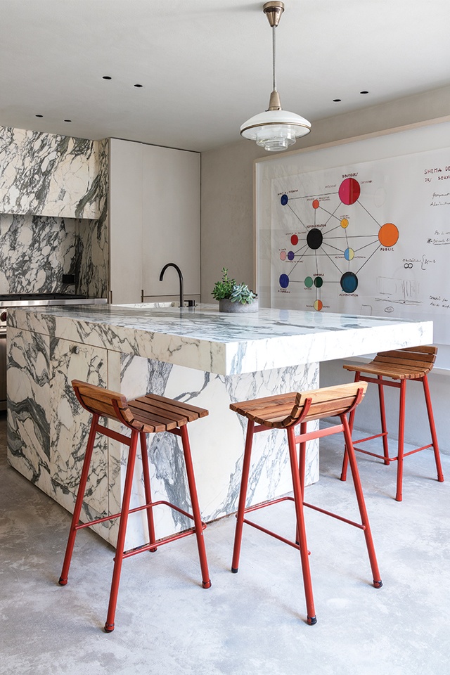
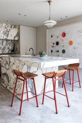
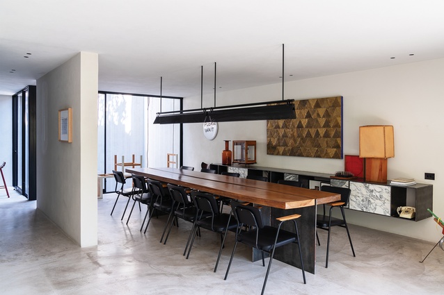
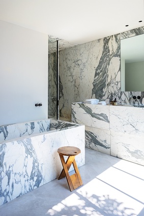
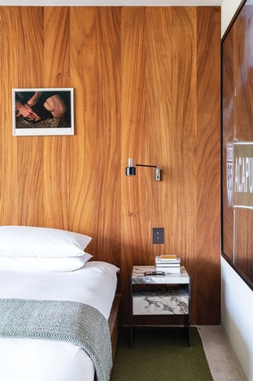
Punctuating the monochrome palette are the openings’ blackened steel frames and heavily patterned Arabescatto marble, which is strikingly used in the kitchen and bathrooms. In a display of Schuybroek and Merckx’s fine attention to detail, this same marble is judiciously incorporated into the dining area’s custom built-in console and the main bedroom’s side tables: delightful accents that offer visual connection between the residence’s different spaces.
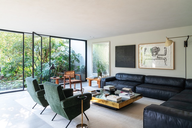
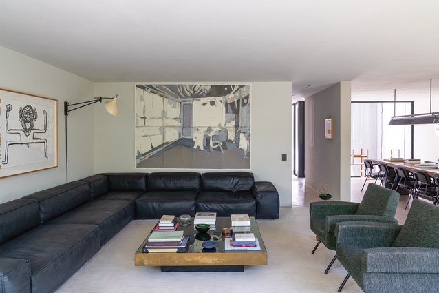
But, of course, the main reason for such minimalist, neutral design is to provide the perfect backdrop for Micha’s art collection, all of which is on display, carefully curated throughout. Consideration has been given to each work’s positioning and so there’s nothing sterile about the outcome. Instead, the effortlessly integrated arrangement feels curious, warm and incredibly alluring.
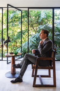
It shouldn’t come as a surprise to discover Micha’s parents are also collectors – who own works by Diego Rivera and Pablo Picasso, amongst others – and he grew up surrounded by art. Perhaps this is where his love for collecting came from and, in decorating his home in this way, he’s articulating a long-standing passion. A Le Corbusier/Bubble Diagram (2014) by Jose Dávila hangs in the kitchen, as does a painting by Gabriel Orozco, which is from the artist’s Flag series (2003). Elsewhere, works by Ai Weiwei, Mathias Goeritz and Abraham Cruzvillegas highlight Micha’s stylistic affinity for Dada-esque collages and sculptures.
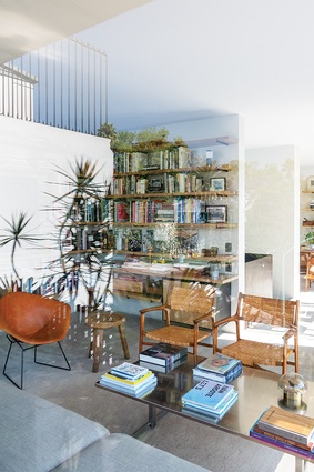
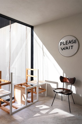
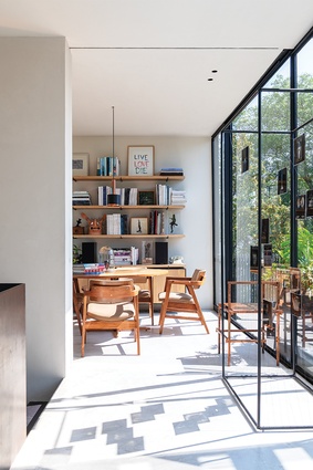
But it’s Damián Ortega’s Unfolding/Flip Chair (2004) that instantly appeals. The piece deconstructs and abstracts a simple chair form; sitting in front of the dining room window at the end of the custom-designed table, the sculpture is a witty study in form. This is even more so because it bridges the conceptual gap between fine art and functional design. It’s the perfect counterpart to the home’s furniture, which Schuybroek, Merckx and Micha selected over the course of a year.
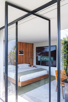
Timber pieces prevail and they inject a lovely mix of caramel and honey tones into the scheme, complementing the main bedroom’s locally sourced parota joinery. Each item’s own particular patina also further softens the concrete interior, while the mix of old and new represents sophisticated eclecticism at its very best. And, just like the Ortega sculpture, the 1960s’ teak and wicker Pierre Jeanneret chair – a rare find in Chicago – stands out. Ultimately, this is a home of incredible style and elegance, realised via an intelligent design that values beauty as much as it prioritises comfort.

