Dramatic contrast: Mayfield Ave Residence
Wanting a larger outdoor space while also seeking an increase of the internal floor area seems mutually exclusive… or is it?
Studiofour’s recent clients, a professional couple with three children, approached the architects with a Pinterest mood board and some very clear ideas about the way they wanted their new three-levelled home to look.
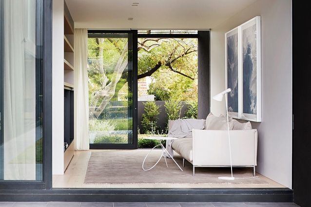
He envisioned an architecture that was bold and dominant and she favoured a soft, light interior that provided a sense of sanctuary. So, when it came to translating their opposing aesthetics, Studiofour co-directors Annabelle Berryman and Sarah Henry celebrated the juxtaposition. The result is a dwelling that presents as a tough charcoal shell protectively wrapping a cluster of relaxed, warm spaces. Multiple programmatic requirements are effortlessly met, including the accommodation of four bedrooms plus a guest room, which doubles as a study, while the structure works to shield the interior from large neighbouring residences.

Essentially a courtyard house, the C-shaped floor plan is well and truly embedded in the generously sized garden. Indeed, this connection with the outdoors was high on the clients’ wish list, although arriving at the outcome was not without its challenges.
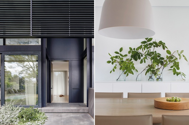
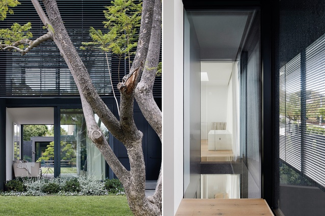
“They wanted a lot of house as well as a lot of garden,” says Berryman. “So, we had to figure out how to minimise the footprint in order to maximise the proportions of the surrounding outdoor space, all the while maintaining a high level of functionality.” The solution was an architectural overlay, or second skin, comprising blackened steel screening set off the façade by 1.5 metres, which makes the interior appear larger than it is without taking anything away from the house’s relatively compact footprint.
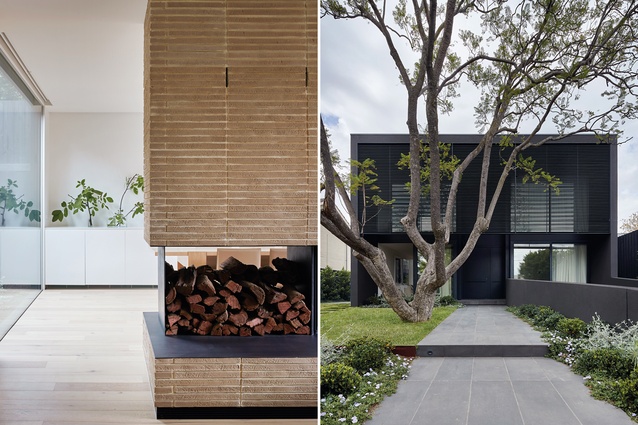
This framework visually reduces the building’s mass and, from the property’s north-facing street elevation, captures plenty of natural light while maintaining the family’s privacy. Passers-by who look up at the first floor’s main bedroom can’t see in because of the angle of the louvres. However, from the inside looking out, the clients have clear views of the giant jacaranda tree and new lap pool at the front of the property. This engagement with the outdoors reflects their desire for a healthy home, as well as their respect for the site’s context, the leafy inner-Melbourne suburb of Malvern.

Interestingly, Berryman and Henry pulled aesthetic cues for the interior from the exterior – not the other way around. So, the charcoal-coloured façade and screens informed the fireplace’s detailing and window reveals, ensuring subtle cohesion between inside and out. More important for the family of five was a logical sense of spatiality and the co-directors achieved this via a semi-open plan.
As Berryman explains, “the clients didn’t want a house that feels like a showroom. Instead, they wanted interior spaces that are purposeful, separate and calm but can still deliver the advantageous aspects of an open plan, such as visual connection and access.”

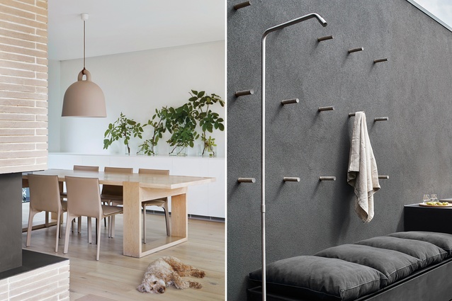
On the ground level, the living areas are clearly defined by built elements to offer a sense of zoning that allows for family interaction as required. The floating fireplace, for example, is a cleverly positioned insertion that distinguishes the lounge from the dining room without alienating anyone in the process.
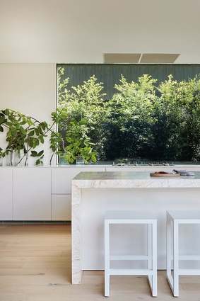
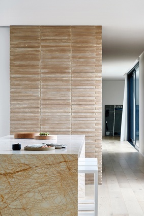
And, as the heart of the home, the kitchen is centrally positioned at the top of the stairs from the basement and features three distinct areas – a butler’s pantry, the main cooking space and a servery. It’s a hard-working design boasting multi-purpose components at every turn. But most impressive is the 11-metre-long bench, which extends into the dining room, not to mention the overall material palette, which is eye-catching in its minimalist restraint.
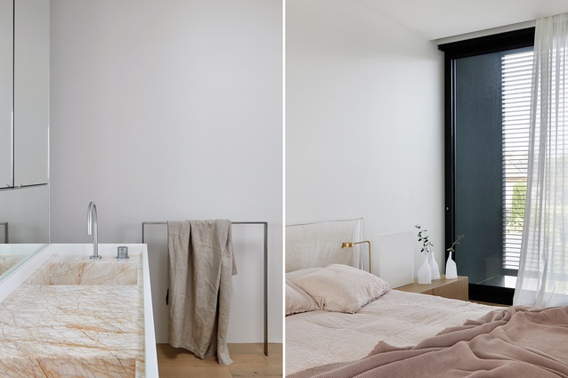
Central to the interior’s organic materiality is the handmade brick used for the fireplace and lift core in the stairwell. It’s warm and textural and complements the oak flooring, while providing the perfect backdrop for the heavily patterned kitchen island’s marble, which ranges in colour from soft pink to muted terracotta. This same marble is also used in the powder room and in the main bedroom’s en suite as a custom inset on the vanity.
Refined detailing, uncomplicated planning and a judiciously executed scheme lend this house incredible appeal. But its true beauty lies in a refreshing simplicity highlighted by the dramatic contrast between inside and out.
This article first appeared in Urbis magazine.


