Dry & Tea
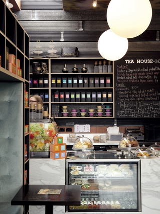
Dry & Tea is, conceptually, quite a rare thing. It is mixed in mode, a composite of two different ‘salon’ typologies that relate to tea and hair. From a modern business perspective, you could argue that it’s right on the money: a local illustration of hybrid diversity and a willingness to do something different to distinguish oneself. Just to clear up any possible confusion, what’s on offer at Dry & Tea’s two stores, one in Newmarket and one at the City Works Depot, both in Auckland, is a variety of hair styling options alongside with a hospitality twist in the form of boutique teas, light refreshments and, more recently, thanks to the addition of a liquor license, some things that are a little more potent – cocktails and champagne.
Dry & Tea’s owners are four in number. The business was set up by Nicole and John Kelly with Louise and Phil Pilkington. Collectively, the group’s members describe themselves as having a “passion for service”. In particular, says Nicole Kelly, they wanted to, “lift the bar on how clients spent time at retail”.
“We have a diverse experience base amongst us,” she says. “I’ve worked in international fashion and love all things beautiful, John has run retail chain stores globally, Louise has been a leader in the New Zealand hair industry, owning Servilles Ponsonby, and Phil has had extensive experience running salon operations and support with Servilles.”
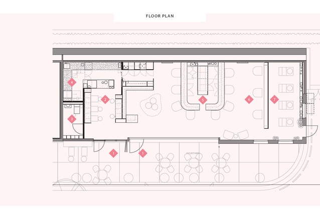
To deliver their new idea they got Cheshire Architects on board. The Newmarket store came first and now anchors Osborne Lane to York Street in Newmarket. The second salon is in a rebuilt-to-original-footprint council garage on the site of the City Works Depot. This second venue, says Nat Cheshire, has “some tooth, some history and some weight”.
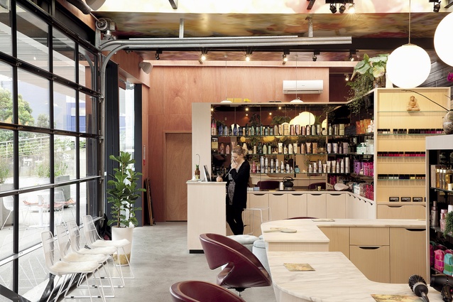
The selection of a site at City Works Depot set up an interesting tension. The salon’s fire station-style doors mark a threshold where the industrial surroundings meet something unabashedly softer. The salon is an oasis of femininity abutted by three-and-a-half hectares of thin-skinned-steel-wrapped buildings and somewhere in the vicinity of 900 car parks. From an accessibility point of view alone, this particular spot offers more parking amenity than a trip to your local mall, while managing to be infinitely more interesting at the same time.
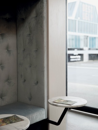
“At Dry & Tea in Newmarket we’d organised a very beautiful Second Nature garden,” says Nat Cheshire. “But City Works was always meant to be a tougher, more urban proposition but, nonetheless, with no less delight in it. In summer, you can hit a big red button so the fire station glass door tracks up and along the ceiling. Then, all of a sudden, you’re sitting at a beautiful marble counter top drinking bespoke tea or sipping champagne, perhaps you’re having your hair styled, the sun’s streaming in, and you’re doing all of that for a few dollars. It’s a very exciting and enticing offering.”

There is little that is new in this world. Businesses of a similar, if not exact, ilk exist in the Land of the Free. Emily Priest, a spatial designer at Cheshire Architects, conducted some early research into the aesthetics of these American iterations and found that that, to her eye, they were not quite friendly enough.
“The first thing that cried out to me was that there was no warmth in what we saw, no real love in the tactility. You need to make the space clean and fresh but at the same time you have to make it feel inviting and comfortable. And you get a lot of that from light and colour.”
With respect to design process, Priest says that creating a fictional character, akin to an ideal customer, can be a helpful barometer for creative decisions. “The way I shape some projects is through a type of muse, so we have this person that starts and creates the story, and then around that everything else is formed. We had two separate muses for these two spaces. For me, it makes it easier to make creative decisions when you can ask, ‘what would that person want?’”
At Newmarket, the muse took the form of an elegant, Remuera “shopping mum”; at City Works Depot, with its warehouse surrounds, the client was pictured as a “city girl”, who “doesn’t have much time but wants some pampering”.
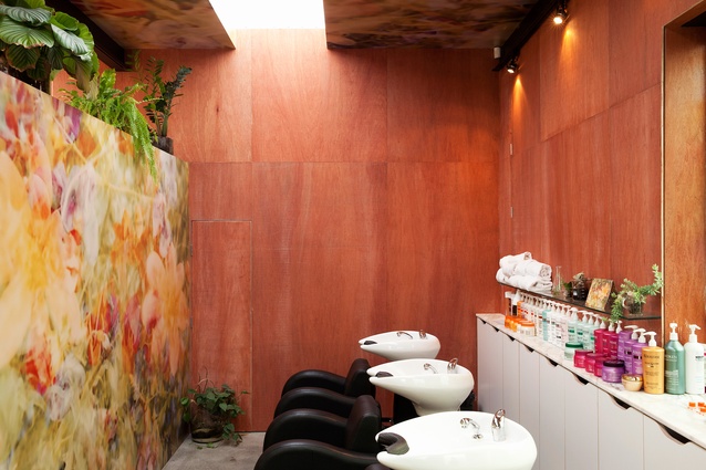
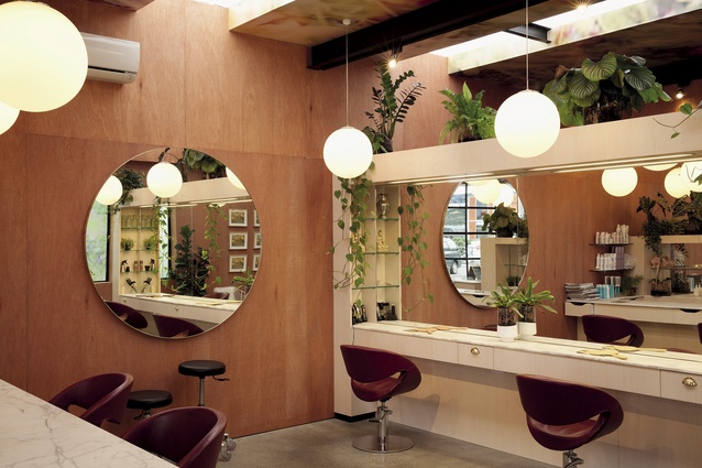
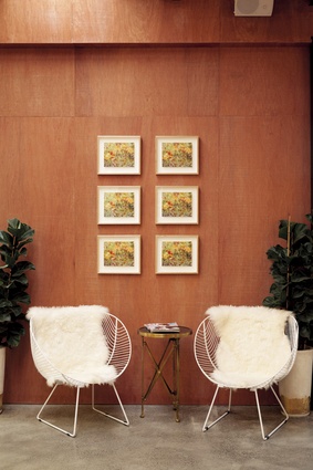
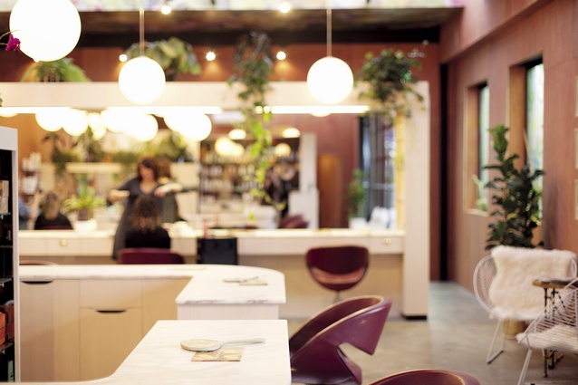
Those initial decisions resulted in a design that is comprised of soft blonde timbers, pale marbles, orchids and little bits of brass. There are soft pinks and delicate “sea salt” greens, all of which is quite lovely, delicate, warm and fresh. The two stores, which share some material similarities, are not identical. The elegant cararra marble made the jump from project one to two, as did the super graphic floral artworks, from Paul Hartigan’s ‘Power Flower’ series, which provide a soft floral lilt at the periphery of the eye.
“The two stores are quite different in feel,” says Priest. “We decided to take some quite important design gestures that say, ‘Okay, so this is Dry & Tea’ – like the marble, the white shelving and the globe lights. And then as we got into the space we thought actually, Paul Hartigan works extremely well graphically at Dry & Tea in Newmarket, so we’ll see if he’s up for doing another one. We worked closely with him, and his work is on the ceiling at City Works – he’s a great guy, a great creative, and really fascinating to work with.”
Hartigans’s prints provided a colour template for the spaces, influencing the furniture, for instance. At City Works, the styling chairs are a deep red, in Newmarket they are a lighter shade. There are also ottomans and cushions made up out of Hartigan’s print, there is upholstery in a delicate green and dusky pinks that visually tie with the plywood cladding at City Works. The marble was chosen for its inherent beauty and its Old World nature, as was brass, which is, “so much warmer than chrome”.

From issue to issue, it often seems we are singing from the same songbook when it comes to the success of developing precincts in Auckland. Britomart’s successes are ongoing and well documented. The City Works Depot, likewise, appears to be making a very good fist of place-making rather than just making places.
It continues to attract vibrant and experimental businesses that are interested in surrounding themselves with the fabric of the old metal workshops. When it comes to experimental business models, I’d venture that few businesses at City Works outgun Dry & Tea.


