Dual impact: Exploding Shed House
This “energetic” one-bedroom cottage by David Weir Architects provides a place to live and a place to work, embracing its small footprint while packing punch through bold materiality and strength of form.
The Exploding Shed House by David Weir Architects is perched in the back lot of a subdivided property, on the eastern fringe of Perth’s Mount Lawley. The one-bedroom, one-bathroom home stitches together a space to work and a space to live, tailored to the lifestyle of the client, a designer/illustrator. An experiment in urban infill, the house embraces its small footprint to celebrate the simplicity of home life, while packing punch through bold materiality and strength of form.
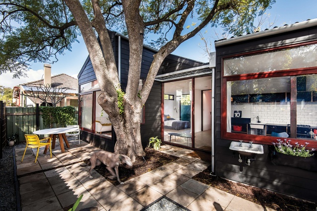
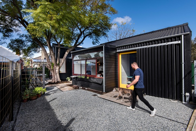
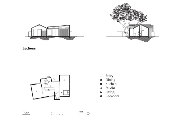
The client’s brief to design a small, affordable house with a yard and studio drove the architect to split the new building into two discernible spaces: a weatherboard cottage for living and an adjoining corrugated shed for working, with a durable concrete floor throughout holding the spaces together. The dwelling’s blackened exterior form is a reworking of the cottage and shed vernacular that dominates this pocket of Mount Lawley. The materiality and spatial qualities of each volume playfully explore these archetypal spaces, the cottage reflecting a simple and modest lifestyle and the shed a rough and messy workspace.

At just ninety-four square metres, the house eschews unnecessary floor area for an intimate garden paved with recycled concrete pavers. The cottage is anchored by a mature jacaranda tree that provides shade throughout summer, while a concrete slab provides thermal mass to warm the home in winter. The house is cranked ten degrees due north to optimize northern light and invite natural breezes into the main living spaces.
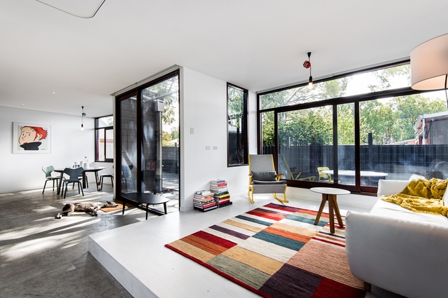
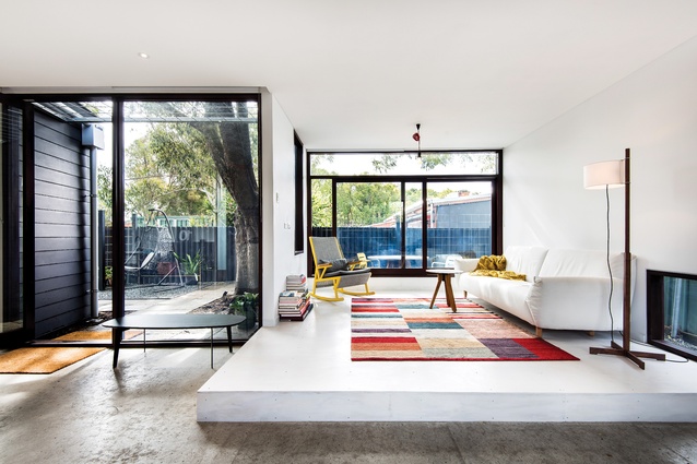
Defined by white walls interspersed with wide, jarrah-framed sliding windows, the living hub of the cottage is visibly connected to the yard. The orientation of openings toward the laneway affords delightful views to the established trees of neighbouring backyards. This draws focus beyond the boundary of the small block to create a sense of airiness within the otherwise compact interior.

The established roots of the jacaranda tree are accommodated by a raised plinth of whitewashed ply that demarcates the lounge area, the slight reduction in volume creating a sense of intimacy. The adjacent bedroom opens to a narrow garden and can be delineated as private space by closing the hand-drawn curtain. This European, studio-style arrangement maximizes floor area, allowing the full extent of the home’s small footprint to be visible as desired.
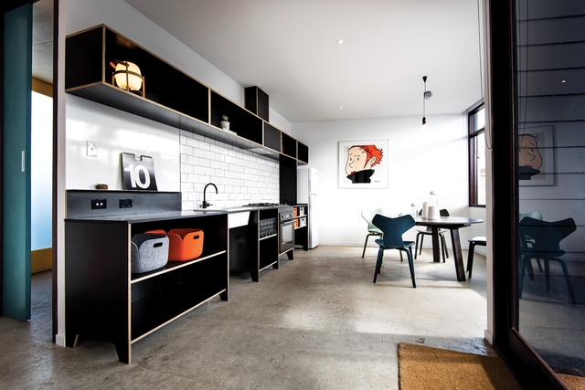
The bold, black laminate kitchen features plywood edging and a splashback of white subway tiles. Pre-cut, delivered to site and assembled by the client, the simple kitchen cabinetry is predominantly open shelving with colourful crates for storage. The kitchen’s wide sliding window provides access to fresh herbs growing from wall-hung planters, while the lounge’s sliding doors provide a comfortable ledge to allow for exchanges between the interior and exterior. Intrinsically connected to the yard, these living areas impart a spaciousness and ease that deformalize the program of the house.
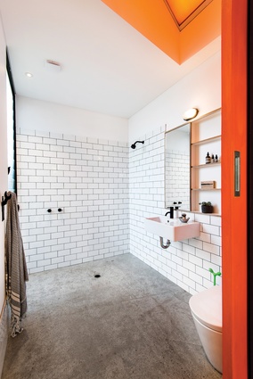
The client’s desire for a vibrant orange bathroom was met with a tinted skylight that floods the space with a strong wash of orange light. The effect of the skylight is transformative – an ephemeral explosion of colour on an otherwise restrained palette of neutral and raw finishes. The bathroom’s louvred window attracts natural breezes and provide views to a sliver of garden, articulating an axis to the residential street front. The continuation of white subway tiles, plywood-edged cabinetry and black fixtures provides a clear link between the kitchen and bathroom.
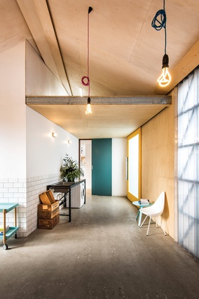
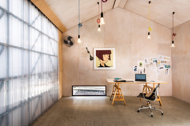
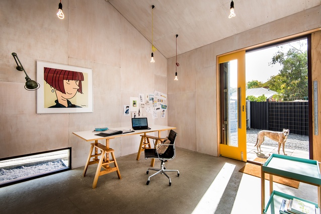
The prefabricated steel shed adjoining the house presents a large open workshop and laundry that are suited to the client’s illustrative work. This volume is more roughly finished, lined simply with face-fixed, whitewashed ply. A portion of the shed is clad with translucent corrugated sheeting that exposes the geometry of the steel structure behind it while softly diffusing natural light. Low-energy pendants complement this lighting, animating the space with colour and ambient light. The client’s punchy illustrations sit in perfect harmony with the industrial aesthetic.
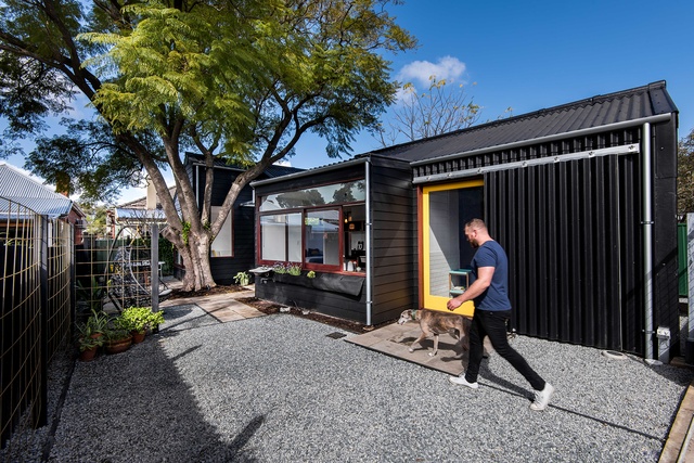
Two bold yellow sliding doors open from the shed, one to a narrow drying courtyard and the other to the pebbled driveway. The latter provides a wide aperture that lets in northern light and helps the driveway to serve as a loading dock for the client’s artwork and supplies. Two low-level windows create an axis through the studio to the lounge, accentuating the size of the house and its site boundaries.
The Exploding Shed House has the tenets of a well-designed suburban dwelling, and David’s design embodies ease and adaptability, making it conducive to basic home life. Thoughtful orientation and planning capitalize on the surrounding landscape to augment the building’s small footprint, while the accents of colour provide interest without overwhelming the interior. The house is simple, energetic and not too precious, reinforcing the connotations of cottage and shed while leaving room for the production and personality of the artist’s work.

