Duct Tape workshop
Nestled in the juncture between craftsmanship and gadgetry: a digital repair shop undergoes a highly eclectic and very hands-on design treatment.
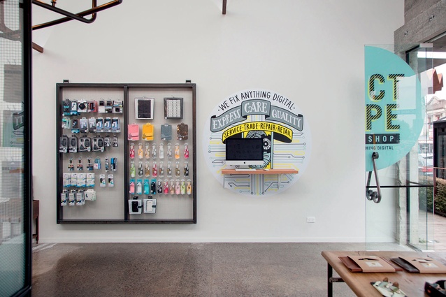
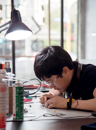
Duct Tape’s motto, ‘We fix anything digital’, implies a certain resistance to the throwaway culture that surrounds so much of today’s gadgetry. The company aims to fix things rather than automatically upgrade them and recycle (they sell and trade restored items) rather than dump them – expanding technology’s ever-decreasing shelf life.
It was at this crossroads between the quick turnover of new machines and the ‘old-school’ expectations of longevity that the designers at Material Creative wanted to place the visual experience of this Ponsonby store.
“It was quite hard to marry the two so it made sense to reference this more through the technological side rather than purely materials and layout,” says Olivia Harper who, with Toni Brandso, co-directs Material Creative.
“Also, the co-owners, Guang and Jia Han, were completely out of control,” she continues with a grin. “Jia especially was so full of energy and great concepts that, every time we met, she had around 10 new ideas.”
The most outlandish of them included building a Ghostbusters-styled backpack which, instead of suctioning malevolent forces, would project advertisements for the new business. “Guang wanted to stand in the middle of the Queen and Customs streets intersection and project up onto all of the buildings for passers-by!”
From spirited discussions, some more realistic concepts began to emerge. “We came up with the name Duct Tape,” says Harper, who says Material Creative is often approached for early branding strategy and helping with the overall image of small businesses.
The Chinese-born, New Zealand-educated owners wanted something intrinsically Kiwi to represent their brand – “we explained to them how in New Zealand people have this idea that anything can be fixed with duct tape,” she says. “They loved it!”
Initially the Hans wanted something hyper-modern, while the designers’ palette tends to veer toward recycled timbers. They compromised and agreed on the super slick, almost futuristic geometric patterns but incorporating beautiful finished oak with brass bead detailing and lots of neon light. They wanted a large, curved, faceted desk to act as a centrepiece.
“We finished a full concept and drawings and showed it to the landlord and he wasn’t pleased at all!” says Harper. “I opened his email and got the shock of my life!” Duct Tape is nestled in between a homewares/linen shop, designer furniture purveyors and an array of cafés and restaurants in the Ponsonby Central complex. The design had to be vetted by the landlord to ensure there was a common visual thread running throughout the coveted retail conglomerate.
“We had to redesign and had less than three weeks to do so,” says Brandso, “but having those boundaries meant we had to push things more and in different directions.”
The result is a mixture of custom-made pieces and second-hand finds, a minimalist, curated mélange of objects and furniture from rescued vintage, French country, a British gentleman’s lounge and the textures of 19th-century industrialist through to the slick and modern textures of metal panellings – and a touch of neon thrown in for good luck.
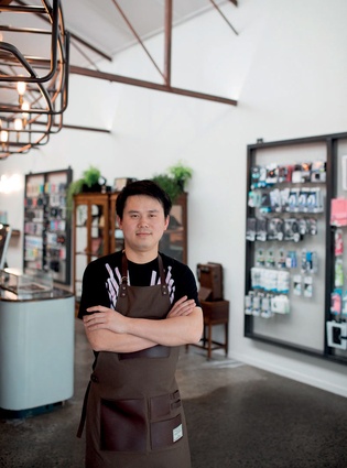
There’s a conversation taking place between the industrial crafts of the past (such as the canvas and leather aprons and old wooden drawers where library catalogues were housed) and the high-tech elements of what, at one stage, was what the future was expected to look like.
The most immediately noticeable contribution by the Material Creative team was a partition dividing the workshop from the rest of the store. “We wanted the workshop to be visible and central – people being able to see what was going on inside and how the technicians fix things,” says Harper.

The solution came in the shape of a curved, metal-piping, rail-like frame on the ceiling. At first sight, the piece, with its rusty tinge and decorative wheels (much like large mechanisms from an old clock), combine well with the geometric patterns and metal trusses that make up the internal architecture of this space. There is an air of New York loft mixed with industrial nostalgia.
The exposed filament bulbs screwed directly into the structure hint at something slightly more futuristic/steampunkish. From it hang a series of removable steel frames with steel mesh, which allow for the space to be reconfigured and for privacy to be reached by hanging objects on it and ensure workshop tools always have a place to rest.
“This piece was also influenced by old workshops in New York – in particular, Roman and Williams offices in an old loft, an image of the glass and steelwork was what started the direction. Then Jia took off to Bangkok for the weekend to gather some inspiration from all the new retail/shopping malls popping up over there and came back with a number of images we referenced which helped us develop the final design of the workshop,” says Harper.
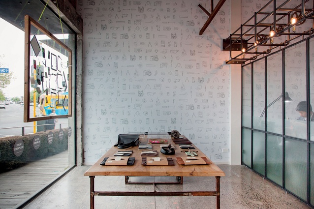
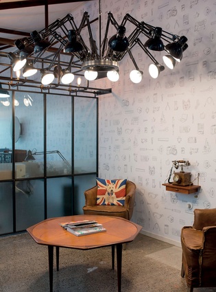
Other touches include the wallpaper (custom-made by Scott Cleary of HMNI), which, reminiscent perhaps of Michael Craig Martin’s 1970s’ illustrations, quotes various objects and tools used in the trade. “We also included the owners’ dog!” says Harper. “We love to personalise things where we can.”
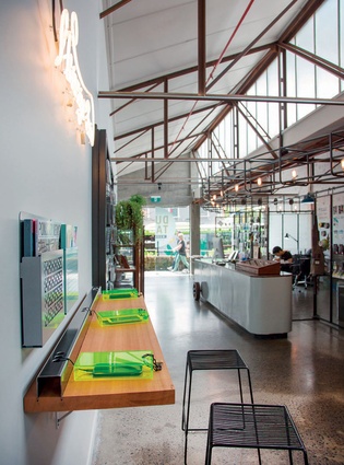
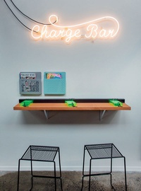
Towards the back of the store is a custom ‘bar’ where anyone can come and leave their precious pixel mirrors to recharge. The fluorescent green boxes where the phones are inserted and left were handmade by Material Creative with the help of Harper’s husband (he’s a builder, which – she says – helps heaps when she wants detailed jobs to be done well but in a hurry and under budget).
The diverse list goes on: the main reception desk is an old sawing table (ex-Boiler Room), hand painted by Material Creative. At the back of the shop one finds a sort of industrialist spider – a hanging lamp named Dear Ingo created by Ron Gilad for Moooi. Its design has been added to the collection at the Art Institute of Chicago and, luckily, Material Creative found it at a fraction of what it normally costs.
It’s busy and wildly creative in part but Duct Tape’s eclectic aesthetic maintains a highly curated and thought-out mood rather than a feeling that is haphazard or cluttered. “It is,” agrees Brandso, “all in the small details.”

