Dynamic geometry: Chapel Street Centre
One of the challenges for architects – working within the constrained budgets that post-quake Christchurch frequently presents – is to create safe, functional buildings that also include some architecture. Where do you prioritise modest finances to achieve an enlightened architectural solution?
In the case of a new chapel and community centre for North Methodist Presbyterian Church in Papanui, Dalman Architecture also had to respond to the strong local presence of the previous church spire, which had to be demolished due to earthquake damage.
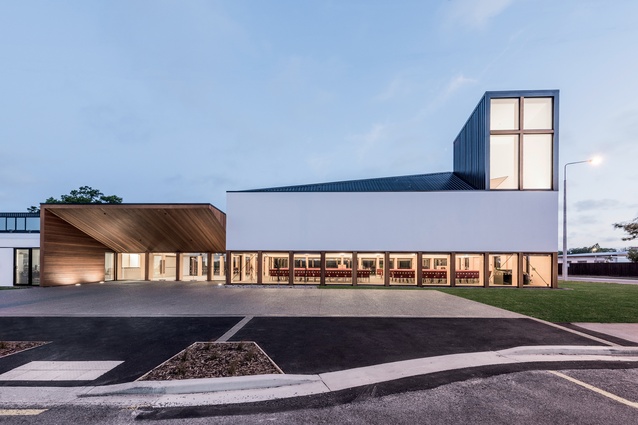
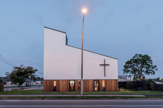
Located on a busy corner site at the intersection of Harewood Road – an arterial route into the central city – and the quieter Chapel Street, the new church still needed to work as a place-maker in the locality but, much like the Sumner Surf Lifesaving Club (published in the previous edition), this new community building had to be pulled together on a very tight budget. Insurance covered just over half of the rebuild cost, so the remainder had to be made up from contributions from parish reserves and fundraising, as well as a top-up from the national church body.
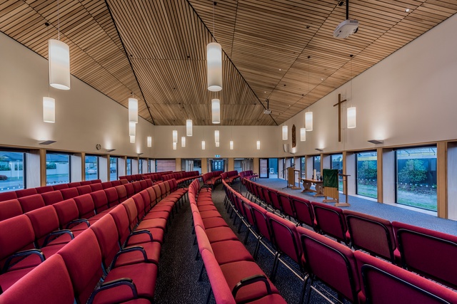
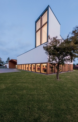
Despite some initial resistance from a few parishioners, the parish was keen to support Dalman Architecture’s scheme to build an open and transparent centre for the community. Controversially, the design welcomes passers-by to view the congregation and the activities inside the worship hall through large 2m-high windows.
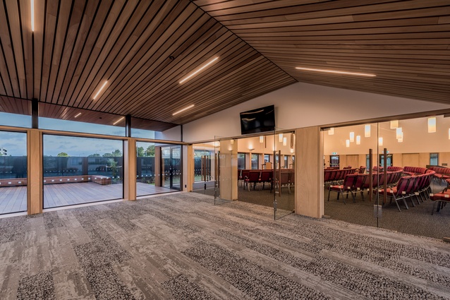
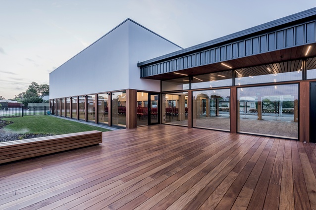
The overall plan is organised around a central foyer, which has a transparent connection to a decked courtyard in the back garden, and links to a worship hall on one side and a community block on the other. The foyer accommodates up to 100 people and offers spill-out space into the entrance, which is expressed with a sharply-angled form jutting out towards the street and a timber-clad soffit.
It’s evident that this area is designed to be welcoming; the external paving matches the foyer carpet, creating flow into the building and a relaxed vibe that aims to puts people at ease. The frontage is open for the congregation to mingle and enables both hearses and brides to drive right up to the front door.

The courtyard at the rear of the foyer was designed so that people could sit and enjoy views of the neighbouring Sanitarium factory gardens. However, this has subsequently been demolished and turned into a large car park to support yet another big-box retail building for a well-known DIY company.
This charming and well-loved garden was designed by Edgar Taylor, Christchurch’s first ‘city landscape architect’, so it seems a travesty that the city could allow such a well-loved part of its history to be destroyed by the whims of commerce. (Yet another example of some of the questionable decisions currently being made in regards to our built environment). Over time, at least the courtyard will provide developed trees and scrubs along the fence line for people to enjoy.
The community block enjoys a wide, open gallery corridor, with continuous skylights that create light and inviting circulation space, and connects with a parking area. On one side of the corridor, meeting and lounge rooms maximise the north-western light and can be opened up to a fenced outside area. A commercial-style kitchen (which links to the foyer), a large multi-use hall and a storage room sit along the south-eastern side.

These spaces support the activities of various groups within the church, as well as community activities dedicated to sports like yoga, badminton and tai chi, as well as a pre-school group and a heritage committee. While it is clear that a tight budget has been applied to these functional spaces, which utilise strandboard and coloured steel, the architects have applied the budget to the most crucial elements of the design, achieving a light and well laid out space. Simple forms create versatility, without trying to be overly clever.
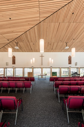
At the other end of the building, the worship space is a lot more sculptural. The ‘wow’ moment is a high, timber-panelled ceiling, with a distinctive geometry that draws the eye upwards and towards a ‘light-well spire’ sited at the ‘intersection’ corner of the building. This serves to bring light into the interior, it celebrates the building’s primary purpose as a worship space and it addresses the original church’s steeple as a well-known local place-maker.
The plan of the original church was long and narrow with the congregation sitting at the back, so the parish was keen for the new space to have an adaptable configuration, with a moveable stage and seating. The architects have designed an asymmetrical rectangular space that can be functionally orientated in different ways. They had initially wanted to recycle the kauri from the original church, however, it proved to be too difficult to achieve the required fire rating.
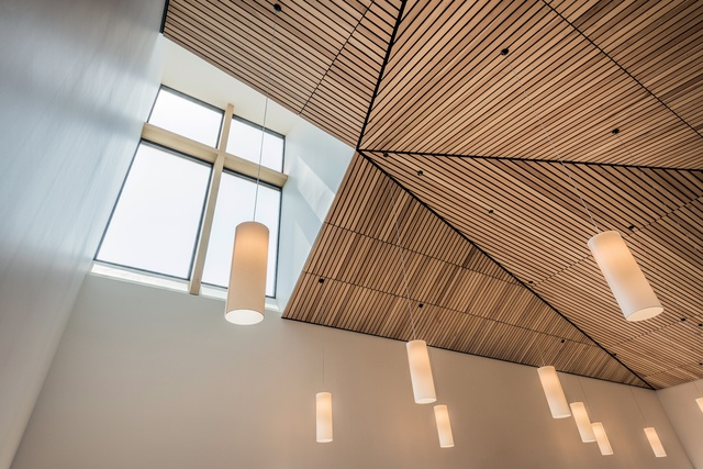
Instead, this Fijian kauri panelled ceiling was given a random arrangement, made dramatic with a black lining seen in the grooves between the timber. The ceiling was modelled to act as an acoustic damper, with reflection created at the front and absorption at the back. In here, pendants lights are hung low to create intimacy, with low-level timber window frames adding warmth, while plain white walls make the ceiling appear as if to float over the space.
This is a simple and cost-effective building with some quirky details and a lot of love and thought for the community in which it sits. If we have to build with a minimal budget, then this is an admirable example of how it can be done. But, perhaps, with a little more investment over time, including better seating in the worship hall and more craft and quality to the functional spaces at the other end of the complex, this building will truly be elevated.

