Effortless makeover: Balwyn House
Neil Architecture has thoroughly transformed a classic suburban house by an intervention that manages to appear both understated and effortless.
It has often been said that good design, and good design solutions, make the outcome look easy – almost effortless. There is a sense of comfort and ease pervading this renovation and it is fair to say that the design experience and skill required to make the result look so natural are considerable.
Located on a leafy suburban street near a well-known school in Melbourne, the Balwyn House makes for a civilized neighbour. In an interesting piece of historical circularity, the site was the childhood home of the grandfather of the children now living in the house. He is said to be endlessly pleased to know that his grandsons are daily treading the path that took him from his house to his school so many decades ago.
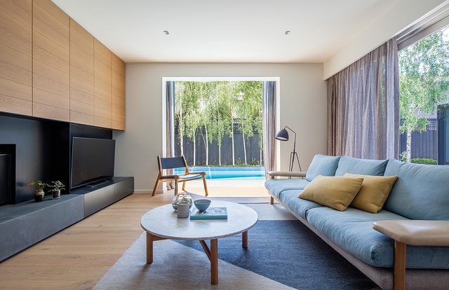
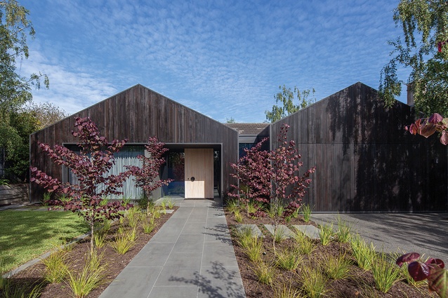
The existing dwelling on the site was a 1980s period piece, down to the butt-jointed glass bay windows, the bland colour scheme and the pencil conifers choking the light out of the front entrance. What director David Neil and his team at Neil Architecture have wrought in its place is a remarkable transformation, one that breathes new life, and new light, into the bones of the original house. Having seen the “before” photo, I can say that the house is now unrecognisable, and that’s a good thing.
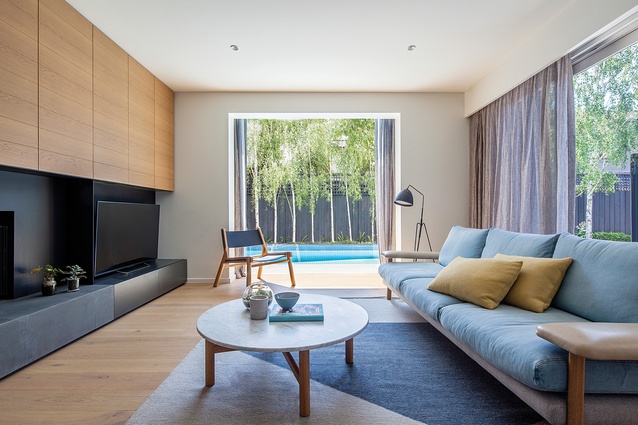
With a few significant exceptions, the transformation of the Balwyn House has been mostly a matter of new colours, new materials, new surfaces and new furnishings. Combined, these things give it an entirely new aspect. One of the exceptions to that regime was an adjustment to the plan of the rear living room, which saw divided rooms liberated into an open-plan space through the removal of walls.
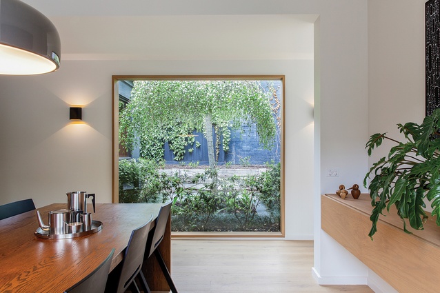
Another exception to the cosmetic changes, with a lasting impact on the exterior appearance of the dwelling, was the demolition and removal of the bay windows and their replacement with sharply detailed protruding boxes. Each box frames a view of the yard through a large picture window, bringing the sight of the garden deep into the house.

Finally, and perhaps most strikingly, David proposed the replacement of the existing front wall of the house with a new double-gabled façade clad in charcoal-stained timber, incorporating an expanded entry. This thoroughly transformed the appearance of the dwelling in the streetscape. Whereas previously the front yard bled indiscriminately out into the street across a struggling lawn, the handsome façade is now mediated by a front fence and wall at the boundary line, creating a new front garden containing silver birches and more geometric tree specimens that complement the architecture.
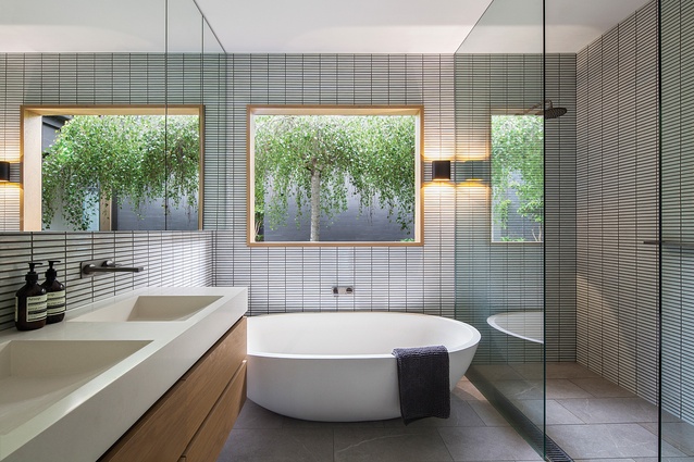
With those key moves in place, the interior of the dwelling was completely reconsidered and re-finished, including the replacement of all windows and doors. The palette employed is studied and neutral, but with some intriguing elements of darkness. Greys, dusty eucalyptus-like green-greys, a slightly blue charcoal and whites all figure. It is a somewhat masculine palette on paper, but much softer and more accessible in the flesh, with liberal use of timber and soft fabrics throughout. The combination of ample access to daylight and the warmth of the timber, juxtaposed with some fine furniture pieces, including the owner’s original dining table, gives the interior a slightly Scandinavian tone.
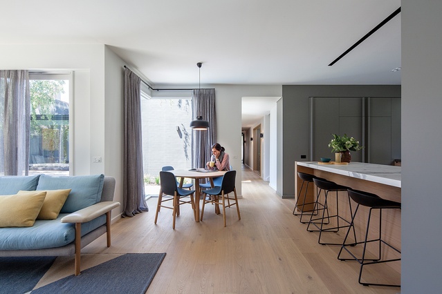
The gardens, both front and rear, have also been transformed. Neil Architecture undertakes its own hard landscape design, and as such the interior and exterior spaces are tightly integrated and of a kind. At the rear of the dwelling the original pool has been re-decked but is otherwise intact. The colour of the exterior walls is a satisfyingly dark charcoal/gunmetal colour, one that, like the dark-stained timber boards on the street façade, the client initially wavered on; thankfully David held firm and the result in each location is visually strong and robust.
Pervading the design is a keen sense of detail, applied in a way that is both accessible and matter-of-fact. This potentially comes from David’s previous professional life, working on residential projects with Melbourne architectural practice John Wardle Architects. Nevertheless, David has made his stylistic moves his own; there are no virtuosic detailing “solos” in this overall composition.

Materials are certainly allowed to sing out loud – timber, stone and fabrics are used in a way that expresses their richness and materiality – but nothing is unduly clamouring for attention or expressed through overtly architectural detailing. This sense of understatement seems fitting, and it appears to suit the owners, one of whom reported in my visit that she finds her house a deeply relaxing place to be.
As a measure of success, this is high praise. What David and his team have achieved is a generational house, one that will stand the test of time mostly by virtue of its simplicity and its clean, understated style.
This article first appeared in ArchitectureAU.com.

