Electric by design
Simon Bush-King unravels the new, quirky design within a former electricity company headquarters in Antwerp.
Using a powerful mix of talent and ambition and entrepreneur muscle, Stijn Geeraets and Maarten van Gool have created co-working space, Fosbury & Sons, in a re-purposed high-rise in the south of Antwerp.
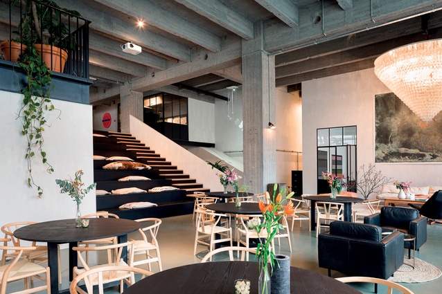
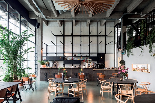
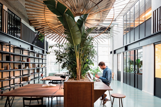
Local studio Going East, led by Anaïs Torfs and Michiel Mertens stripped away the interior of original architect Léon Stynen to its bare concrete bones leaving generous floor heights and access to light and views. Like grandparents surprised that the grandkids are raiding their closet, the modernist bones of beam and columns, never expecting to be exposed, have been joined by Danish Furniture, natural fibres and the tool kit of warm tones and nice touches we have become familiar with in office design over the last few years.

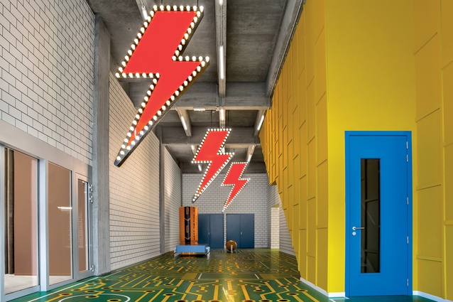
Meanwhile downstairs in the lobby, yet seemingly miles away in terms of concept and expression, Studio Job was let loose with their pun filled take on the buildings former use as an electrical company’s HQ.
Lobbies were originally used to separate rooms from the cold drafts of a building’s entry. They discovered a new use in high-rise architecture as a place to put the lifts while defining the kind of building you were in through scale and details – from the ersatz glitz and gold of a Trump Tower to the approachable, familiar tones of mid-market hotels.
Studio Job have found fame walking the tightrope of design andart from their early days as part of the wave of Dutch designers breaking out in the 1990s. Positioning themselves in the tradition of the decorative arts, the duo of Job Smeets and Nynke Tynagel are regular fixtures on the global arts scene, often producing provocative work, including a fence inspired by a concentration camp.
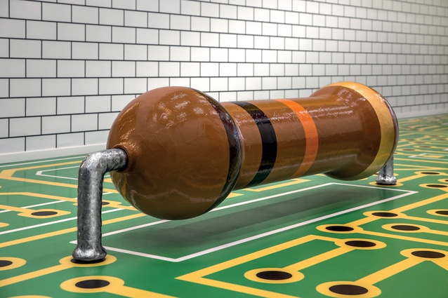
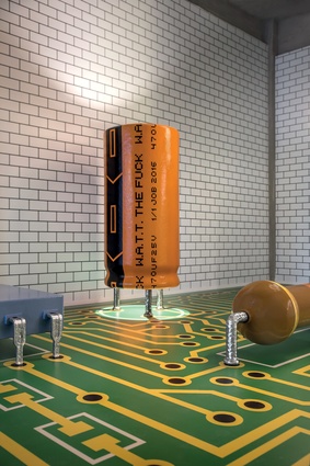
The lobby may be the perfect typology for their work – allowing a conceptually direct and clear expression in a space that people pass through. Focusing on the building’s former use, Studio Job took an idea and ran with it, establishing a white brick shell reminiscent of a substation as the backdrop for a landscape of electrical objects. Like a meme taking a built form: the orange battery housed on the green microchip-inspired floor asks a question and makes a statement with the text simply reading “Watt the Fuck”.
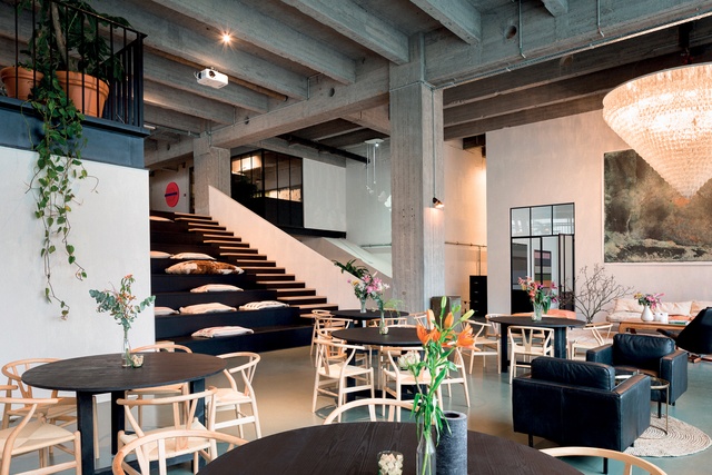
Meanwhile upstairs, Going East completed their largest commission to date turning a building whose workplace and architectural principles were distinctly modernist into a space built for today’s worker. Starting out in 2012, the young studio, like many firms before them, grafted commissions from their extended network designing apartments and small hospitality projects with a strong focus on tactile material use.
Going East had a clear idea of how they wanted to work, as Anaïs explains: “The idea to do something together grew while we were on a trip in Asia. We fell in love with the craftsmanship and the honest respect for surrounding materials. The purity and simplicity was what we really loved.”
This desire to work closely with materials and construction, while common among Antipodean firms, does not have the same tradition in northern Europe where young firms have often chased larger commissions via competition. With the European economy still spluttering back to life in 2012 Anaïs talks of the repeated advice they received to literally go east! “Everyone told us, if you want to make it, go to the east. Go to Dubai… but that’s not what we wanted. We wanted to transport that vision of one’s materials and craftsmanship to our own little city of Antwerp.”

Instead, the firm chased opportunities closer to home and secured the commission through a pitch to developers Geeraets and Van Gool looking to create a co-working space in step with a creative, open community in Antwerp. Taking the buildings name as a starting point, designers and clients identified the base ambition of a co-working space in the acronym W.A.T.T – Working Apart Thinking Together.
The 3000m² space is structured around its public space, with a bar and staircase taking centre stage as both the largest elements and organising principle of the interior. This structure can perhaps best be explained as taking a boutique hotel approach where personal space may be smaller and less formally arranged but will use high-quality materials and textures while focusing on public space and sweating the details.
Anaïs explains this deliberate connection: “We both love the hotel vibe for co-working – our own office is like this as well. Where you can sit, work, relax and eat outside in the garden.”
Spatially, this is expressed by a restrained hand – there are no architectural gymnastics or games. Instead, Going East reads the original structure well, keeping spaces open and free, improving the circulation and layering the project with nicely textured furniture and smaller spaces in which the myriad tasks of the freelancer can be performed.
There is a freedom and flexibility to this approach that can often seem effortless. However, don’t be fooled, as Anaïs exhorts: “I think when you start you shouldn’t overthink it. We started from one project into another, and that’s how we learned. But I think the most important thing is not to be lazy. Every little detail counts.”

