Embassy
A cross-Tasman collaboration results in a sympathetic addition to one of Wellington's much-loved cinema buildings.
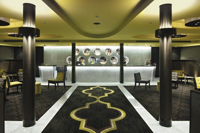
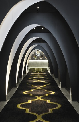
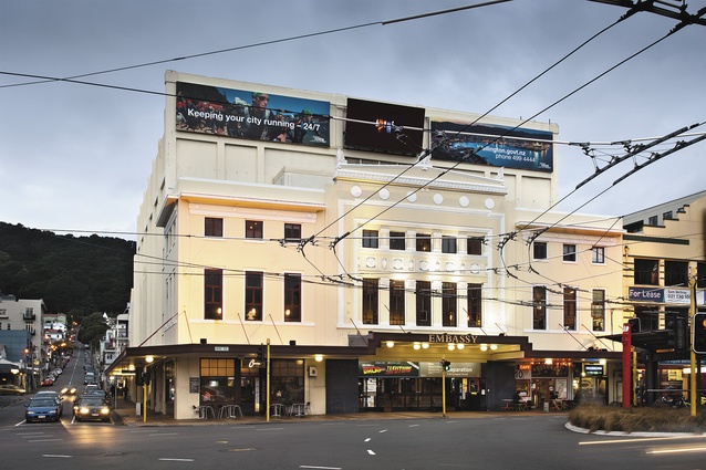
White and black arches add drama and intrigue to the street appeal of the Embassy Theatre, Wellington’s oldest surviving picture theatre. At the end of the hallway bottles gleam inside octagonal niches set into a white marble wall.

The new lounge/bar and two-cinema development, once orchestra pit and stage access, completes the restoration and alteration of the Embassy, begun in 2003 for the world premier of The Lord of the Rings. Listed Category 1 on the New Zealand Historic Places Trust register, the Theatre was built in 1924 and known as the “de Luxe”, the name given to the new facility.
Australian Company, Amalgamated Holdings, leases the Theatre and manages Event Cinemas in New Zealand. The designers from Indyk Architects, Australia, have worked with the client on many projects; however, the heritage value of the Embassy made this a unique project for Indyk.
Embassy Theatre manager, Damianos George, summarises his vision for the space as, “A warm, cosy den-like environment. I had no specifics. When I walked in here about three weeks ago… I felt it was going to look exactly how I wanted without being able to tell anybody in words,” George says.
“The black-and-white arches draw people inside. Once in the open space, they forget about the hallway – there are so many other things to see.”
Those things include geometrically patterned carpet and furnishings, the interplay of light and shadow patterns on walls and ceiling, making the space both restful and energising. Once an orchestra pit and part of the stage, the space, encased by a concrete shell, posed quite a challenge says designer and ex-pat Cantabrian, Catherine Bakker of Indyk Architects. The 15m-long concrete-block corridor, ended in a low-height space where bare steel beams supported Bondeck metal-lined ceilings. The base of the old stage was still visible and, under many layers of paint, were the remnants of damaged, ornate glazed tiles.
Lighting plays a strong role in Indyk’s designs. The internally lit archways elicit further inspection. Set at increasing intervals and lowering heights, the arches flatten and shorten the corridor view. “The arch form was inspired by elliptical forms seen throughout the existing building, but was given a theatrical, quirky edge by tilting the arch shape and alternating the tilt to create a herringbone effect,” says Bakker.
The effect is intriguing rather than intimidating; the use of black and white links with the foyer tiles and white marble staircase and would easily match any future redecoration.
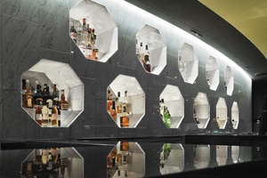
In the modern lounge, white marble is an elegant choice for the flooring and bar material. The bar is visible from the foyer and adds a strong connection between the pre-existing and the new, a principle that informed materials and form decisions throughout.
Strong geometric shapes and repeating patterns echo the elements of art-deco style in the original theatre’s design, rather than the more floral decorative notions of Neoclassical. The design intention, says Bakker, was “to draw inspiration from, but not mimic nor use ‘fake heritage’ styling to create a new, inspiring and inviting space”.
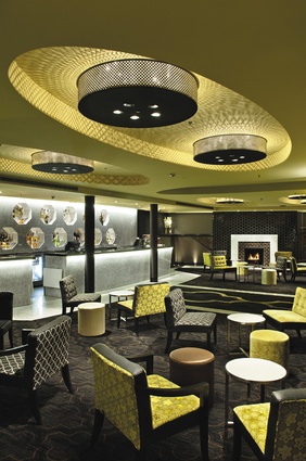
Pragmatic choices, driven by budget and available materials combined well with aesthetics. The chartreuse colour tone in the lounge links with the sepia of the 1920s, without being overly gold. Carpet colours are coordinated to the main palette, with the chartreuse as a highlight colour. The idea was to keep the colours simple and relating to what was there.
“We took the coppery-brown of the original tiles and used that in the carpet, so the carpet would always relate even if the paint colours and the furniture and the fabric on the walls were changed,” says the designer. A distressed carpet pattern will help to conceal stains while evoking ambiguity and elusiveness.
Indyk has designed many carpets for the client; experience bears out the practicality of a stippled background with a pattern that fades and reappears along the hallway runner. The carpet shapes are Moroccan-inspired and relate to the building, the lights and fabrics, which repeat hexagonal and octagonal forms in differently textured materials such as vinyl and velvets.
The octagonal niches in the back of the bar demanded a similar form for the new fireplace tiling and linked geometrically to the design concept. A search for local product gave them a handmade ‘honeycomb’ tile with a deep glaze. The glossy black tiles combined with white Carrara marble and some reproduction heritage tiles link the new fireplace to the heritage tile walls nearby and to the existing marble foyer space.
“A modern insert settles in and appears to have always been there,” Bakker says.
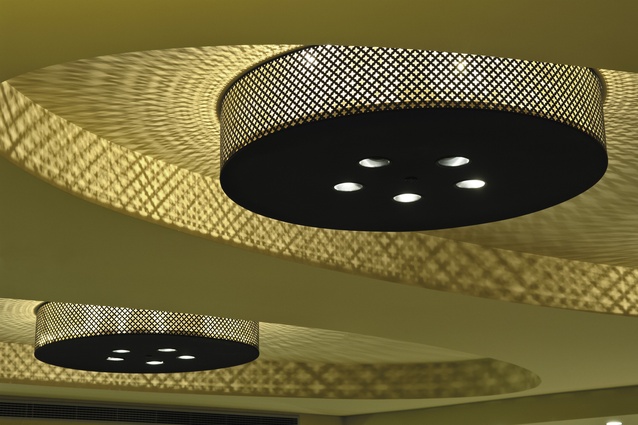
Large lantern lights, set into elliptical ceiling coffers (featured throughout the building) throw shadow and textures across the ceiling, creating an Aladdin’s cave effect. Due to the existing ‘concrete shell’ limitations, the ceiling heights could have become quite low, says Bakker.
“By using the space between the existing structural beam layout to create ceiling coffers, the maximum height is utilised.”
The lanterns were handmade from an existing, geometric pattern and echo the perforated domes in the large, upstairs cinema. Some liken them to early film reels.
Intentional references to the story of the building include the heritage tiles, which end on a diagonal line on both sides of the room where the stairs went up to the stage; the bar sits where the stage used to be. The old floor with its different levels is intact beneath the new slab.
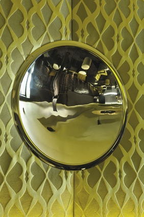
“Uplighting the existing heritage tiles on the flank walls emphasises their role in the design, and shows that they are not perfect and new: rather full of history of the building, texture and stories,” says Bakker. Upholstered, acoustic panels, studded with highly polished, stainless-steel mirrors, are also uplit to enhance the contrast in the fabric’s silk texture. The mirrors, which are concave, invert the reflection of the room, adding an entertaining aspect to the theatre lounge. The twilight zone of the lounge is the threshold for two cinema boxes, designed by John Sik and Nigel Dong, from local architecture firm Designgroup Stapleton Elliot. The same carpet continues into the cinemas where up to 73 movie-goers each sit in leather chairs as large and as comfortable as are those in front of the bigger screen upstairs.

